
Ah well, so it was that I inked up KWZ Red #1 last month. I put it in what looked like the perfect pen for it, my trusty Pelikan M600 Ruby with fine nib. It only took me writing a few words to realize, “I’ve used this before.” (True.) And then, “In the very same pen, I think.” (Also true.)
But my third thought was, “Well, it would take more effort to put it back in the ink vial than just to use it.” (So true.)
The fourth thought, and the only relevant one for our purposes, was, “Darn if this isn’t an excellent ink.” (Double true.)
In fact, the second time around, I liked KWZ Red #1 just as much, if not more. Which is why I’m writing another post about it now.
KWZ Red #1: it definitely qualifies as a #1 red ink. Here it is, on Tomoe River paper.
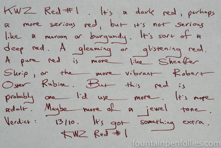
Clearly, KWZ Red #1 is not a typical medium red. It’s darker. It’s a red that tiptoes up to the edge of burgundy or maroon. But it’s not harsh in any way. It’s just slightly unusual, but still very attractive. It’s also a red that avoids what are, for me, the two squidgy areas for red ink: either “That looks like blood” or “You failed this pop quiz.”
I did give Red #1 a 13 out of 10 rating, which may not be scientific, I know. But KWZ Red #1 excels. It is a worthy #1. It deserved a little grade inflation.
I’ve been using KWZ Red #1 a lot, obviously. Also on many papers. But I only wrote up a writing sample for this post on Tomoe River paper. Because it’s summer. There are many more photos of the ink in my first, actual review, anyway. Just go here.
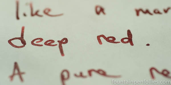
Does the ink sheen?! I have no idea! I am too happy to use it in this Pelikan with fine nib. Over and over. And I don’t really notice sheen unless it’s so obvious that it practically slaps me in the face. But I do think Red #1 has sheen potential.
Also it looks really cool in closeup, with or without face-slapping sheen.
It occurs to me that red is among my favorite ink colors. I must like 80 percent of the red inks I’ve ever used. So I can think of a few #1 reds for me. KWZ #1 Red, obviously. Caran d’Ache Infra Red. The excellent Diamine Red Dragon. The gentle (thus overlooked) Pelikan Edelstein Ruby. Kaweco Ruby, another softer red, but this one nearly pink.
Then there are some #1 standard reds, like Stipula Florentine Red. And the dynamic, stunning Robert Oster Rubine. I believe that Sheaffer Skrip Red is the most standard red of all standard reds — but it’s almost too standard if you ask me. KWZ Thief’s Red has a more dashing name and does not induce grade-school flashbacks, so I’d pick that instead. Except, wait: Skrip Red is absolutely my #1 red for mixing.
There are so many #1 reds. But KWZ #1 Red is one of the best.

Wonderful review. It really is a gorgeous ink. I like your description of it looking more “adult”, I think that’s a great way to put it. I might have to pick up a sample of this tomorrow. 13/10!
LikeLiked by 1 person
It looks like a pretty red. I’ve never given that one much thought. I like darker reds, but red isn’t my favorite color. I do love Diamine-Red Dragon though, and would use that sample in a variety of pens. Diamine-Matador was a true red to me, and it was acceptable in color. So maybe I would like KWZ-Red #1. I do love Diamine-Burgundy Rose. I also love Diamine-Wild Strawberry. (although I don’t use the Wild Strawberry a lot for some reason, I have the 30ml bottle of that) I do however love burgundy/maroon inks, and will use them in any situation with a variety of pens.
It is good to revisit samples sometimes. What I don’t like in one pen, I may love in another. One thing I do is keep an ink journal. (in fact I have two) One journal is more of a tester to see how the ink performs. The other journal is the one I see how it performs on cream/ivory paper, and I write my thoughts about the performance of the ink. If it shades, sheen, spread, bleeds…whatever, then I make notes of it there. I have changed my mind about an ink, but that is rare. My first thoughts are pretty much right on! I can refer back to these journals to compare ink, and they are just fun to look at with all the beautiful ink in there.
LikeLiked by 2 people
A wonderful re-review. I am on the hunt for a dark red ink and this one looks great.
Oh and I love the Pelikan M600 Ruby with a Fine nib. Now, if I can just get one of those pens and some of that ink, THEN I will (may) stop wanting new things.
LikeLiked by 2 people