
Papier Plume made a new batch of its New Orleans Collection of inks last month, and I looked at the original five here. I’ve been happily using those ever since I got them. And, even better, Papier Plume also sent me a pre-release sample of Red Beans and Rice to use.
Papier Plume made the ink Red Beans and Rice in homage to the classic Creole dish that they tell me was traditionally cooked on Mondays because it could simmer all day while mom cleaned and washed. It still is a Monday restaurant staple in New Orleans today. Apparently Louis Armstrong, a New Orleans native, loved red beans and rice so much he’d occasionally sign letters “Red Beans and Ricely Yours.”
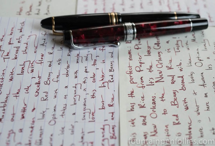
I’ve been using the ink Red Beans and Rice for about a month in an Aurora Optima with medium nib. (Which is such a narrow medium that I mistakenly called it a “fine” in my writing samples.) I’ve also been writing with Red Beans and Rice in a Montblanc 146 with broad nib.
There is a difference, and it’s nice. The first line is written with the Montblanc, and the next two with the Aurora, on Tomoe River paper.

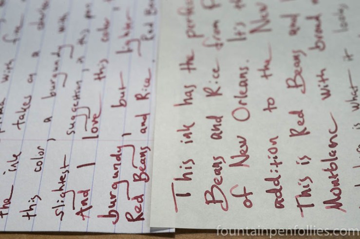
I like the way the ink looks in both pens, and I like that it can look different in different pens. Actually, I’ve noticed that the ink seems to darken a little over time in the pen. But the Montblanc look is also what I get from a pen with less ink flow, like a Lamy Safari.
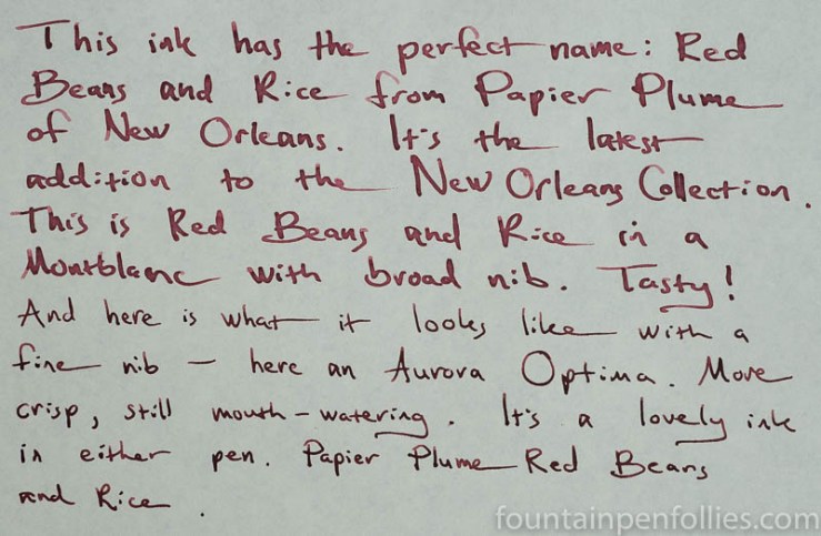
Here is a larger writing sample on Tomoe River.
And on on Rhodia.

I wanted to go big with the writing samples so you could see how dark and legible the ink looks, even in its relatively lighter guise. Red Beans and Rice is a nice strong burgundy or maroon. It is not a wishy-washy or pale color, like the disappointment (for me) that is Montblanc Burgundy Red and Monteverde (Napa) Burgundy. Red Beans and Rice has good saturation and a much more satisfying color.
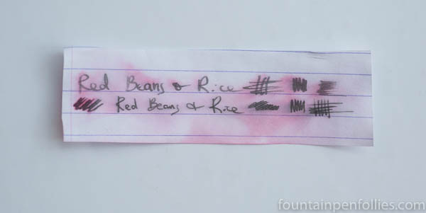
Here is a swab comparison of three burgundies.

There is so much more vigor in both Red Beans and Rice and Graf von Faber-Castell Burgundy Red, which you can see more of here, if you like.
Do you think the swabs also show that Red Beans and Rice looks a touch browner? (Which would be more like red beans and rice.) I think I do.
In terms of how the ink behaves, Red Beans and Rice is a nicely wet and well-lubricated ink. Startup has been perfect. The ink has nice shading. I don’t see much sheen — perhaps a touch on Tomoe River. I’m not a sheen whisperer, however.
On poor paper, in a wet pen, Red Beans and Rice can feather and show through the other side of the page. That’s not unexpected from a dark and wet-writing ink either. And it depends on the pen and the exact paper. But I always like to mention it.
Strangely, Red Beans and Rice feathered more on my Staples Sustainable Earth legal pad paper than it did on my cheap copy paper, which usually is the worst paper I have. I think that’s because the Staples is so thin. For the worst case scenario, here is an extreme closeup on the Staples.

People who need water resistance will be pleased that Red Beans and Rice stands up to water. Here are the results after running water over a writing sample on Rhodia, which is the hardest test for water resistance.
Sill completely legible at its core. And that core is a gray-brown. Which means that we were right: Red Beans and Rice does have a bit of brown in the base.
I really like Red Beans and Rice. I liked it from the moment I first saw Papier Plume’s writing sample of it, and unlike some inks, I like it even more after using it for four weeks. It’s a nice strong color, but not heavy — always pleasant. I think it will be a great ink to use into the fall and winter. And it really does remind me of red beans and rice, which makes it a fun ink to use.

Laura, not only does it taste great…it is good for you too. 🙂
LikeLiked by 1 person
Oh yes, we’re fans. 🙂
Balanced proteins, plus iron. And delicious. I’m following your cornbread suggestion, too. 🙂
LikeLike
I like real butter on that cornbread. Then I like to dip it into the juice from the beans (and peas too). You won’t be disappointed!
LikeLiked by 1 person
👍🏻 Butter 😁
LikeLike
I love how different it looks between the two pens. It reminds me of the natural variation in the color of red beans.
LikeLiked by 1 person
Yes, well put!
LikeLiked by 1 person
I love your ink reviews, you go “all out” on them! This color really appeals to me. Feathering and show through do annoy me though. I like the difference it has between pens in lighter and darker coloring. It looks great on good paper, and it has water resistance. I will still try a sample of this in the future, when I am able to.
LikeLiked by 2 people
Guess what we’re having for dinner tonight? 🙂
LikeLike