Pen of the Day: Sheaffer PFM I in Green with Caran d’Ache Delicate Green

Sheaffer PFM I green

Sheaffer PFM I with medium nib. For my friend Jon, here’s my second PFM I, and first working one. It’s green, because, apparently all my pens now must be green. When I got this one, the nib wasn’t really writing well. It was a little misaligned, a little out of whack.

No worries. Because it’s a Sheaffer inlaid nib — which means, not like other nibs — and because I was going to the Ohio Pen Show, I took it to Ron Zorn. Ron did a little of this and a little of that (I was chatting), and boom, all fixed. He’s the Sheaffer master.

Sheaffer PFM I green

Probably it’s heretical, but I like the PFM I’s stainless-steel colored trim and plastic cap best of all the models. And the green. The PFM green is an unusual color. It’s not a forest green, but more a dark medium green. It usually looks lighter than in that photo.

Believe it or not, I don’t love the color green. And the PFM green isn’t conventionally attractive (to me). In fact it feels dated (to me). Paradoxically, that’s why this is my favorite. The blue, maroon and black PFMs are conventional colors, and more conventionally attractive. But the green is a little odd, and a little retro. It fits the pen.

So basically, I think the green PFM I is the coolest PFM, because it’s the most PFM.

And right now, it’s filled with my favorite green ink, Caran d’Ache Delicate Green. Which is really too pretty for this pen. But, hey, it’s almost the holiday season. It gets to dress up for a bit.

Sheaffer PFM I green with Caran d'Ache Delicate Green


Richard Binder’s Nib-Smoothing Workshop at the Ohio Pen Show

Richard Binder's Nib Smoothing Workshop materials

One of the highlights of the Ohio Pen Show for me was a nib smoothing workshop given by Richard Binder, with help from Linda Kennedy of Indy-Pen-Dance and Brian Gray of Edison Pens.

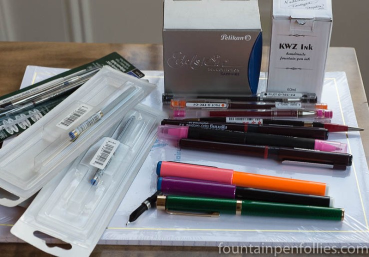
I pre-registered and paid $20 for the materials, shown above, and for the workshop. There were probably about 18 slots for paid participants, but Richard let anyone else audit the class from seats in the back.

It was really worth it, and I highly recommend it. According to Richard Binder’s website, the next show he and Barbara will attend is Baltimore on March 3 through 5. If I were in the area, I’d keep checking Baltimore and other upcoming shows for the seminar.

Richard also has a wonderful website, and I’ve spent a lot of time over the years looking through the reference pages and the blog. You can find the reference pages here. A lot of what Richard talked about in the seminar can be found in his writings about nibs, just organized differently.

I can’t teach anything about nib work, myself, but I thought I’d share a few of the workshop’s biggest lightbulb moments for me, in hopes of helping someone else.

The workshop covered the basics of nib alignment, tip shapes and nib smoothing. Richard talked about the principles, then had us practice, while Richard, Linda and Brian walked around giving individual instruction.

I learned some interesting things about loupes. For basic nib adjustment and smoothing, Richard recommends a loupe between 7x and 12x. He emphasized that an unlighted loupe is better for nib evaluation and adjustment, to avoid reflections. If, like me, you already have a lighted loupe, just keep the light off when working on nibs.

The first step is to hold the loupe and pen in the right orientation. That’s basic, but believe it or not, it was also the hardest for me and the people around me to do consistently. Richard counsels that you should hold the loupe up to your eye and look straight ahead, at the wall essentially. Then you hold the pen in your other hand, at a 45 degree angle, nib toward the ceiling (at that 45 degree angle), with the top surface of the nib facing toward you and the feed side facing away. You move the nib in that position toward the loupe until the nib tip is in focus.

That was hard, for this rank amateur, because it felt odd: you’re only seeing a very small portion of the nib tipping.  My instinct, and that of most of us, if we weren’t being conscious of following the directions, was instead to hold the nib more straight on, so we saw more of the tipping material. Or even to bend our necks and look down at the nib from above, again seeing more of the tipping material. Before the class, I would have held the nib pointing straight up and with the feed directly facing me — which lets you see a lot of tipping material, but is pretty much the opposite of what Richard counsels.

Richard explained his reasoning: when you hold the nib at a 45 degree angle, with the feed facing away, and look across the top, what you are seeing is the part of the nib that touches the paper when a person writes with the pen at a 45 degree angle. You are forcing your perspective to be that of the paper. And that makes perfect sense. It was an aha moment. This way, you are checking that the nib is perfectly aligned where it hits the paper.

As an aside, not everyone holds a pen at a 45 degree angle — I for one write at a steeper angle. So keep that in mind. (It’s also really important to mention your writing angle when you’re asking for nib work, or buying a new pen from someone who’ll adjust it to your preferences.)

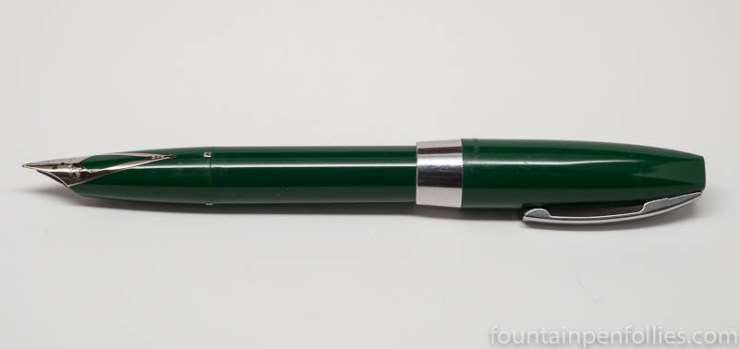
Another key lesson, that was helpful right away, because I bought something at the pen show, is to know that modern, newly manufactured nibs can frequently have issues out of the box. After the workshop, I knew enough to look at my new nib before trying it, and sure enough, it needed a slight adjustment in the slit alignment.

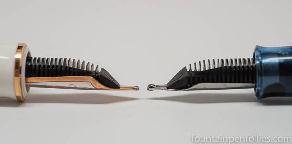
What is slit alignment? The slit in the nib should be tapered from the breather hole to the tipping, so that the slit is wider at the breather hole and narrower at the tip. And you should be able to hold the uninked nib up a light source, look through your loupe and see light through the (hopefully tapered) slit all the way along. If the slit alignment is not correct, you can adjust it by moving the tines gently with your finger nails. That’s fairly easy to fix, but I hadn’t really been conscious that I should check for it on new pens.

And that’s a key word: conscious. I think after taking the seminar I have a better sense of the nib and how so many little things come together in the writing experience.

Back at the workshop, we also practiced gently adjusting tines if they are out of alignment at the tip, by moving one of the tines. My practice pen gave me a run for my money there. It kept jumping back out of alignment when I smoothed the nib on the buff stick or the mylar sheet. In a way, that was frustrating, but in a way helpful, because I started to be able to tell right away when the nib was out of alignment again. There’s a distinct kind of scratch when one tip is above the other.

And that brings up another critical lesson: whatever you are doing on a nib, keep double-checking that the step you just took didn’t undo a previous step. For example, if you spread the tines for a wetter flow, make sure you didn’t misalign the tines accidentally. If you did, realign, then go back and double-check the flow. And so on.

Nibwork is clearly one of those things you learn, and improve, by doing. But I feel like having Richard Binder’s instruction gives me a solid base from which to go forward. It was very gracious of Richard, Linda and Brian to share their knowledge and time in this way. I think that’s the spirit that represents the best of the pen community.

Doubling Down: Pelikan’s Double-Broad Highlighter Nib Isn’t Just for Highlighting

Pelikan M205 with double broad BB nib

That is the Pelikan double broad nib I bought at the Ohio Show this weekend from Dan Smith, the Nibsmith. I put it on my M205 Blue demonstrator.

I don’t know if the size of that tipping material can be adequately appreciated, but there’s a lot. I call the nib The Blob. In a good way.

Here is a comparison of an M600 BB nib on the left with the M205 BB nib on the right.

Pelikan M600 BB versus M205 BB highlighter

And the other side, again with the M600 BB nib on the left and the M205 BB nib on the right.

Pelikan M600 BB versus M205 BB highlighter

I’m guessing that Pelikan wanted to make the M205 BB more round for highlighting. That said, I first tried a Pelikan M205 Highlighter fountain pen at the Chicago Pelikan Hub, and that nib was more stubbish than mine.

Having seen the nib, you won’t be surprised that it writes a gigantic line. It’s almost marker-like, and very smooth. It’s kind of fun writing with such a wet and wide nib. Also good for making your points forcefully. Or writing with yellow ink.

Here is a writing sample with the M205 double broad writing in blue and the M600 in pink.

writing sample Pelikan M600 BB versus M205 BB highlighter

The M205 has Pelikan Edelstein Tanzanite ink, which is a wetter ink than the Sailor Sakura-Mori in the M600. But the M205 double broad is just bigger, and it writes wider.

writing sample Pelikan M600 BB versus M205 BB highlighter

I’m a person who loves a good fine nib, but I think most fountain pen people prefer broader nibs, and this makes an intriguing choice. Because you can buy this one separately. And it will fit into any Pelikan from M200 through M700.

In the US it’s $60. Which means every else in the world it’s probably only $20 or less. (A little black humor, for those of us in Chartpak territory.)

I decided to buy the nib only. You could instead buy it on the highlighter pen. Or if you’re buying a different new M205, ask for the BB nib instead of the usual choices. I’d probably do that, if I ever bought another M200-sized pen, and I’d have the BB modified into a stub or architect’s nib. Because The Blob has tipping material to spare.

I Came, I Saw, I Bought a Little: My Mostly Measly Ohio Pen Show Purchases

2016 Ohio Pen Show purchases

Okay, it’s a slim haul, but I’m sure you’ll identify with me saying that I still spent more than I intended at the Ohio Pen Show. I didn’t really intend to buy anything. And, yes, feel free to be aghast: there aren’t a lot of fountain pen things in the pile.

That’s because I went to the show with my 16-year-old daughter, and there is no way she could have spent two days shopping for fountain pens. Which is fine. I actually like other pens and pencils, too.

(click Page 2 below to continue)

Pen of the Day: Sheaffer Targa Green Moiré with Bookbinders Blue Coral Snake Ink

Sheaffer Targa Laque Green Moiré

Sheaffer Targa Laque Green Moiré. I brought this home from the Ohio Pen Show. Wow.

You may remember that I fell hard for my friend’s Green Moiré Targa a few weeks ago. But I never expected to find one for myself. I certainly wasn’t looking. I’m in a quiet period with pens: I feel more like selling than buying.

But the Green Moiré breaks through my “no new pens” ennui. It is the perfect pen for an “ooh shiny” person like me. Since it was dark when I got back home, these photos don’t show it at its best. But the Green Moiré lacquer is shimmery, flamboyant and fun. while also being elegant. Look how beautiful the lacquer work is.

Sheaffer Targa Laque Green Moiré closeup

I got very lucky because this Green Moiré has some scratches, so I could afford it. Also because it has a stub nib. And finally because my daughter (a) approved of it and (b) won the auction for it.

And I’m also lucky that my friend gave me the perfect ink for it. He had purchased a bottle of Bookbinders Snake Ink in Blue Coral that day, and had given me a vial to take home. He put Blue Coral in the pen he bought at the pen show, and I put it in mine. I think that makes Blue Coral the official ink for cool Ohio Pen Show purchases.

Blue Coral is a very appealing color. It’s a bit darker in real life than you see below, but the blue hue and nice shading are accurate.

Bookbinders Snake Ink Blue Coral writing sample

Ohio Bound

I’m getting ready to pack up for the Ohio Pen Show. This is my first “away” pen show. And actually I’m looking forward to three days being around other adults more than any pens I might come across. Holiday!

But I do have a feeling the pens will end up being interesting, too.

More Montblanc Golden Yellow Ink: Comparisons

Montblanc Golden Yellow ink swab comparisons

Here’s a golden array of inks, with Montblanc Golden Yellow shining right in the middle.

We all know that colors look different depending on surrounding colors. And this is a perfect illustration. Look how unattractive the two amber inks seem when they flank Montblanc Golden Yellow.

In fact, J. Herbin Ambre de Birmanie and Pelikan Edelstein Amber are both lovely. In fact, they are favorites of mine. When they aren’t next to Montblanc Golden Yellow, the ambers are attractive golden brown inks with nice shading. So I should apologize for them looking so awful here.

Golden Yellow is so lively and so yellow-orange, that it deadens these amber inks. Not every ink looks good with every other. So here’s a link that shows how Ambre de Birmanie really looks, next to more congenial colors, and here’s one showing  Pelikan Edelstein Amber.

Now, I really like Golden Yellow, which is why it’s interesting that one of the inks in this array is an ink I intensely dislike. The ink that sets my teeth on edge is on the far right: Sheaffer King’s Gold. The King’s Gold is no longer in production, for which I applaud Sheaffer. But King’s Gold almost looks like a more orange, more brown Golden Yellow here, doesn’t it? Yet, to me, one is yay and one is nay.

It’s a reminder in (bright yellow) Broadway lights, that nothing beats testing an ink to see if it works for you.

Finally, it’s interesting how Diamine Sunshine Yellow is fairly close to Montblanc Golden Yellow.

Montblanc Golden Yellow ink swab comparisons

When you write with them, Montblanc Golden Yellow is darker (more orange) and more legible than Diamine Sunshine Yellow. That’s nearly impossible to see from the swabs. But you can tell from the swabs that there’s a lot of similarity.

And now I have one final twist, worthy of Hollywood: there is another.

Remember that Diamine operates on the principle that “if one ink is great, three nearly identical inks will be fantastic.” (That happens to be my motto, as well.) So you won’t be surprised to hear that Diamine has another ink, Diamine Amber, which is very close to Diamine Sunshine Yellow, and thus to Montblanc Golden Yellow, albeit browner.

I did not include a photo of Diamine Amber, because my photo array is full, the two Diamines are very close to each other, and I’ve already got two better amber inks in there. But I find it interesting. Inks. Even the yellow ones are interesting.

Ink Snippet: Montblanc Golden Yellow

Montblanc Golden Yellow ink

Montblanc Golden Yellow. Liquid happiness.

This just arrived from Montblanc, brightening up a rainy day.

I love the sunshine orange of the bottled ink, but this ink is not orange: Montblanc Golden Yellow really is a yellow, and a golden yellow at that.

Montblanc Golden Yellow ink

The color reminds me of a glistening egg yolk. It’s deep and warm.

I’ve got mine in a Montblanc 146 with broad nib. The ink seems to have good flow, but it is  a yellow ink, so not very dark. I wanted the wider nib.

Montblanc Golden Yellow ink writing sample
I am a fan of shading inks, and I love the shading of this ink.

Golden Yellow is not eye-searing or overly bright, and it seems to have a slightly orange tint. But it’s still yellow, so this is probably not the color for writing a note to your boss. But what a happy color.

Montblanc Golden Yellow ink writing sample

Golden Yellow looks like it could sheen, perhaps, but rainy weather here makes it impossible for me to know. And I suspect any sheen would be very subtle.

Montblanc Golden Yellow ink writing sample