Pen of the Day: Pelikan M400 White Tortoise with Sailor Waka-Uguisu

Sailor Waka-Uguisu with Pelikan M400 White Tortoise

Pelikan M400 White Tortoise with medium nib.  Coincidentally, I bought this pen about the same time I started this blog. I wasn’t sure about buying it. In photos, the White Tortoise had always looked a little blingy, a little too much. I am not a huge tortoise fan. And the white resin?

Well, those reservations lasted until I opened the box. In real life, this pen is fantastic.

Sailor Waka-Uguisu with Pelikan M400 White Tortoise

However, today the pen is an afterthought. This post is really inspired by the ink. I had wanted another springy ink, after enjoying Diamine Apple Glory and Sailor Sakura-Mori. Luckily, Sailor’s Four Seasons line is all about seasonal inks.

This is Waka-Uguisu, a “spring” ink that ranks among my very favorites from last year.

Sailor Waka-Uguisu with Pelikan M400 White Tortoise

I absolutely love this ink.

New Iron Gall Inks From Japan Are Coming Soon: Platinum Classic Inks

Platinum Classic Inks

My friend who’s just become a Platinum dealer texted me this photo last night. Yay. It looks like Platinum is going to be debuting a new line of inks, and although Platinum doesn’t use the words “iron gall,” these must be iron gall inks.

In the official announcement, Platinum says its upcoming Classic Line ink is produced using the traditional method. Also that the Classic Line is an extension of Platinum Blue Black. Platinum says Classic Line ink is bright when you start writing, but gradually darkens. “It is also highly water resistant and suitable for permanent preservation.” All of that, my friends, clearly adds up to “iron gall.”

Yay, again. KWZ inks have shown a wide audience how attractive, and easy to use, modern iron gall inks can be. The more of these in the marketplace, the merrier.

By the way, I am working on a post about how one can confidently use modern iron gall inks in fountain pens. Because in my experience, modern iron gall inks are excellent inks to use, and almost all are as gentle as the gentlest Pelikan or Waterman ink. (Some are higher maintenance or require more caution. But that is true with any brand of ink. Even Waterman has the harder-to-clean purple.)

The Platinum announcement actually says that Classic Inks turn black with time, and as a result the Classic Line puts the word “Black” in each ink’s name. But until I try them, I’m going to assume most of the inks will darken, but not necessarily all the way to what I’d call black. Because, in general, that’s been my experience with modern iron gall inks. Platinum does have ink swabs at that link above.

If the Classic Line inks are available by the first weekend in May, I’ve already twisted my friend’s arm so I’ll have samples for people to try at the ink testing station at the Chicago Pen Show. I’m really hoping I’ll get them sooner, however. Because these look awesome.

Ink Dips: Diamine Apple Glory

Diamine Apple Glory writing samples

Ink Dips is a more casual, and potentially disagreeable, ink evaluation than is normal here at Fountain Pen Follies. Instead of carefully evaluating an ink I’m interested in, the point of Ink Dips is to blindly pick an ink sample from a box of the unwanted or uninteresting. Then I fill that sample into one pen and see what I think. An inky experiment that’s a bit dippy.

Diamine Apple Glory. It’s not that anyone in the world needed another green ink, but this one is charming, and hard to resist. Apple Glory is a happy, cheery green, the perfect match for my Lamy Apple Green Safari. It’s bright enough for editing or fun little notes, but never obnoxious or eye-searing. Never neon. Possibly even office appropriate. Apple Green turned out to be an unexpected pleasure.

(click Page 2 below to continue)

Fountain Pen Favorites for January 2017

calendar image

January is over? How did that happen? Well, swiftly, I guess. In terms of pens and inks, January wasn’t particularly notable for me. But if I dredge, I can dig up some highlights.

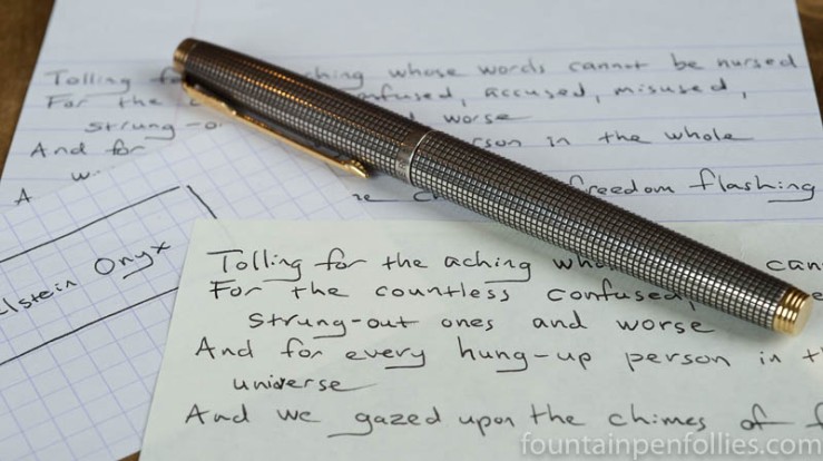
1. Ink Dips. I liked the first two, Sailor Something Something and Pelikan Edelstein Onyx. Oh, yes, Sailor Oku-Yama. Details … poof. The mind is the first thing to go. Or maybe vision. Possibly hearing. What was I saying?

2. Yellow Journalism. I wrote in my new journal pretty consistently. Not every day, but almost. So it’s becoming a habit, which is nice. Unfortunately, I have written 96 pages since Christmas, which is going to be financially ruinous; these things are costly. I’m going back to a Rhodia Webnotebook when I fill my Nanami Writer, to see if the type of journal makes a difference or not.

3.  Hmm, a Rant. Yeah, um, well, hard to think of a third highlight, to be honest. I liked the inks I used this month. Pens were pretty calm for me — there is not much happening here in pens. Actually, I dislike something. I am not in favor of the newly announced 2017 Lamy Safari color, which is “Petrol,” which is the German word for “Teal.” I can’t even pretend to care about this Safari. Especially when the 2017 Al-Star is already an aquamarine called Pacific.

It seems I’ve gone off Lamy. After so many years of the neons and the greens and the greenish yellows, now in 2107 we’re getting not one, but two, blue greens. That’s not what I’d call progress.

I’ve lost faith in Lamy, or interest, or both. I don’t know if the string of similar colors is due to lack of imagination, cost-consciousness or trying to profit off an influx of newbie buyers with no apparent discernment (given the prices they’ll pay for counterfeits). But whatever the cause, I don’t care. I’m bored with the result. It seems cheap and cynical, and worst of all dull, by Lamy.

Yes, I am now completely unexcited about Lamy Safaris. And I used to be their biggest fan.

——————

Photo by Dafne Cholet, Flickr, used under Creative Commons license.

Pen of the Day: Sheaffer PFM Green with Caran d’Ache Idyllic Blue

Sheaffer PFM I fountain pen with Caran d'Ache Idyllic Blue ink

Sheaffer PFM I Green with medium nib. The PFM, once again, because we have gone out of the green and into the blue. At least in terms of ink. With apologies to Neil Young: hey hey, my my; a PFM should never die.

My first stab at a blue ink for the PFM is Caran d’Ache Idyllic Blue, which is a normal standard blue ink. This is what it looks like, more or less.

Caran d'Ache Idyllic Blue writing sample

Idyllic Blue is very close to Waterman Serenity Blue in color and behavior, but smoother feeling, I think, and I like it a tiny bit more. Not that I don’t love Serenity Blue. I probably just wanted a slight change.

No pen changes, though. Boring as that is, I know. I feel so set.

We’ve had a lot of really valuable discussion about the PFM’s inlaid nib. So here it is, in the dark of a late winter afternoon. I like the shape, I like the “R,” I like the “apostrophe S” that connects to the “R.” I certainly like blue ink drops. I like it all.

Sheaffer PFM I fountain pen nib closeup

Ink Dips: Pelikan Edelstein Onyx

Pelikan Edelstein Onyx and Parker 75 Silver

Ink Dips is a more casual, and potentially evil, ink evaluation than is normal here at Fountain Pen Follies. Instead of carefully evaluating an ink I’m interested in, the point of Ink Dips is instead to blindly pick an ink sample from a box of dullards and discards. Then I ink up that sample in one pen and see what I think. It’s sort of like the feeling you get when you leave for the airport during a snowstorm: you don’t know what’s going to happen, but you’re prepared for it to be painful.

Pelikan Edelstein Onyx. I’m pleased to say that Pelikan Edelstein Onyx turns out to be an awesome performer. It’s a black ink, on the lighter side, and although it is premium-priced, the more I use it, the more I think it’s worth it.

(click Page 2 below to continue)

Pen of the Day: Montblanc Heritage 1912 with Sailor Sakura-Mori

Montblanc Heritage 1912 with Sailor Sakura-Mori

Montblanc Heritage 1912 with broad nib. This is one of my favorite pens, with its updated safety-filler design and its pleasantly bouncy nib. But today I’m really doing a disguised Ink of the Day.

I read that the first cherry blossoms begin blooming in Okinawa right about now, which made me take out the Sailor Sakura-Mori. Warm weather envy can be a beautiful thing.

Montblanc Heritage 1912 with Sailor Sakura-Mori

I really enjoy the gentle pink of Sakura-Mori. A few drops of ink clinging to the nib show the peach tint that makes this ink so interesting.

Montblanc Heritage 1912 nib

Ink Dips: Sailor Oku-Yama

Sailor Oku-Yama

This post kicks off a new adventure for Fountain Pen Follies. Instead of carefully evaluating inks that I’m interested in, I’m going to do the opposite. I’m going to blindly pick an ink sample from my “miscellaneous samples” box, load it in a pen, and then see what I think of  it.

I considered calling this experience Ink Roulette, or Random Inks, or even reclaiming the title Mystery Ink. But I’ve decided on Ink Dips. For two reasons. One, I’m just barely dipping into the ink. I won’t necessarily use it much, especially if I don’t like it. Two: it’s kind of a dippy idea. The reason these samples ended up in the box is because I either didn’t want to use them or didn’t like them.

But what the heck: it’s winter; try something new. Ink Dips begins.

Sailor Oku-Yama. This is an ink I’ve tried before and just didn’t like. So I was a little worried when I plucked it out of the box. But what a success for the first Ink Dip. I really enjoyed it this time.

(click Page 2 below to continue)