Pen of the Day: Aurora Optima Burgundy Auroloide

DSC_8271

Aurora Optima Burgundy with medium nib. This beautiful Optima is a great match for the KWZ Maroon #2 I’m testing.

DSC_8272

I just reviewed KWZ Maroon, which I loved, so I wanted to give Maroon #2 a fair shake by putting it in a special pen.

DSC_8287

Aurora took its red pen down a different path by making it a sophisticated burgundy. It has a rich, dark color, featuring deep wine reds and black, with chrome trim.

In bright light or sunlight, the acrylic shines and sparkles, but the photo above was taken on an overcast day, and brings out the name and logo: “Aurora Italia, Fabbrica Italiana Di Pennea Serbatoio.” Which Google roughly translates as Aurora of Italy, Italian Factory of Fountain Pens. But as usual, the Italian sounds much better. Grazie mille, Aurora Italia.

Fountain Pen Throwdown: Lamy 2000 Fine Verus Lamy 2000 Extra-Fine

DSC_8364

Well, I did a bad thing, but my friend Plume has me covered, because now all my lapses are “for the blog.” A few weeks ago, I saw a great price on a new Lamy 2000 extra-fine.  Reader, I leapt at it.  So I am a Lamy 2000 extra-fine owner now.  Which lets me compare the extra-fine to the Lamy 2000 with fine nib that I’ve been using for years.

(click Page 2 below to continue)

Fountain Pen Favorites for January 2016

5374200948_539b10fb1c_b

January is the worst month in Chicago. February is almost as bad, but at least it’s shorter. But in terms of fountain pens and ink, this January was pretty darn good.  Here are some highlights.

1. KWZ Inks. I’ve really been enjoying these. Such beautiful inks, with such nice behavior.

2. Mysterious New Pen. I bought a new pen.  But as Plume says, it’s for the blog.  I’m selfless like that.

3. Learning Slowly but Surely. By the end of the month, I had started writing “2016” as the date, nearly automatically.  Oh yeah. Those gears are still turning.

——————

Photo by Dafne Cholet, Flickr, used under Creative Commons license.

Pen of the Day: Aurora Optima Blue Auroloide

DSC_8237

Aurora Optima Blue/Chrome with fine nib. I filled this Optima for two reasons. First, it seemed like a perfect match for the color of KWZ Azure #3 ink, which I wanted to try. Second, Aurora has announced a forthcoming blue and green Optima 365 limited edition. And I’m tempted. So it’s time to appreciate what I already have.

DSC_8236

First, the ink, which is a knockout. Not much shading; great color.

DSC_8247

Second, this is such a beautiful pen. So I think that’s that. Phew.

Pen of the Day: Lamy Al-Star Dark Purple

DSC_7905

Lamy Al-Star Dark Purple with medium nib. Ah, the power of a name. I have always slightly disapproved of this pen because Lamy called it “purple,” and it’s just not my idea of purple. But I like it as a maroon or burgundy pen.

Anyway I’m using it to test KWZ Maroon, a very nice ink.

DSC_7934

I’ve never really like the Al-Star as much as the Safari.  But it’s starting to grow on me.  Aluminum is neat.

DSC_7913

Montblanc Agatha Christie

DSC_7895

Is this my nicest pen?  It is the only one that people keep asking about.  It definitely cost the most.  And it is a dream to have it.  So I guess so.

I’m not sure a review of a limited edition pen from 1993 is in any way helpful, so I’ll just post some photos of the pen and write down a few thoughts about it.

(click Page 2 below to continue)

Pen of the Day: Edison Hakumin Urushi Mina

DSC_7813

Edison Hakumin Urushi Mina with extra-fine nib. This is a custom urushi pen from Brian Gray at Edison Pens and Ernest Shin at Hakumin Urushi Kobo.  I am very lucky.

The pen is just gorgeous.  The finish is Ki-tamenuri, which has a brown finishing coat and a yellow under-layer, which is easiest to see on the section threads.

DSC_7835

The wonderful nib was customized as well.  Brian sent it off to Mike Masuyama to be ground extra-fine.  I asked for the equivalent of a Sailor fine.

KWZ Maroon is the ink.  Also wonderful.

DSC_7858

At Least I Got to Play With It: the Montblanc M

1500x641_MON_545731_Black_Project_PR

So yesterday I got a chance, finally, to play with the Montblanc M designed by Marc Newson.  I really liked the design from photos, and am not in the least put off by a cartridge-only pen.

In person, it is smaller than I expected, and lighter, too, but also heavier, which I’ll try to explain.

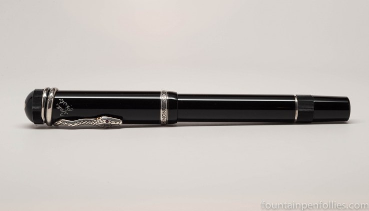
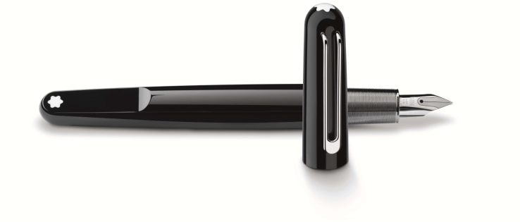
I think it looks great.  It does seem small, though.  I liked the snowcap on the flattened end of the body — it’s a fresh take on the traditional design elements.  I like the unusual and interesting, but inviting, shape. The M is made of the same “precious resin” as Meisterstück pens, but it looks much more sleek and modern. The nib is small and fairly plain.  The cap has a magnetic closure, which made it easy to close.

Unfortunately, the M didn’t work for me in terms of feel in the hand. I thought the ridged metal section was comfortable to hold.  And the capped pen feels fairly lightweight.  But the M felt heavy when I uncapped it and held it in a writing position, which I found surprising at first.

It’s clearly because the section area has all the weight.  The section is metal, and the inner threads connecting the body and section are metal.  But everything else about the pen is light. Putting all the weight in the grip makes it feel like a much heavier pen when you’re writing with it.

For me, alas, the M isn’t a good fit, because I need a lightweight pen.  But if you do like writing with a heavy pen, the Montblanc M could be something to try.  It’s a pen that feels light when you carry it around, but writes with some heft.

——————

The photo is from Montblanc USA’s website, here.


Pen of the Day: Lamy 2000

DSC_7696

Lamy 2000 with fine nib. This pen is the definition of understated excellence for me.  I love everything about it, from its design to its writing performance, but I admit that it’s more of a workhorse than a show horse.  I know a lot of people think it looks dull.  And some don’t find it comfortable. But if I could only have ten pens, this would be one of them.

I really want to try one with an extra-fine nib, though.  Someday.  Maybe.

DSC_7709

This is filled with a new-to-me ink from KWZ called Dark Brown.  But Dark Brown looks black, doesn’t it?  And I surely love an ink that has something unexpected like that.  So I’m going to put a few quick thoughts about KWZ Dark Brown in a separate post.