
So yesterday I got a chance, finally, to play with the Montblanc M designed by Marc Newson. I really liked the design from photos, and am not in the least put off by a cartridge-only pen.
In person, it is smaller than I expected, and lighter, too, but also heavier, which I’ll try to explain.
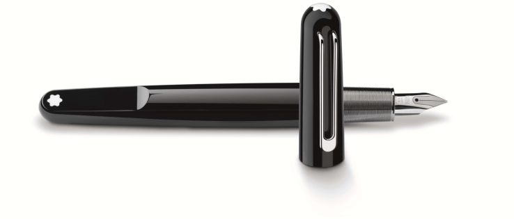
I think it looks great. It does seem small, though. I liked the snowcap on the flattened end of the body — it’s a fresh take on the traditional design elements. I like the unusual and interesting, but inviting, shape. The M is made of the same “precious resin” as Meisterstück pens, but it looks much more sleek and modern. The nib is small and fairly plain. The cap has a magnetic closure, which made it easy to close.
Unfortunately, the M didn’t work for me in terms of feel in the hand. I thought the ridged metal section was comfortable to hold. And the capped pen feels fairly lightweight. But the M felt heavy when I uncapped it and held it in a writing position, which I found surprising at first.
It’s clearly because the section area has all the weight. The section is metal, and the inner threads connecting the body and section are metal. But everything else about the pen is light. Putting all the weight in the grip makes it feel like a much heavier pen when you’re writing with it.
For me, alas, the M isn’t a good fit, because I need a lightweight pen. But if you do like writing with a heavy pen, the Montblanc M could be something to try. It’s a pen that feels light when you carry it around, but writes with some heft.
——————
The photo is from Montblanc USA’s website, here.

No pics☹️
LikeLike
Aw, thanks! I’m guessing it’s the designer. 🙂
LikeLike
It may well be! I just googled him, and I liked most of what I saw of his straight away, even though it’s not a style I like viscerally (I have to think or read about it before I do, if I do). Maybe that’s just what talent is, and he’s got it! I also liked some of his stated opinions about design, fashion and architecture. Thanks for the intro!
LikeLike
You know, I’m normally more immediately drawn to more traditional (read: pre-WW2) pen designs; for the modernist ones I admire the design prowess but I generally don’t get that feeling of actual fondness with them unless I’ve had them ‘explained’ by someone who does (ahem *Laura*). But I loved this one straightaway!
I don’t know if it’s your tutelage in modernist pen design that’s subtly changing my aesthetic or if this particular pen is just a crossover hit, but either way, it was a surprise!
LikeLiked by 1 person