
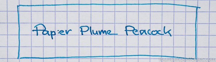
Such a cheerful color. I put Papier Plume Peacock (say that name with me — it’s fun) in a vintage Parker Vacumatic with medium nib. (I also did the same with a green ink and a green Vacumatic.) My thinking was, it’s a pretty pen and I haven’t used it for a while.
Long story short: big mistake. My Vacumatic is a sparkling pen, but it has a very wet-writing nib, as vintage Parker nibs often are. And Papier Plume Peacock is a wet-writing ink.
As a result, on poor paper, I got a lot of feathering. I’m not sure how much this is due to the ink, and how much is due to putting a wetter ink in a pen that’s already a firehose. I have to try Peacock in a dry writer, like a Lamy Safari, before figuring out how much it feathers in normal use. Unless a reader can chime in.
But this is how Peacock did in this super wet writing pen on Staples Sustainable Earth.
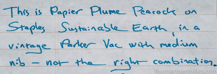
There’s feathering there — not the worst, but it’s not good. There was also showthrough. And Peacock wrote a wider line on the Staples and other more absorbent paper. So when used in this wet-writing pen, Papier Plume Peacock was better suited for fountain-pen friendly paper.
Like Rhodia.
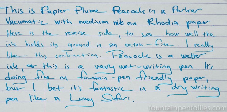
I flipped the nib over at one point to see if Papier Plume Peacock had enough heft for an extra-fine. It does.
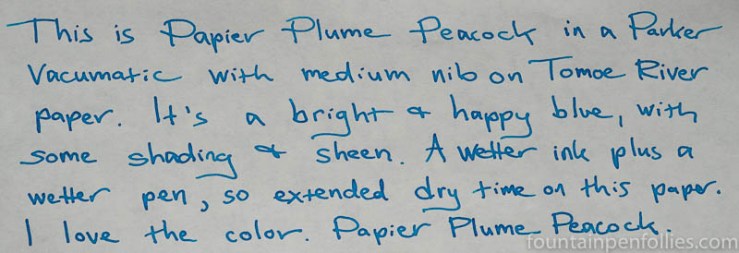
Here’s Peacock on cream-colored Tomoe River.
A closeup.
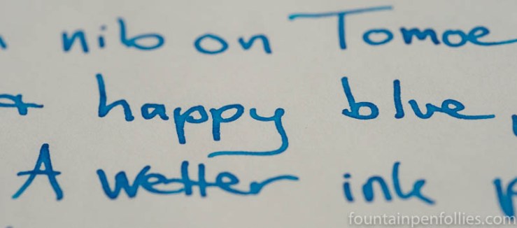
Like all the Papier Plume inks I’ve tried so far, Peacock has nice saturation and shading. And a really nice color. It’s happy but in a relaxed style. Not frenetic, not cloying, not “notice me” bright.
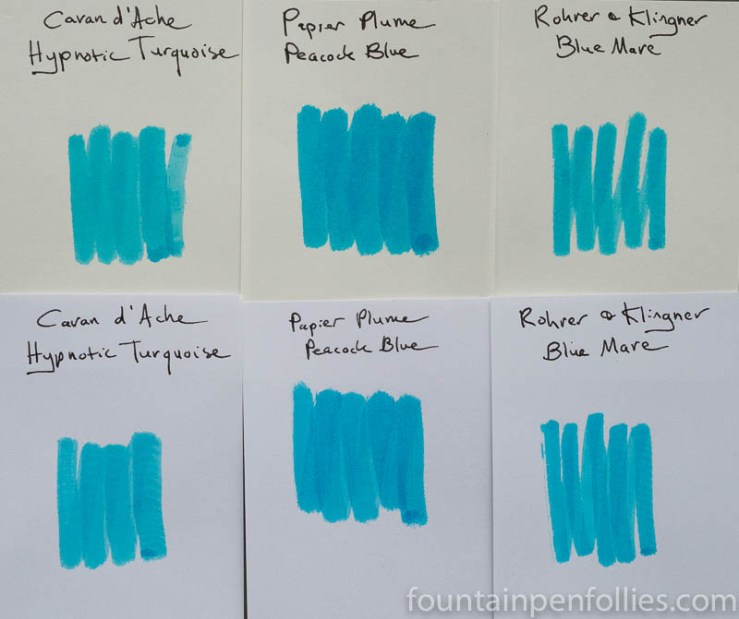
I think Peacock is most comparable in color to a blue-leaning turquoise. But it’s blessedly bluer than most turquoise inks.
Here are some comparison inks.
Papier Plume Peacock is an ink I like very much, and I hope I have enough left, after filling a pen for the Ink Testing Station, to try it in a drier-writing pen. It is a welcome hit of happy.
Ahem, the random limerick version: She went into a nice kind of shock, when using Papier Plume Peacock. She wanted to share with the flock, but does hope for some remaining stock.

“Then I saw her face (doo doo, doo doo), Now I’m a penabler”.
Another great ink and another great review. The limerick might need a bit of work though:)
The nice lady from Fountain Pen Follies,
Was fed up with grey skies and brollies,
But a new peacock ink,
Brought her back from the brink,
And her posts remind us what LOL is.
LikeLike
See that’s actual talent! 👍🏻
LikeLiked by 1 person
You just now figured that out? 🙂
LikeLiked by 1 person
I guess so! 😂
LikeLike
I love turquoise inks. I like blue leaning turquoise, and green leaning ones too. It is a cheerful color, and I have a turquoise in one of my pens right now. Most sample sizes don’t give you quite enough to test adequately if you like them, but aren’t quite sure. I like to try in at least two pens, or three. Some inks you know right off the bat aren’t going to work for you on the color. One of the first 3 inks I ever bought was J. Herbin-Bleu Pervenche. It tends to have a little spread, but runs great in the finest of pens. I think it may have similar qualities to what you are describing. I have no shortage of turquoise around here…lol. I have never tried any Papier Plume inks. Because of this blog I have two 15ml bottles, and one 4ml sample on the way.
LikeLiked by 2 people
Whoa, I’m a Penabler now…. 🙂
LikeLike