

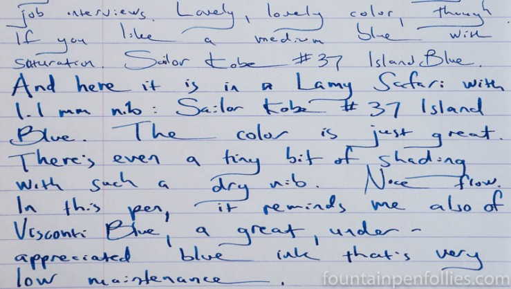
I’ve been using Sailor Kobe Island Blue for about a month, in two pens, a Kaweco AL-Sport with extra-fine nib, and a Lamy Safari with 1.1 mm stub. Island Blue looks a bit lighter and shades more from the drier Lamy Safari nib, shown above. With the wetter, fine Kaweco extra-fine nib, shading is suppressed and the color has the same hue, but looks darker. It’s nice in both guises.
Here is a writing sample on Rhodia.
And here it is on Tomoe River.

This is an ink that has some sheen, but not an exaggerated amount. Those who seek sheen will choose pens and paper to bring that out more; those who care less about sheen won’t be hit over the head or blinded. It’s an amendable ink.
While it’s a reasonably saturated ink, and is somewhat lubricated, it’s not super wet or super saturated. It seems average in wetness. Dry time is slightly longer than average on coated papers like Clairefontaine or Tomoe River, but not crazy long, at least in the pens I used. If you leave your pens for a week without using them, the ink will dry out in the feed and hesitate at startup until you dip the nib in water. In normal use, it flows just fine.
It is easy-going, and not dramatic in its behavior. No highs or lows. I like that.
And I like that it behaves well on poor paper. Here is Island Blue on my everyday Staples Sustainable Earth.

Feathering was always under control, no matter the paper. There was no bleedthrough on the Sustainable Earth, and only the faintest showthrough. Part of what makes Island Blue a good everyday ink is how it behaves on a wide range of paper. Again: amenable.
I was a little worried about cleanup, because this ink really stains your hands if you accidentally leave a drop on the section, which tends to happen to me with Kaweco AL-Sports. However, cleanup was easy. Even after a month of use, Island Blue cleaned out of my pens with just plain water.
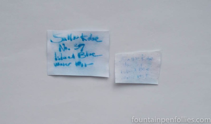
Kobe Island Blue isn’t the ink for lifeguards. It has some water resistance on absorbent regular paper, but much less on fountain pen-friendly paper like Rhodia.
Where Island Blue stands out, really, is the hue. It’s just slightly different than, say, Waterman Blue. It’s easy on the eyes and not overly bright, so your reader’s attention will be on the words rather than the ink. Yet the color has more pop and cheeriness than most standard blue inks. It’s also more saturated.
It’s kind of a stealth blue, in the sense that it is just slightly different enough to set your writing apart, without anyone catching on to that.
If you do want a “notice me” ink, and many people do, Kobe Island may not be the best choice available. Parker Penman Sapphire (the late and beloved ink) is more stunning. The very-much-alive Diamine Blue Velvet is brighter and more showy. Even a bright turquoise would be.
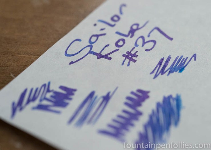
Here are some swab comparisons.

Swabs are useful is comparing the hues, and you can see that all these inks are very similar. What swabs don’t show is the brightness on the page, and how the inks respond to different pens. Visconti Blue and Sailor Kobe Island Blue are the ones I’d recommend for everyday. Blue Velvet is very bright and perhaps better for editing or for briefer notes than for long blocks of text.
Just for fun, here is a quick comparison of Island Blue with Parker Penman Sapphire, because I happened to have a few writing samples of the Parker Penman Sapphire in my files. Here on Rhodia, with wider nibs.

And here is another, on Tomoe River, with narrow nibs.
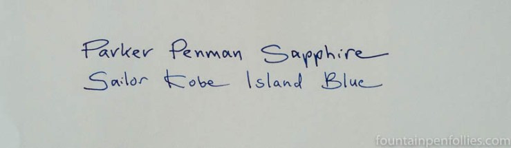
I should mention sheen again. If you go to a few posts about Parker Penman Sapphire, like the one linked above or the one here, you’ll see the extreme (and extremely beautiful sheen) of Parker Penman Sapphire. Sailor Kobe Island Blue does not approach that. Nothing does, in my mind: I don’t think there’s a doppelgänger for Parker Penman Sapphire.
Here’s one more swab comparison, just to compare Island Blue to three current Japanese inks.
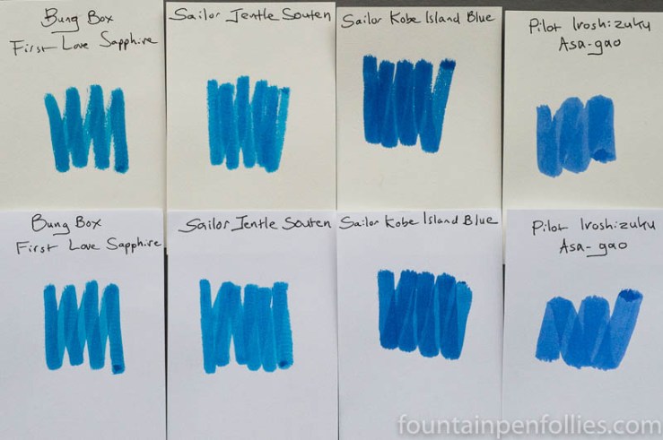
I’ve reviewed Bung Box First Love Sapphire here. It is very nice, but very expensive. Sailor Jentle Souten, which I have photographed here, is one of Sailor’s current inks, and I like it very much. However, Souten is not as dark as Island Blue, as is obvious from the swabs. Pilot Iroshizuku Asa-Gao is a premium standard blue, and I used to own it. Asa-Gao is closer in hue to Waterman Serenity Blue than to Island Blue.
As for Island Blue, you can usually buy Kobe inks on Rakuten or eBay, and I think this one sells on eBay for $25 for a 50 ml bottle.
Here is paper towel chromatography of Sailor Kobe Island Blue.
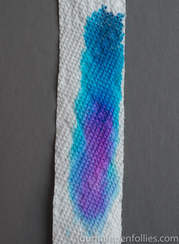
I’m not surprised by the violet tint in Island Blue. That explains its vivacity and the fact that once on your fingers, this ink doesn’t scrub off. However, I can assure you — as a person who can’t abide any blue that looks too purple — that Island Blue never looks like a purple blue. I would hate that. Island Blue looks like a regular blue. Just better.
I really did like Sailor Kobe Island Blue. I like that it’s an everyday blue with more pop, but not too much pop. In fact Visconti Blue is another blue along the same lines, which I don’t use as much as I should. Island Blue has very good behavior, too.

Thanks for a fine review! I particularly liked to comparison inks.
I realise I am a few years after the original review, but just to add my “pennyworth”, the Minatojima Island Blue is, IMHO, one of the finest blues around- with that subtle shading that gives the writing on the page real depth. My other “essential blues” are Sailor Kobe 14 Maya Lapis and Iroshizuku Asa-Gao: all are deep, strong blue with wonderful ‘lift’…
LikeLiked by 1 person
Have you tried KWZ Chicago Blue our pen show blue? That’s good, too!
LikeLike
Yes, that is just too far for me to go. If I could, I would. What’s this about OUR 300 Ink Sample Array? Wow, that would be awesome to see in itself.
LikeLiked by 1 person
At the Chicago Pen Show, we have a free ink testing station, with 300 pens filled with ink.
LikeLike
Wow, that is really cool. I would have a field day doing that for sure! Something tells me my wish list would grow by leaps and bounds too!
LikeLike
Excellent review! It looks like a really nice ink to have. I love seeing comparisons too. I have never tried Visconti Blue. (or Aurora-Blue for that matter) I will eventually sample these colors mentioned. (except Parker Penman Sapphire-can’t afford that one, or the Bung Box ink)
LikeLiked by 2 people
Come see me at the Chicago Pen Show in three short months, and I will personally give you samples of PPS, Aurora Blue and Visconti Blue. I know, it’s a little out of your way, but you never know. 🙂
This does give me the idea to maybe donate some of my PPS to our 300-ink-sample array at the show, so more people can try it. Though maybe people would prefer all current inks.
LikeLiked by 1 person
As to your last comment: it is *really* an unusual phenomenon that was witnessed at the SF show. There are those that really appreciate the addition of “unobtainium” inks, and relish the chance to try them, see them in use in person, and have a sample of it in their notebooks; there are also those that became somewhat unhinged when they found out that this really cool ink THAT THEY JUST USED RIGHT OVER THERE couldn’t be purchased at the show, or pretty much anywhere else. It kind of falls into the “this is why we can’t have nice things” category.
I mean, I think it’s a great idea to include these, but just be aware of an occasional negative reaction. You can always show them the door… 🙂
LikeLiked by 1 person
This was my first try with a Sailor Kobe ink, and I really like it. I appreciate how thoroughly you explain what it is like. I knew I liked it, but now I understand much better why that is.
LikeLiked by 2 people
Thank you very much for this comment. It really made my day. 🙂
LikeLike
I missed that one, but now will have another object of desire …
LikeLiked by 2 people