

With Yuki-Akari, what you see is exactly what you get, in color and behavior. It’s an unsaturated light blue, very light in color and close to turquoise. I’ve been using it in a Kaweco Sport with double-broad nib and a Pelikan M600 with extra-fine and broad nibs.
Yuki-Akari is part of latest batch of Sailor Jentle Four Seasons inks, and like a lot of the other Four Seasons inks, Yuki-Akari looks especially nice on cream-colored Tomoe River paper. Compare Yuki-Akari on white Rhodia, above, with it on Tomoe River, below.

Here is a writing sample of Yuki-Akari on Tomoe River, first with the Kaweco double-broad and second with the Pelikan M600 with extra-fine nib.

In terms of ink flow, Yuki-Akari seems well-lubricated, and flowed perfectly in both pens; it’s not a gusher, but it seems to flow on the wetter side. Still, the extra-fine nib wrote a nice narrow line.
Ink dry time depended entirely on nib width: the Kaweco double-broad nib and the Pelikan broad nib both put down a lot of ink, and dry time was long; whereas with the Pelikan extra-fine nib, Yuki-Akari dried quickly.
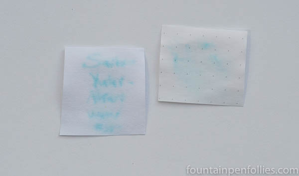
Here is a writing sample on Rhodia.

Yuki-Akari’s color is cheerful and attractive at both extremes — double-broad or extra-fine. It shades nicely. But Yuki-Akari is darker and easier to read with broader nibs, especially on fountain-pen friendly paper.
On regular paper — either copy paper or my everyday Staples Sustainable Earth paper — more ink absorbs into the paper. So Yuki-Akari is easier to read with the extra-fine nib on lower-quality paper than higher-quality paper.

Yuki-Akari showed good resistance to feathering on regular paper. I do get significant showthrough on Sustainable Earth with either the double-broad or broad nibs, but only mild showthrough with the extra-fine nib.
Yuki-Akari has almost no water resistance. But it cleans out of a pen very easily.
In terms of color, it’s a pure blue, but so light that it resembles some turquoise inks. It’s very close to Diamine Turquoise, in fact. But many turquoise inks have a touch of green, and many are darker than Yuki-Akari. Here are two turquoise inks, to compare.

Yuki-Akari is so light that I wanted to compare it to Bung Box Fujiyama Blue and J. Herbin Bleu Azur, two light blue inks I’ve reviewed previously.

Yuki-Akari is brighter than both Fujiyama Blue and Bleu Azur. And I think it’s the most legible of the trio.
Yuki-Akari really can be compared to any pure blue that is lighter than a standard, medium blue, and there are a lot of those. Here is a random selection.

Of these, Yuki-Akari is closest to Seitz-Kreuznach Arctic Blue, another very light blue, almost turquoise, ink. I have photos of Arctic Blue here, if you want to compare the two. Arctic Blue is much less expensive than Sailor Yuki-Akari, though Yuki-Akari has better ink flow for me.
Here is paper towel chromatography of Yuki-Akari.

And here is paper towel chromatography of, from left to right, Bung Box Fujiyama Blue, Yuki-Akari and Seitz-Kreuznach Arctic Blue.

The Bung Box ink, which is made by Sailor, appears to have the same, or a very, similar dye mixture, but with a gray dye added. The Seitz-Kreuznach ink seems to have a very similar dye mixture as Yuki-Akari.
Yuki-Akari is a nice bright light blue or turquoise. Admittedly, I like unsaturated inks more than almost anyone, but even for me Yuki-Akari wasn’t ideal with the Pelikan extra-fine nib. Well, behavior was great, but the color very light. So I swapped a broad nib into the Pelikan, and I am back to being delighted with Yuki-Akari.

What a shame it is too light. I am trying to stay away from inks that fall under that category. It is a lovely color though, in a large nib.
LikeLiked by 1 person
Aaargh. It’s the color I hate 🙂
LikeLiked by 1 person
My problem is, I don’t feel that way nearly enough. 🙂 Purple is the closest to a color I just don’t love, but then I’ll try a particular purple ink, and I’ll think, you know, this really isn’t so bad…. It leads to too many inks. 🙂
LikeLike