

Starting this month, Sailor will be releasing an additional eight inks worldwide as part of its Four Seasons lineup. Just like with Rikyu-Cha, I couldn’t wait for Kin-Mokusei, so I bought a bottle from Japan this summer, and have been using it since.
I initially tried Sailor Kin-Mokusei in both a modern Parker Duofold with a medium stub and in a Sailor Professional Gear with fine nib. Flow and behavior were good with both pens, and dry time was unremarkable. But even though Kin-Mokusei is a Sailor ink, it makes a poor match for a Sailor fine nib. Kin-Mokusei is just too light, and too bright, to be legible from such a narrow nib on all papers.
Here is a writing sample on Rhodia, with the Sailor fine second.
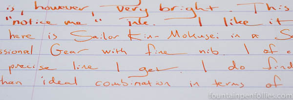
That photo is limited to two dimensions, so it can’t adequately convey the glare transmitted under bright artificial light by Kin-Mokusei from the narrow line written by a Sailor fine nib on bright fountain-pen friendly papers like Rhodia or Clairefontaine. It’s not a good combination if you want to write words with your ultra-fine nib that you want people to be able to read.
But I adored Kin-Mokusei from the medium nib.

Kin-Mokusei’s brightness grabs attention, in a nice way, but what makes Kin-Mokusei so special is that the brightness is layered over a yellow base that makes the ink subtler than you’d imagine.

It’s luscious. The yellow tint that doesn’t tone down Kin-Mokusei, exactly, but it does bring a burnish and a subtlety. It saves the orange from reaching eye-searing levels of brightness. It looks natural.
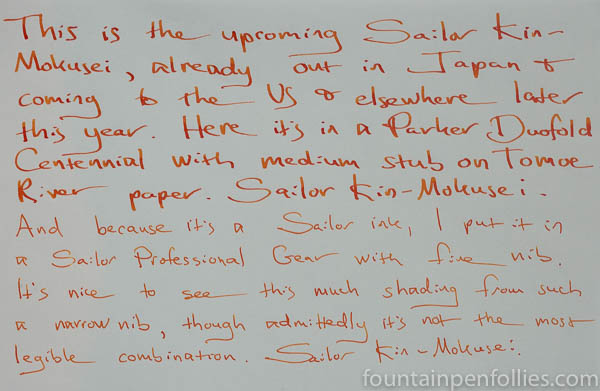
The shading is beautiful but never garish.

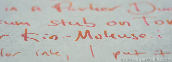
Sheen fans will be able to do something with this, too.
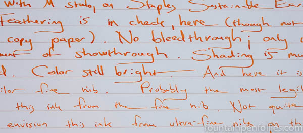
In terms of behavior, Kin-Mokusei does feather some on poor copy paper, but I found it absolutely usable on Staples Sustainable Earth. In fact, the absorbency of Sustainable Earth made that just about the only paper that allowed me to comfortably read Kin-Mokusei from the Sailor fine nib.
Sailor Kin-Mokusei cleaned up very easily from both pens. It has practically no water resistance — none on Rhodia (which is true for many inks), but not so much even on absorbent regular paper. If you work poolside, use a different ink.

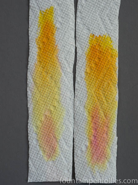
Here is paper towel chromatography. As was obvious from the writing samples, there is a lot of yellow in this orange ink.

For comparison inks, as one would expect, Kin-Mokusei is very close to the no-longer available Sailor Jentle Apricot. Here are the two inks together.

And here is chromatography, with Apricot on the left and Kin-Mokusei on the right.
Apricot and Kin-Mokusei are not identical, I don’t think, but they sure seem to use the same dyes in very similar combination. Nearly identical? Oh yes; they are close enough for me, and I would never need to own both. If you have been longing for Apricot, I heartily recommend you just wait for Kin-Mokusei. It’s cheaper, and you’ll get a newer, fresher ink. And more pop (aka, more of that pink dye that darkens it just a tad).
Here is a comparison of Kin-Mokusei with some other orange inks.
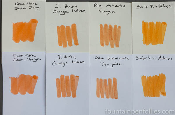
Kin-Mokusei is the brightest, but also the lightest. Most interesting to me as a comparison here is Caran d’Ache Electric Orange, which is actually a bright ink, too, but much less yellow. And of course, all these less-yellow orange inks are legible from a fine nib.
I’m not so upset that the yellow tint of Kin-Mokusei makes it a no-go for a very fine nib. Since it’s that yellow tint is also responsible for the lovely color In fact, Kin-Mokusei is so special in any not-narrow nib that it’s an orange ink I can’t pass up. And for me that’s a very short list.

Such a lovely color, it is to bad it doesn’t work well in finer nibs since that is my nib of choice. I do, however, think it would be lovely for flex writing so I will be picking up some to give it a try. Your reviews really help me get a feel for an ink and if it will work for me. Thanks for sharing with us.
LikeLiked by 1 person
I think that ink is gorgeous. Thanks for the great review.
LikeLiked by 1 person
Great review! It looks like a fun and lovely ink! I missed the boat on Apricot, so I will pick up a bottle of this. If it’s not identical, it looks pretty darn close. 🙂 I normally love Yu Yake, but compared to this one, it looks rather dull LOL! Will you be reviewing the other colours from the lineup? I’ve got to get a bottle of the Sakura and compare it to Jentle Peche. I pretty much want all of the colours hahha
LikeLiked by 1 person
The only other one I bought early was Irori, and I will review that soon. (It was a lot more expensive to buy from Japan, so I only could spring for three.) Sakura is on my list to purchase, and the light blue is a maybe.
I remember you love Peche! It was a beautiful shade of pink, but is it terrible to say that I’m hoping the Sakura is just a smidge darker? 🙂
LikeLike
I really enjoy your “posts.” Have you done a “review” of Sailor Jentte Four Seasons Irori? I am considering it now and would like to have your opinion.
LikeLiked by 1 person
Thank you. Irori is next in line. I’m aiming for this week. In short, it’s a very cheery ink, a red that sometimes looks like it has a pink or orange tint. (I have yet to do a chroma to be sure.) Irori has next to no shading, so it’s very legible, even from that Sailor fine nib. Fun color, a little wild.
LikeLike