

I’ve been using KWZ Red #1 in a Pelikan M600 with fine nib, and in a Lamy Safari with both 1.1 mm stub and extra-fine nibs. It started up and flowed perfectly for me with each combination.
KWZ Red #1 seems neither wet nor dry: it worked equally well with the wettest and driest pens. The line it wrote seemed nicely tight, but not stingy or scratchy. Dry time for KWZ Red #1 was average on coated paper like Rhodia. It shades, but not a dramatic amount.
I found the color stunning in both of the wetter pens I used, the Pelikan with fine nib and the Lamy Safari with 1.1 mm stub. Here it is on Rhodia, first with the Pelikan and next with the Lamy stub.

I do feel that KWZ Red #1 shouldn’t be wasted on a dry pen: in the Lamy Safari with extra-fine nib, KWZ Red #1 flowed and started perfectly, but it looked less vibrant and interesting to me in a pen that is so stingy with ink flow.

To get a fuller idea of the color of KWZ Red #1, here is more of it on Rhodia: first the Pelikan with fine nib, then the Lamy Safari with 1.1 mm stub, then the Lamy Safari with extra-fine nib.

And here is KWZ Red #1 on Tomoe River paper. This shows a little writing from each of the three pens, with the Lamy extra-fine just in the bottom corner.
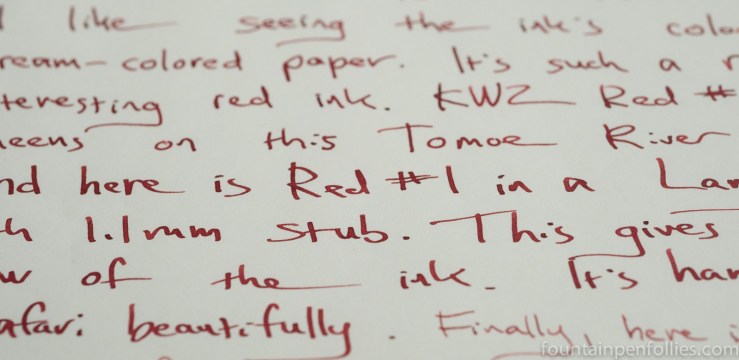
I think KWZ Red #1 has sheen potential, at least on Tomoe River paper.
On lower quality paper, KWZ Red #1 did very well. There was some feathering on my “everything feathers” paper, but it resisted feathering well enough on Staples Sustainable Earth to be usable even with the 1.1 mm stub. I got neither showthrough nor bleedthrough on Sustainable Earth.

KWZ Red #1 cleaned up very easily from my pens, too, which was fantastic for a saturated dark red.
There was some water resistance as well, though not much on coated Rhodia dot paper.

I think the best feature of KWZ Red #1 is its gorgeous color. I find it hard to pin it down. It’s a natural-looking red, but deep. I’ve said before that it reminds me of cranberries, and that’s still my closest analogy. I think it reminds me of the lustre of the berry, as much as the hue.
But to try to fix the color a little better, I’m going to show a few comparisons.
KWZ Red #1 is redder than KWZ Cherry, which is pinker and lighter, and it’s redder than KWZ Maroon and Maroon #2, which are more burgundy.
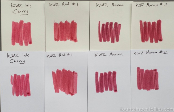
For a fuller look, reviews can be found here for KWZ Cherry, here for KWZ Maroon and here for KWZ Maroon #2.
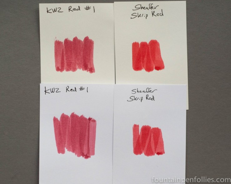
But KWZ Red #1 is deeper and more burgundy than a standard red ink. Here it is compared to Sheaffer Skrip Red.
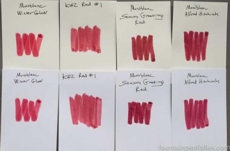
The hue differs, but the richness and feeling of KWZ Red #1 reminds me of a few of Montblanc’s past limited edition inks.
Paper towel chromatography of Red #1 shows a fascinating mixture.
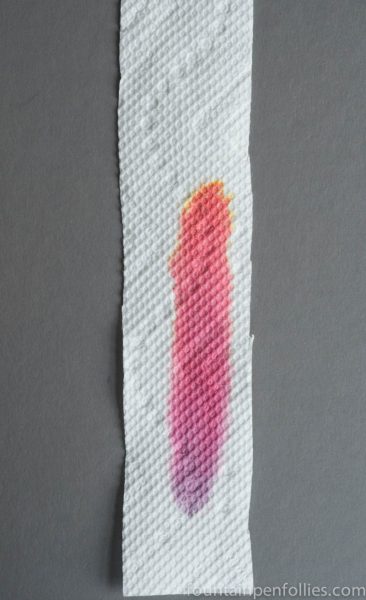
I feel that this chromatography may show better than words what is special about KWZ Red #1’s color. It’s red, but complex. It really does have the blush of pink that makes it seem close to KWZ Cherry. And it has the deeper, bluer underlayer that approaches a burgundy like KWZ Maroon and Maroon #2.
I just love interesting and unusual red inks, and KWZ Red #1 is one of the most interesting reds I have tried in ages. It has all the advantages of a more saturated red ink, but it was very easy to for me to clean out of my pens, and it behaved very well for me. The only caution I could mention is the slight feathering I saw on the cheapest copy paper.
I received a sample of Red #1 from KWZ Ink so I could review it. KWZ Ink is available online from at least one US store and also directly from KWZ in Poland.

Look at that, purple AND yellow dyes in the same ink! Fascinating 🙂
LikeLiked by 1 person
One of my absolute favourite ink colours ever !! I use it for calligraphy and note taking
LikeLiked by 1 person