
KWZ Foggy Green. This is a beautiful evergreen ink that behaves incredibly well for such a dark ink.
(click Page 2 below to continue)


Edison Hakumin Urushi Mina with extra-fine nib. This is a custom urushi pen from Brian Gray at Edison Pens and Ernest Shin at Hakumin Urushi Kobo. I am very lucky.
The pen is just gorgeous. The finish is Ki-tamenuri, which has a brown finishing coat and a yellow under-layer, which is easiest to see on the section threads.

The wonderful nib was customized as well. Brian sent it off to Mike Masuyama to be ground extra-fine. I asked for the equivalent of a Sailor fine.
KWZ Maroon is the ink. Also wonderful.
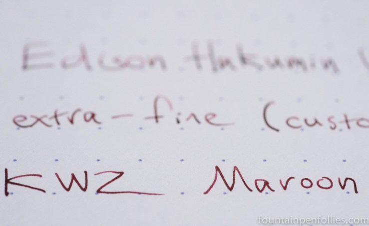

Happy Martin Luther King Jr. Day to everyone. It is going to be another inky week here. I’ve started using two new-to-me KWZ inks, Maroon and Iron Gall Blue #2. Every time I use Maroon, which is a lot, I’m saying, “wow.”
I do think Dark Brown looks slightly more brown with that 1.5 mm stub up there.
I’m also hoping to do a post about my Montblanc Agatha Christie this week. A few people have asked, so sure. I’ll probably just say “wow” a lot. I think it’s my most excellent pen. I mean, of course it is: it has a snake clip.
Otherwise, it’s been like eleventy below zero here for a few days. So I’m saying “brrr” a lot, too.
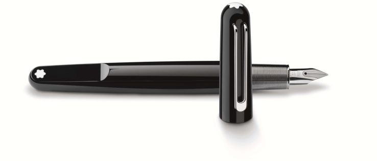
So yesterday I got a chance, finally, to play with the Montblanc M designed by Marc Newson. I really liked the design from photos, and am not in the least put off by a cartridge-only pen.
In person, it is smaller than I expected, and lighter, too, but also heavier, which I’ll try to explain.
I think it looks great. It does seem small, though. I liked the snowcap on the flattened end of the body — it’s a fresh take on the traditional design elements. I like the unusual and interesting, but inviting, shape. The M is made of the same “precious resin” as Meisterstück pens, but it looks much more sleek and modern. The nib is small and fairly plain. The cap has a magnetic closure, which made it easy to close.
Unfortunately, the M didn’t work for me in terms of feel in the hand. I thought the ridged metal section was comfortable to hold. And the capped pen feels fairly lightweight. But the M felt heavy when I uncapped it and held it in a writing position, which I found surprising at first.
It’s clearly because the section area has all the weight. The section is metal, and the inner threads connecting the body and section are metal. But everything else about the pen is light. Putting all the weight in the grip makes it feel like a much heavier pen when you’re writing with it.
For me, alas, the M isn’t a good fit, because I need a lightweight pen. But if you do like writing with a heavy pen, the Montblanc M could be something to try. It’s a pen that feels light when you carry it around, but writes with some heft.
——————
The photo is from Montblanc USA’s website, here.

Lamy 2000 with fine nib. This pen is the definition of understated excellence for me. I love everything about it, from its design to its writing performance, but I admit that it’s more of a workhorse than a show horse. I know a lot of people think it looks dull. And some don’t find it comfortable. But if I could only have ten pens, this would be one of them.
I really want to try one with an extra-fine nib, though. Someday. Maybe.

This is filled with a new-to-me ink from KWZ called Dark Brown. But Dark Brown looks black, doesn’t it? And I surely love an ink that has something unexpected like that. So I’m going to put a few quick thoughts about KWZ Dark Brown in a separate post.

Since January is at its coldest and bleakest just now, I am trying to jazz things up with garnet ink, in honor of the January birth stone. It’s a little like inky jewelry. Except so much more frugal.
Last week was Pelikan Edelstein Garnet, a red orange that I thought added a little spice to the wintery weather. Alas, it’s a limited edition ink from 2014 and so not easily available.
So this week I’m trying a second garnet ink, Faber-Castell Garnet Red.
(click Page 2 below to continue)


