Pelikan M450 Tortoise with fine nib. This beautiful pen is my favorite of the modern Pelikan tortoises. The binde is translucent and leans green rather than brown or honey. Cap and piston knob are vermeil.
(click Page 2 below to continue)


Pelikan M101N Lizard with medium nib. This pen is a special edition that I think doesn’t get enough attention. It has two tortoise brethren, which are also quite nice. But this is the one for me. I mean, lizard! And a sleek black. And a few sparkly bits in the binde.
Always remember that I am a complete sucker for “ooh shiny.”

It’s a gorgeous design, a modern updating of the 101N brown lizard models from the 1930s. Look at the beautiful curves of the clip, and the Pelikan Germany engraving on the cap top — those and other details quote the original 101N.
The original models were all quite small, compared to most modern pens, and the M101N Lizard is as well. That’s the only thing that I would mention as a caution, though the pen can be used posted. The nib is wonderful and has a bit of softness, unlike most modern Pelikan nibs.
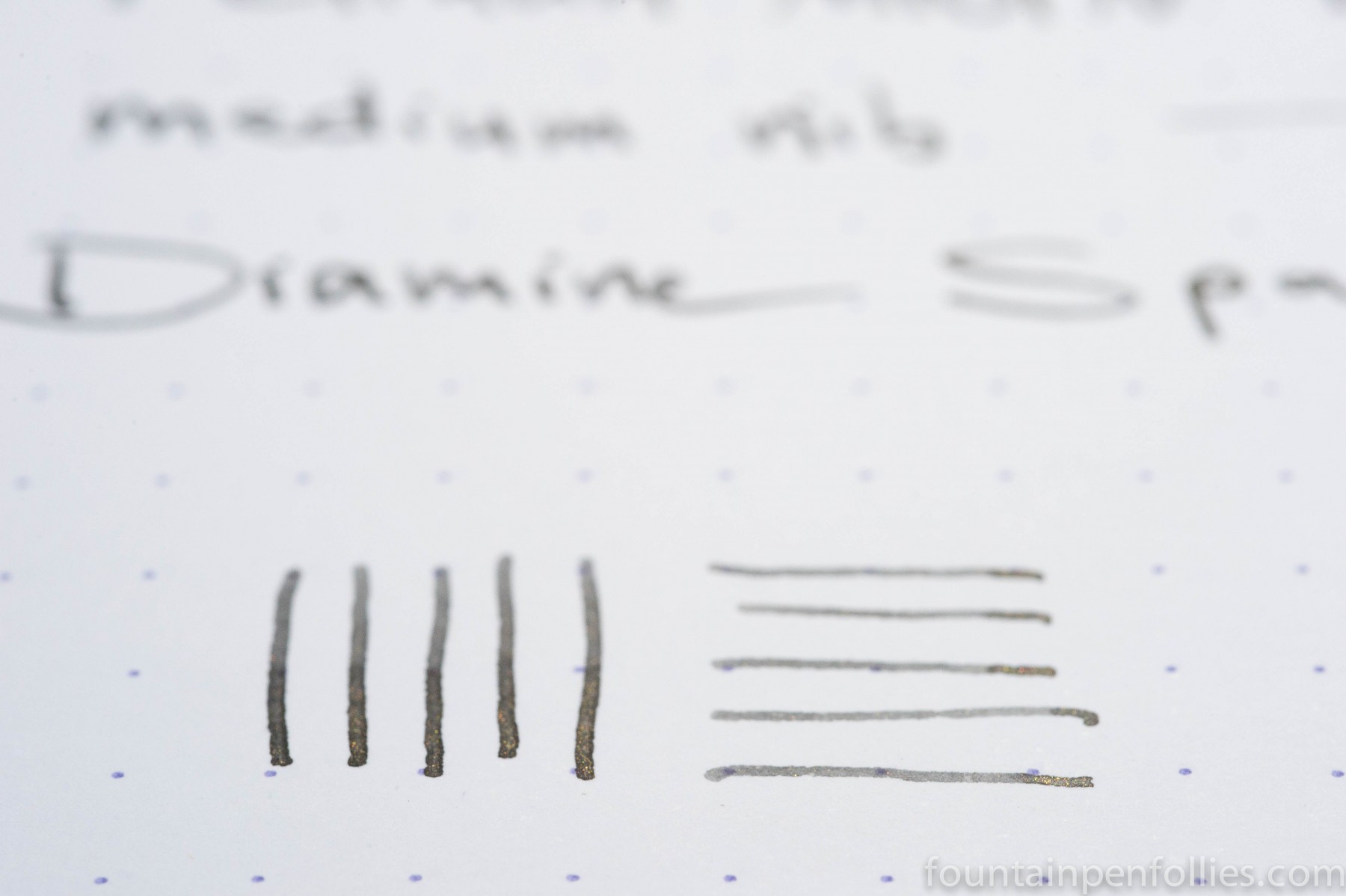
The ink is Diamine Shimmering Shadows. As my friend said, I’m sort of cheating with this Pen of the Day: I used it last week and have kept it inked. But can you blame me? Fantastic pen, fantastic ink. Plus, ooh, shiny.
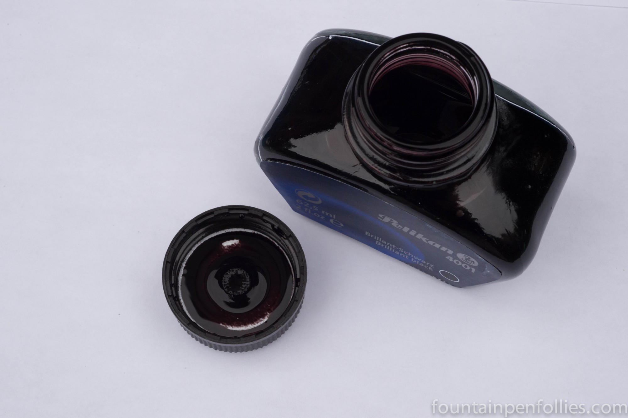
Pelikan Brilliant Black. A standard black ink that is a good bet if you have a wet writing pen or have to use poor quality paper. It has the nice quality of writing with a narrow line, which keeps your fine lines fine. It’s dependable, reasonably priced and has very decent water resistance. But it’s also a dry ink, so with a dry pen it can look gray.
An everyday ink? Absolutely, especially with wet pens or challenging paper.

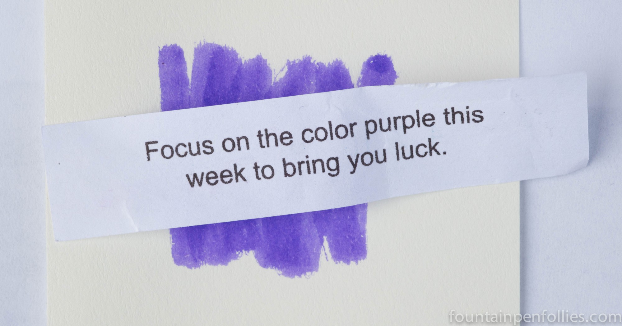
American football kicked off its season this week, just in time to inspire this post. Since the NFL has traditionally played its games on Sunday, we call post-game insights and criticisms “Monday morning quarterbacking.” After all, hindsight is always 20/20. But that can be helpful, too. So maybe it will be useful to look back at my pens and inks last week with a little hindsight.
1. Luckiest guess. Putting Diamine’s Shimmertastic Brandy Dazzle into a Pelikan Ibis with broad nib. The vintage Pelikan has a lot of ink flow, and the nib has a bit of flex, and both those characteristics really showed what Brandy Dazzle could do.
2. Luckiest break. I am very lucky to have a great friend who sent me six Shimmertastic ink samples to play with. They were all such fun.
3. Undeserved criticism award. Diamine took a lot of internet heat for putting the name “Shimmertastic” on its forthcoming ink line. And, yes, “Shimmer” would have been fine. But the truth is, after you use the word “Shimmertastic” a few times, you kind of forget that it sounds silly and just go with it. Heck, the inks do shimmer. And they are sort of fantastic. The power of suggestion worked for me here.
4. Deserved criticism award. Pelikan took a lot of internet heat for its M600 Pink Pelikan box design. And maybe Pelikan should have listened. Though it turns out I liked untying the bow, I think just a bow would have been quite enough to set the box apart. The corset lace design felt a little “ick” to me. And even if you like it, it does seem out-of-step with what is actually a fairly classy and professional pen.
5. Unluckiest break. In 2005, the Chicago Bears had the fourth pick in the NFL draft, which they wasted on a running back whose ignominious Bears career would be over by 2008. Among the players the Bears passed over was Aaron Rodgers, the quarterback of my beloved University of California Golden Bears. Worse, Rodgers was drafted by none other than the Green Bay Packers, arch-rivals of the Bears. Rodgers has gone on to become probably the best quarterback in football, a fact that he demonstrates to Chicago fans twice a year by stomping on our Bears. As he did once again yesterday. Sigh.

I usually wait to see a pen in person, or at least in photos taken in person, before ordering one. Publicity photos aren’t always accurate about a pen’s color. But the Pelikan M600 Pink was an exception. I pre-ordered it without knowing the specific shade of pink it would be. Because I realized that whatever pink it would be, I’d still buy it. It’s pink Pelikan!
But for everyone else, here are those photos.
(click Page 2 below to continue)
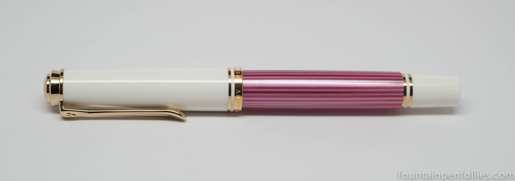
I couldn’t wait to share a quick look at my Pink Pelikan, the new M600. In person, the color is more raspberry than hot pink. I know some people are having fits over a pink Pelikan. But this is not very wild, for a pink. It’s dignified, actually.
The binde is blend of light and dark pink stripes. It is not translucent. It shimmers. You cannot easily see the ink level.

I want to thank the nice people at Iguana Sell, from whom I bought this. They outdid themselves with great service and great communication, not to mention very fast delivery, all at a great price.
![]()
This is the Pelikan Souverän M600 that Pelikan will be releasing next month. It’s pink. Two things I love are Pelikan fountain pens and pink.
Still, I have some other great Pelikans. So I don’t actually need it. I was trying to be sensible.
And then I saw this.

No more being sensible. Wild pink stripes?! Of course I need it.
And I know there’s a lot of “yuck” feeling about this color scheme, and some of the early marketing. As there should be. This one is definitely love it or hate it.
What I love most is that there’s only one more month to wait for it.
__________________
Photos of the pen are from this blog post by the very nice people at Iguana Sell, who have kindly given me permission to share the photos.
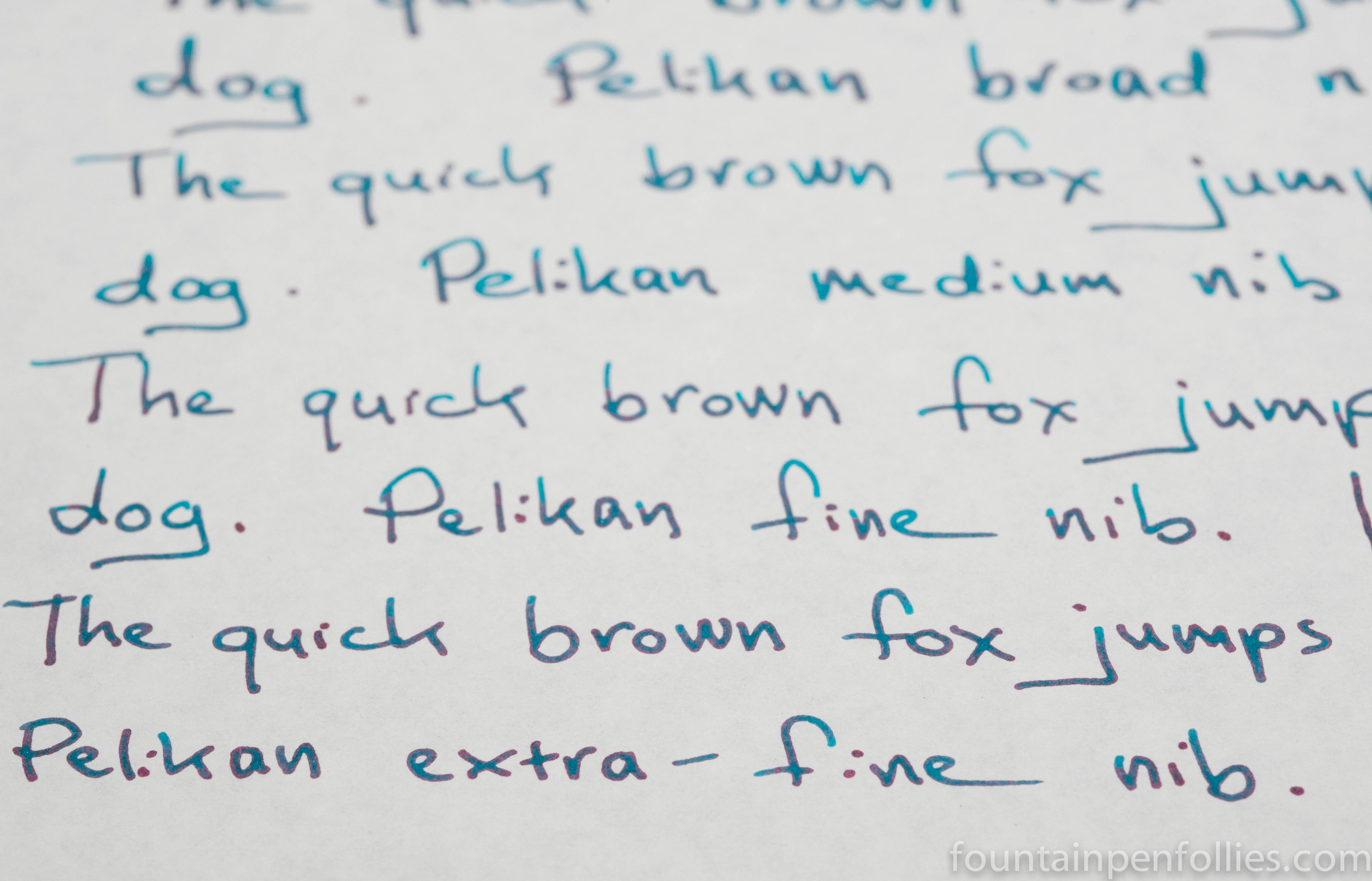
I have been playing with my sample of the new Emerald of Chivor. I had already pored over a great review, and I had even seen a writing sample in person, so I knew it looked spectacular. But writing with it has confirmed that this is really an awesome ink. As you can see in the photo above, the sheen and shimmer come through even with fine and extra-fine nibs.
(click Page 2 below to continue)