

When the Pink Pelikan arrives, it’s in a plain white sleeve, but under the sleeve is this box. So. Well. But at least it’s different. And I don’t do much more than open any box and then put it away. Really quickly, in this case.
But then my second thought was “Oh, no, they aren’t going to make me actually unlace this thing, are they?”

Luckily, no!. It turns out that only the bow needed to be untied. And that is actually kind of nice, like opening a present. Which means the box turned out to be fine. Because inside was the present.

My first impression of the Pink M600 was that it was darker than the photos had made it look. As I’ve said, unlike probably everyone else, I actually was hoping for a wild and crazy hot pink. The wilder the better, for me. Taste, schmaste.
But in real life, Pelikan made a Pelikan Pink. This isn’t really wild or crazy. It’s not hot pink. It’s more like raspberry. It’s a little more subdued, classy and even more business-like than a hot pink Pelikan would have been. And it’s nice!
Here is the Pink Pelikan with two common pink pens, the Lamy Safari in pink, which is a fun hot pink, and the Lamy Al-Star in a metallic color that Lamy calls raspberry. The pink Pelikan is closer to the Al-Star — it has that same grown-up feeling, and actually a similar shimmer. It is not cute and juvenile like the Safari in pink.
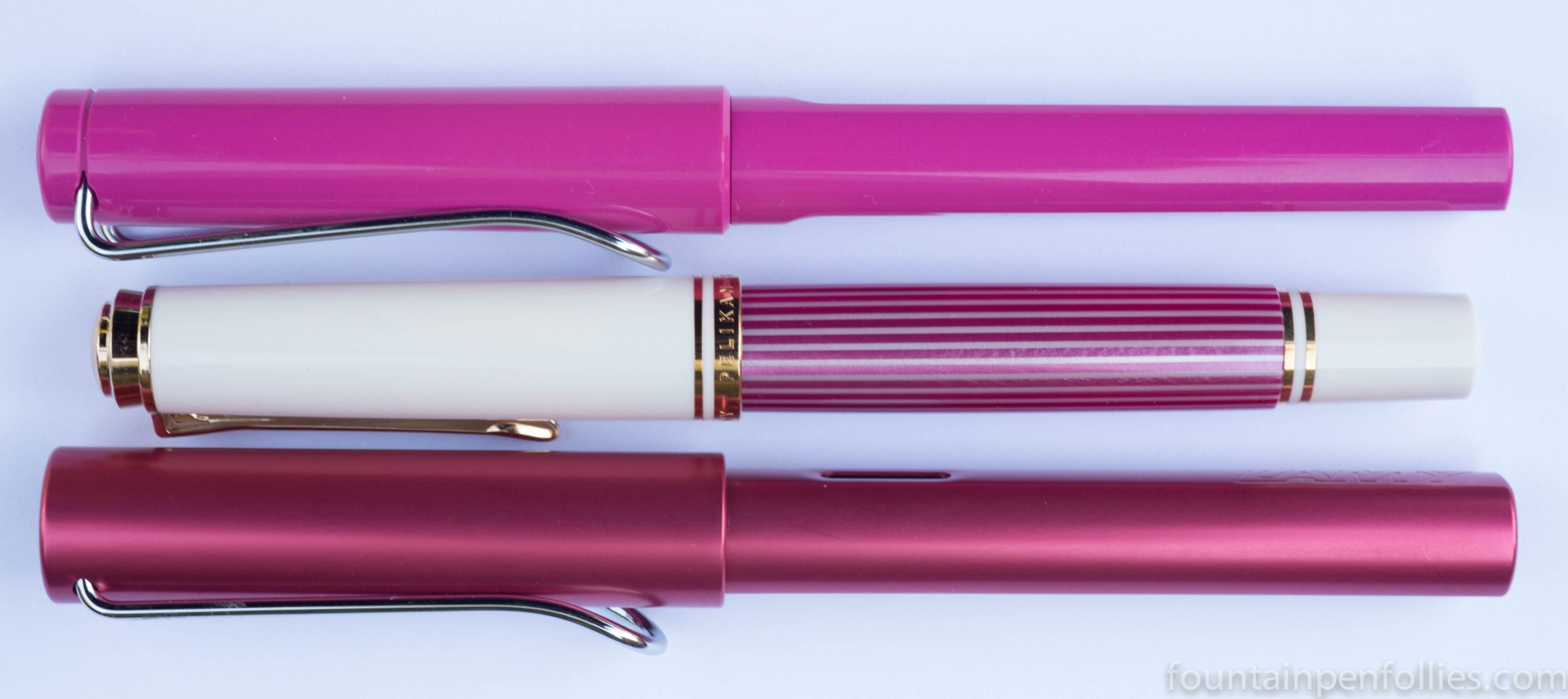
Is it too outrageous for everyday use? Will people, perish the thought, notice your pink pen? They do with the Safari. But I think not so much with the M600 Pink. Though most of the photos you’ll see are closeups, to better show the pen, in real life you’re going to see the M600 Pink from a distance, and so will everyone else.
And, while I’m thinking “yay pink!” to myself, I honestly think most other people aren’t going to see anything remarkable in it. It’s not bright and it’s not particularly showy. Even though it’s pink, it’s normal, too.
So I like it very much. And if Pelikan ever decides to add a hot pink M600 to the lineup, I’ll like that very much, too. And I will buy that, too. But this one is definitely safer and will appeal to more people. It’s elegant, professional and polished.
The only thing I don’t like about it is that it is very hard to check the ink level. The binde is shimmery, but it is not really translucent. At least, not in normal light. You can see the outline of the ink level if you hold up the barrel to a bright light, or hold a small flashlight next to the barrel. I would have preferred this to have been easier.
I’m just going to post some more photos to show how it compares with other pens, to give a fuller idea of how it looks.
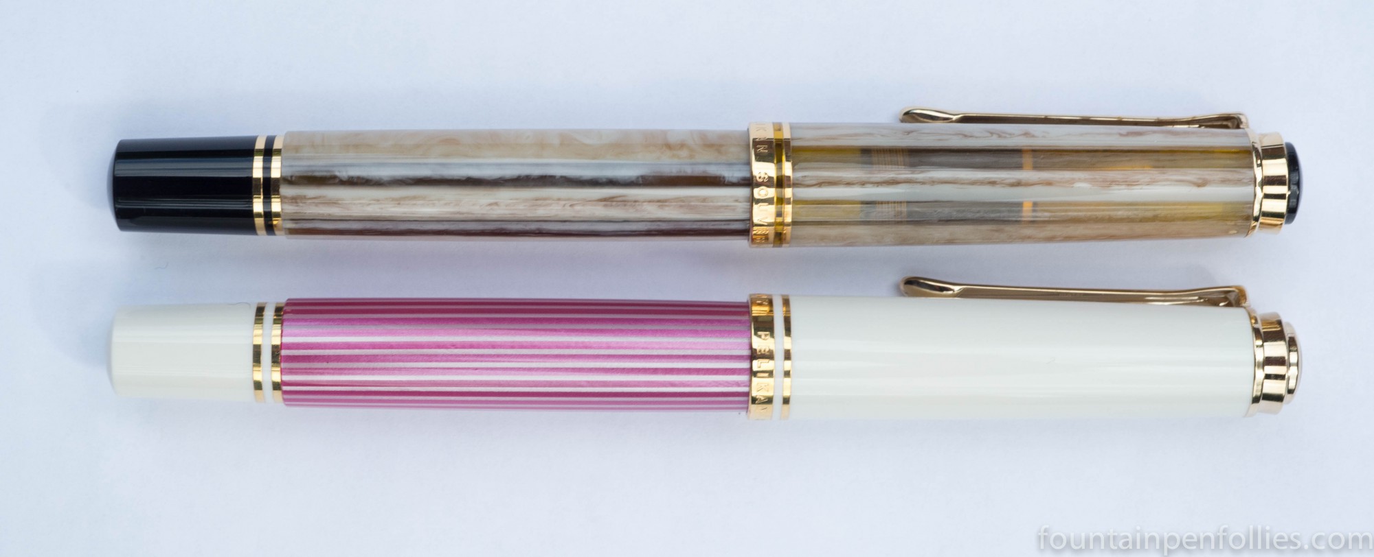
Here is the Pink Pelikan next to the M400 White Tortoise, showing how much more translucent the White Tortoise binde is.

Here is the M600 Pink is next to the M620 Piazza Navona.
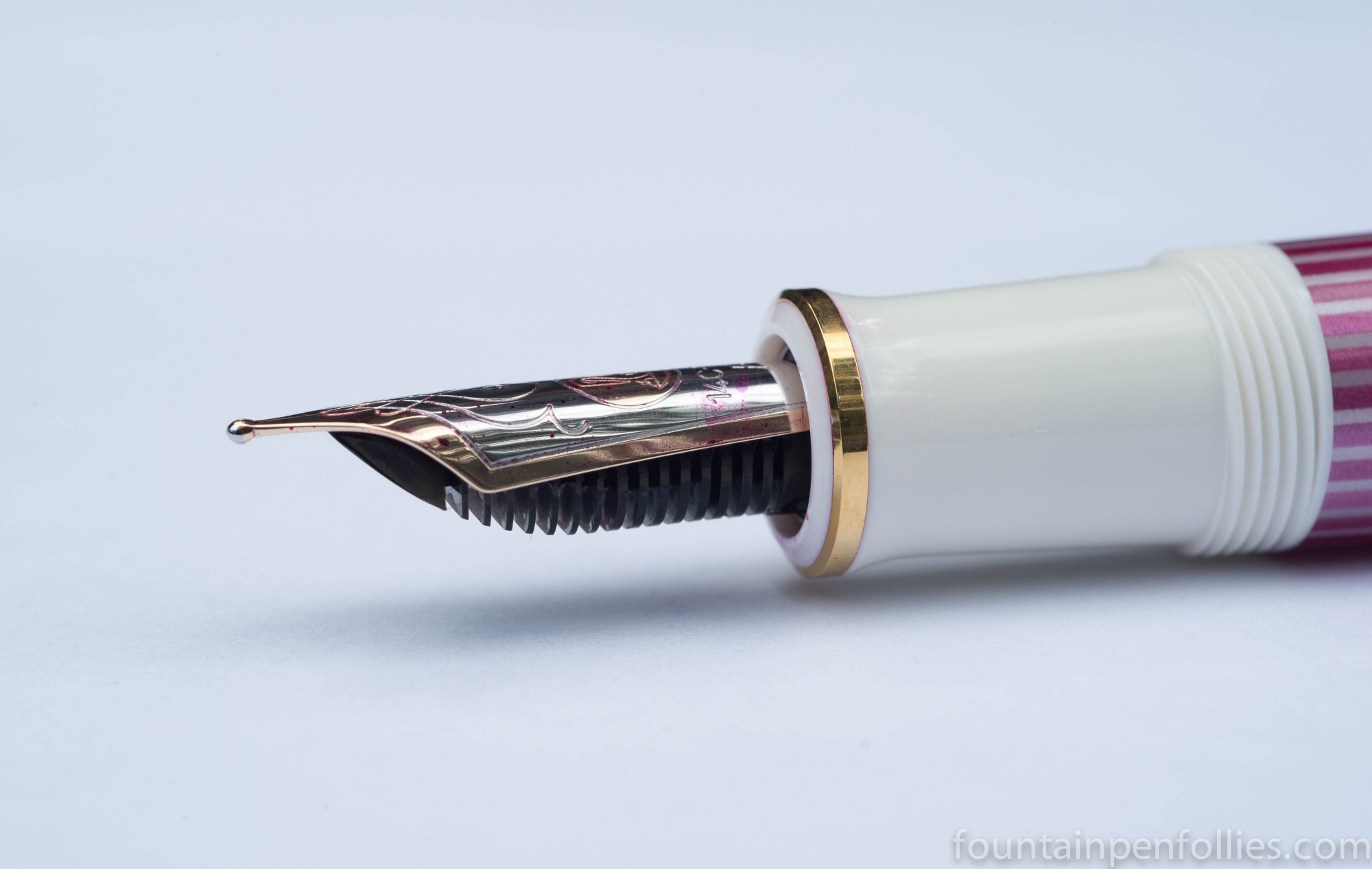
And here is a closeup of the Pink Pelikan binde next to the M600 Ruby.

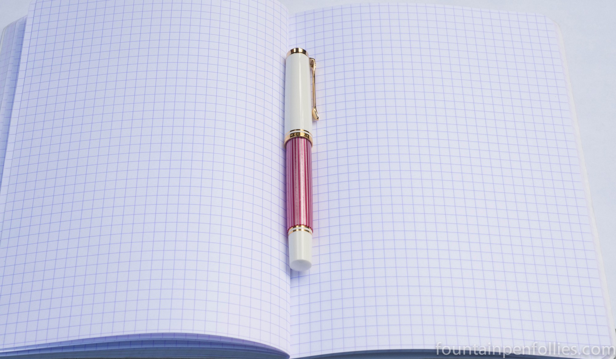
Mine has a fine nib, and of course I filled it with Pelikan Edelstein Turmaline. Because that’s pink ink (pink ink!). Such a happy combination.

lol, won’t be a tough promise to keep I bet 😛
LikeLiked by 1 person
I hereby vow to hide it away forever. 🙂
LikeLike
wow, look at that box! It really doesn’t match the pen inside, does it? I would have pictured something much more frou-frou and boudoir inspired 🙂 Ah well, at least you can stash & forget!
The picture with the three pinks is my favorite from this post – they really enhance each other!
LikeLiked by 1 person