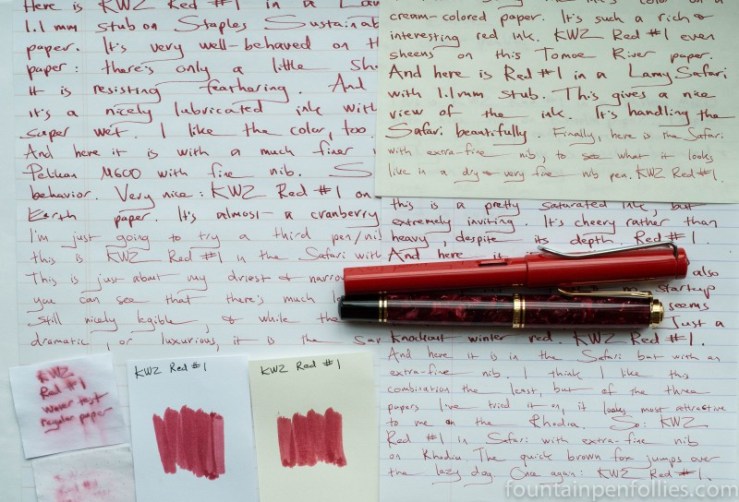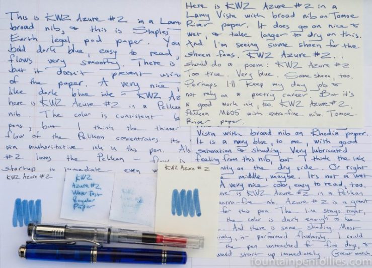
KWZ Azure #2. This is something of a find, if you like blue ink. KWZ Azure #2 performs well on poor paper and seems as low maintenance as a standard blue ink, but with a darker and bolder color.
(click Page 2 below to continue)

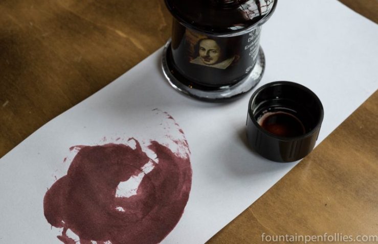
De Atramentis William Shakespeare. The 400th anniversary of Shakespeare’s death makes it a great day to mention this lovely ink. De Atramentis has paid tribute to the Bard of Avon with a beautiful mahogany ink with gorgeous shading. I really like it. And the name does not hurt.
An everyday ink? Oh yes.

If you like this ink, two other to look at are Diamine Mozart and Diamine Bach.
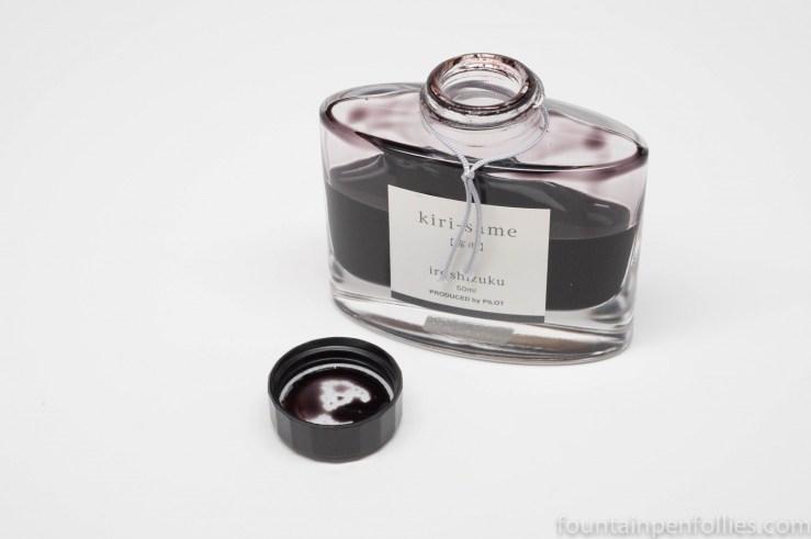
Pilot Iroshizuku Kiri-same. I must be quirky, because this quiet gray is my favorite Pilot Iroshizuku ink. Kiri-same is the warmer twin of Fuyu-syogun. Not very saturated, but legible even from an extra-fine nib, Kiri-same is like a liquid pencil.
An everyday ink? Probably not forceful enough for most people, but I love it.

J. Herbin Bleu Azur. This aptly named ink is a very light blue, and such a clear, pure color that it reminds me of the spring sky.
I am a huge blue ink fan. But honestly I had never used Bleu Azur because I remember reading so many negative comments about it. Which once again teaches me to ignore that kind of thing. Bleu Azur does not work in every pen, but if you pick the right pen, it’s lovely, and legible.
(click Page 2 below to continue)

KWZ Iron Gall Turquoise. This is an ink I first saw in a letter from a friend, at which time I thought “wow.” Now, after weeks of using KWZ Iron Gall Turquoise, I still think “wow.” It’s a darker blue-green than many turquoise inks, with lovely shading, and great presence on the page.
(click Page 2 below to continue)