

In that photo, the ink “legs” clinging to the sides of the glass vial show the color when you write with Bleu Azur, while the pool of ink at the bottom shows how it looks in the bottle. That’s also how it looks in a clear pen.

I used Bleu Azur in that Kaweco Sport, with double broad and medium nibs, and I also used it in a Lamy Safari with extra-fine nib.
I picked the Safari on purpose, as a worst-case-scenario test, because the Safari is a very dry writer and of course the extra-fine writes such a thin line. So here is the result.

I’m going to go out on a limb here and say that this is not a great pen-ink combination. True, it’s not actually invisible. One can read it. But not easily. Which does not mean that Bleu Azur is a bad ink. To me it means that a dry-writing and fine-nibbed pen like a Safari with extra-fine nib is not a good match for Bleu Azur.
For most of us, a wider nib and a wetter pen would be a better choice. In that kind of pen, Bleu Azur is really a lovely blue.

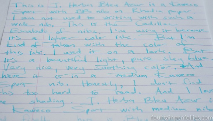
That writing sample is on Rhodia. The top lines are written with the Kaweco Sport with a double broad nib. See also here.
Bleu Azur is also nicely legible with the medium nib of the Kaweco Sport, here in the bottom third of the page.
Here is a writing sample on Tomoe River, to show the color of Bleu Azur against a cream-colored paper.

And here are the Kaweco nibs on Staples Sustainable Earth paper.

Bleu Azur’s behavior was excellent. This ink did not feather at all, not even the double broad nib. It is a slightly wet ink, and I found start up and flow to be perfect in both pens. Dry time was longer with the Kaweco double broad on Tomoe River, but not crazy long even then. I didn’t see showthrough, except a small amount when using the double broad nib on lower quality paper.
Bleu Azur also cleans up very easily. That isn’t a surprise given how light in color it is, and how low maintenance regular J. Herbin inks are.
There was some slight water resistance, which actually is a surprise. I expected it all to wash away, but Bleu Azur remained readable on regular paper even after soaking.

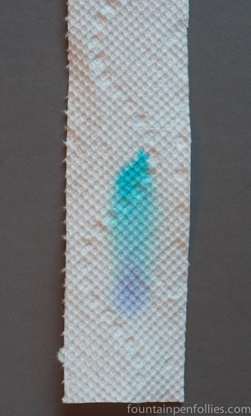
The ink is so very light in color that, when you see the swabs, it almost seems wispy and insubstantial, like blue cotton candy.
But paper towel chromatography shows a little going on there.
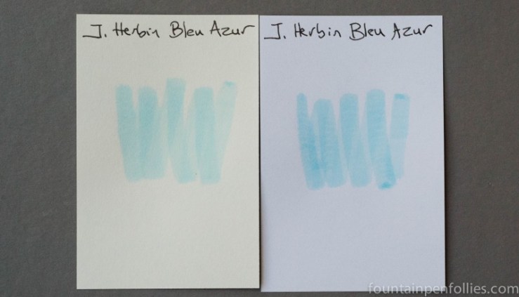
I don’t have any ink close to the color of Bleu Azur.
Here are swabs of Bleu Azur with two standard blue inks and J. Herbin Bleu Myosotis, which is the closest blue ink I have in value, though not hue.

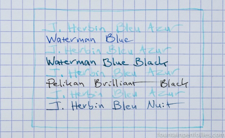
And here is a writing sample comparison with some standard inks.
I really enjoyed writing with Bleu Azur. It’s not for everyone. Nor is it suitable for every purpose. But it’s nice to use a soft and delicate ink every once in a while, and it’s also nice to vary the color palette. I found Bleu Azur a veritable breath of fresh air.

A very valuable lesson you’ve demonstrated here: don’t give up on an ink too quickly. Sometimes it takes a few tries to find the right pen/ink (and even paper) combination.
LikeLiked by 1 person
Wow, it really is a special ink! I love how it has that little hint of purple in it – it’s way more than just heavily diluted blue. Clever! And I’m really impressed that you can still read it even after a soaking!
It’s an ink I can really picture using for special writing, like for the message in a birthday card 🙂
LikeLiked by 1 person