
I liked KWZ Azure #2, and used it, so much that I kept refilling it in my pens, so it stayed inked for six weeks. I used Azure #2 in both a modern Pelikan with extra-fine nib, and in a Lamy Vista with broad nib.
Azure #2 was perfect for the Pelikan. The ink flowed beautifully and the pen started up instantly, even if I hadn’t used it for an extended period.
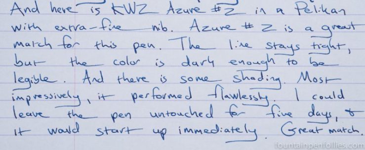
I also liked how Azure #2 looked in the Pelikan. Azure #2 has some shading, though not a huge amount. The line has a crispness and firmness, but it’s lively, not intimidating or too dark. It’s nice to find a blue that looks strong with an extra-fine nib, without having to go to a super-saturated ink.
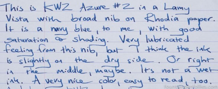
In contrast to the Pelikan, the Lamy Vista didn’t seem as well-suited to Azure #2. It was paradoxical, because Azure #2 always felt smoother and more lubricated in flow from the Vista with broad nib. But the pen would sometimes need coaxing to restart if left unused for a few days.
That happens with many inks in converter pens, and particularly in Safari-type pens. But I do think it means that Azure #2 may be slightly on the dry side.
That said, I thought KWZ Azure #2 looked really nice with the broad nib.
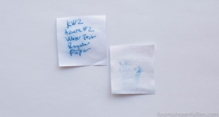
KWZ Azure #2 seems like a good ink to try on lower-quality paper. It resisted feathering even on the worst copy paper. On my everyday paper, the thin and absorbent Staples Sustainable Earth, I saw no bleedthrough and hardly any showthrough. For a fairly dark ink, that’s great.
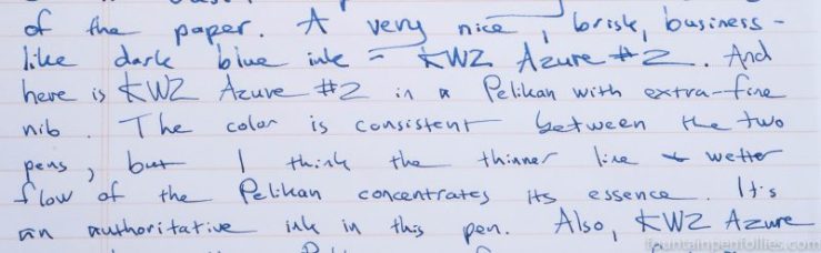
Here is a writing sample on Sustainable Earth.
On cream-colored Tomoe River paper, it looked very nice.

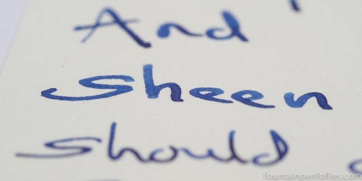
I think I even saw a bit of sheen.
Azure #2 seems very low maintenance. Even after six weeks of use, Azure #2 cleaned out of both pens quickly with just plain water. So far Azure #2 seems to have all of the easy-clean qualities of a standard blue ink.
There was some, although not much, water resistance on Rhodia paper. But like most inks, Azure #2 showed good water resistance on absorbent paper.
Azure #2’s color is interesting. It’s a dark blue. But it lacks either gray or green undertones, and as a result, it doesn’t read blue black. It’s just a dark blue. But it’s kind of a fun dark blue, not heavy.
Here’s a quick writing sample comparing Azure #2 with some standard blues, to show the difference.
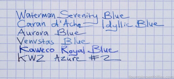
Swabs show the same thing. Here is Azure #2 between two standard blues, KWZ Azure #1 and Waterman Serenity Blue.

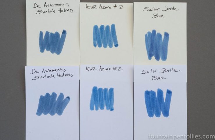
Here is a comparison of Azure #2 to two darker blue inks, De Atramentis Sherlock Holmes and Sailor Jentle Blue.
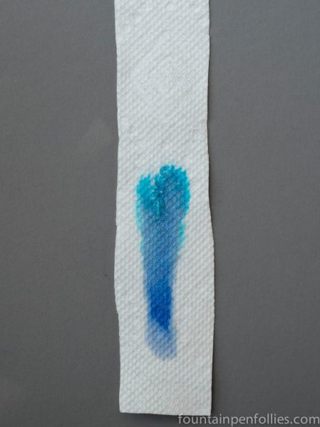
Paper towel chromatography was interesting. It turns out that Azure #2 is a mixture of several blue dyes. And there is some liveliness and punch within this dark blue ink. I think that explains the special character of Azure #2 — it’s quality of being dark in color without ponderousness.
For me, a true blue ink fan, Azure #2 is another winner from KWZ. It’s a clear and firm color. I could see using it every day in a business environment, as a more distinctive alternative to a normal blue. The color conveys authority without being harsh. I also appreciate how low maintenance Azure #2 seems, and how well it performs on poor paper.
I received a sample of Azure #2 from KWZ so I could review it. KWZ Ink is available online from at least one US store — Vanness Pens — and also directly from KWZ in Poland.
