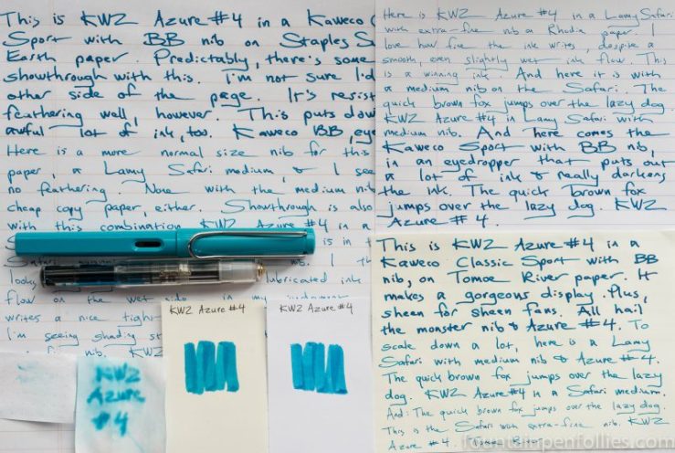
KWZ Azure #4. This is a distinctive blue ink with dramatic shading and some sheen, that looks as nice from an extra-fine nib as from a double broad, and behaves extremely well. It’s another winner from KWZ.
(click Page 2 below to continue)


Montblanc 146 with broad nib. This is actually not the same 146 with broad nib that I was using last week with Caran d’Ache Infra Red. Because, currently, I have two. Sigh. Bad Fountain Pen Follies.
Would you believe that I have two by accident? And if not, what would you believe? Aliens? Amnesia? Feel free to tell me, so I can use that instead.

This is my newer 146 with broad nib. And I have been intending to sell it. But, see, it’s lucky that I’ve been dragging my feet on that. Because it’s such a good pen. And because when this Montblanc BMW ink arrived, I had the perfect pen to put it in.
And they say procrastination is bad.

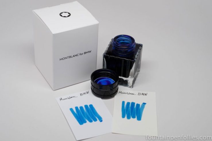
I got a neat package yesterday including this ink: Montblanc’s BMW ink.
It appears to be part of the Montblanc for BMW collection, celebrating BMW’s 7 Series cars. I say “appears” because that link only describes a lot of leather goods and a Platinum LeGrand rollerball and fountain pen. Unmentioned is any ink.
It’s almost as if they considered ink minor, or insignificant. How … strange.
These encounters with normal, well-adjusted people can really make a person wonder.
Luckily I have a friend who agrees with me that ink is the most important thing ever, who sent me a bottle. And it’s inked up already. Because, blue.
It’s a nice blue, with nice shading. I’ll certainly post more about it, and do a review, in the days to come. Because, blue.

Kaweco Classic Sport Clear with double broad nib. I decided I wanted to see this next ink. So it was time to eyedropper a Kaweco Classic Sport. And I decided to bring out the monster truck of nibs, the double broad. My usual extra-fine and fine nibs quail before its majesty.
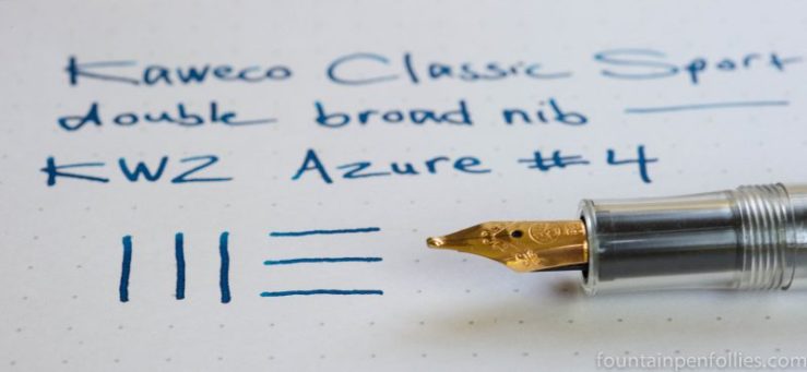
I left Azure #4 for last of the five KWZ Azure inks I’ve tested. Because it seemed to have a slight blue-green tint, and I am not a huge user of teal or turquoise blues. So I wasn’t quite as excited about this one.
Which lasted as long as it took me to ink up a pen. Look at what KWZ did here. Another awesome blue.


May is always beautiful here and has always been my favorite month. This past week has been especially lovely in the garden, which is suffused with the lemony scent of older roses in bloom. And, yes, there have been pens and inks. Here were my favorites for May.
1. Pelikan M205 Transparent Blue. So you know how sometimes when you really look forward to something, it turns out to be a little disappointing once you actually have it? Well, that didn’t happen with the M205 Blue. I like it even more in person. Oh sure, the nib will never be for me, and the pen’s a little skimpy. But it’s such a pretty blue, and if it were perfect I’d only have to get rid of all my other pens anyway. Win-win, I’d say.
2.Boxing Out. May brought the best box for my Aurora Optimas ever. Not only does that gorgeous thing cradle the little fellows in plush comfort. Not only does it have ten (10!) empty slots that eventually I get to fill. But it also means my Aurora Optimas aren’t in the regular pen case any more, creating the erroneous but deeply satisfying impression that “I haven’t got that many pens after all.”
3. New Pen Evaluation Process. I have finally come up with a workable three-step system to analyze and evaluate matters when I want a new pen. It goes like this: (1) Don’t. (2) Don’t. (3) Don’t.
So far so good.
——————
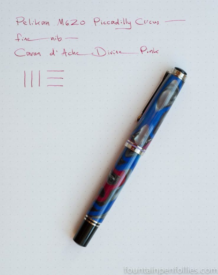
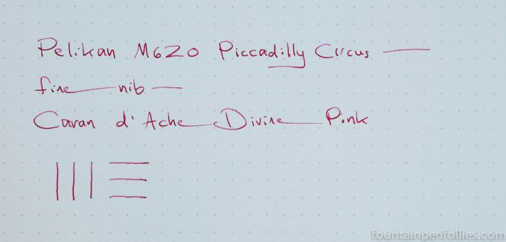
Pelikan M620 Piccadilly Circus with fine nib. We went to Captain America: Civil War this weekend. I am so Team Captain America, and this was the closest pen I could find. Which okay, strictly speaking, is a total fail. But, imagine if Captain America ever went out and had some fun in the West End. Let’s go with that.
The Piccadilly Circus is my most used Pelikan Cities Pen, and in some ways my favorite. It’s the most fun.

I inked it up with Caran d’Ache Divine Pink. Yes, Caran d’Ache Week was last week. But I can almost hear a Donna Summer song playing somewhere, and I’m going to pretend the party is still going on.

So I really like the bottle for Caran d’Ache Chromatics ink.
I know I’ve talked about it before. And before that, too. Because it’s attractive, and because it’s thoughtfully designed for fountain pen users.
Also, it’s a hexagon, which is different. And awesome. And I think I figured out why.
(click Page 2 below to continue)

It occurred to me when I was writing about Tuesday’s pen of the day that I was talking about an ink brand I rarely hear mentioned, Caran d’Ache. Why is that?
Where wise men and women fear to tread, Fountain Pen Follies is always willing to rush in. So let’s talk about Caran d’Ache a little.
(click Page 2 below to continue)