Ink Review: J. Herbin Bleu Azur

J. Herbin Bleu Azur ink writing samples

J. Herbin Bleu Azur. This aptly named ink is a very light blue, and such a clear, pure color that it reminds me of the spring sky.

I am a huge blue ink fan. But honestly I had never used Bleu Azur because I remember reading so many negative comments about it.  Which once again teaches me to ignore that kind of thing.  Bleu Azur does not work in every pen, but if you pick the right pen, it’s lovely, and legible.

(click Page 2 below to continue)

Happy St. Patrick’s Day

green bagels for St. Patrick's Day

And this is roughly reason number 1,979 why I love Chicago: green bagels for St. Patrick’s Day.  I love the melting pot.

Though, yeah, the green color looks slightly strange in a bagel.  Only kids would actually eat those, probably.  Or Shrek.  Or the guy in charge of Lamy Safari color choices.

Bung Box First Love Sapphire: Another Glimpse

Bung Box First Love Sapphire writing sample

I know I mentioned a few weeks ago that a friend gave me a sample of my very first Bung Box ink, First Love Sapphire.

And I posted a writing sample from an Aurora Optima with a fine nib.

But here’s a quick look at Bung Box First Love Sapphire from both the Optima and a much different pen, a Kaweco Sport with 1.1 mm calligraphy nib.

I find it really interesting. The ink color is consistent, but the impression it makes, on me at least, is very different.

Pen of the Day: Pelikan M600 Green o’ Green with KWZ Iron Gall Green Gold

Pelikan M600 Green o' Green fountain pen

Pelikan M600 Green o’ Green with broad nib. Well, it’s the Ides of March, of course, but in addition it’s almost St. Patrick’s Day, so I’m going with the latter theme.  St. Patrick’s Day is more fun.  It’s the unofficial Chicago holiday, with our Chicago River dyed green, and our “everyone’s Irish on St. Patrick’s Day” spirit.  The latter is a nice way of saying that everyone drinks a lot on St. Patrick’s Day. It’s like the law of the city.

And here is the pen cap, the most St. Patrick’s Day part of the Pelikan Green o’ Green.

Pelikan M600 Green o' Green fountain pen cap

And here is the ink, which is from a sample sent by a friend: KWZ Iron Gall Green Gold.  This is another really nice-looking ink from KWZ.

Pelikan M600 Green o' Green fountain pen and KWZ Iron Gall Green Gold ink

A Peek at the Pen Cups

DSC_9614

My pen cup runneth over.  Both of them. And they show what’s going on here for the next week or two.

DSC_9647

I’ve got four Kaweco Sports inked right now.  Three of them contain inks I’m going to be reviewing, or might be reviewing or really thought I’d already have finished reviewing.  Those pens are blue, clear and purple, respectively.

The other is my new AL-Sport.  Which is new.  I am not sure I expressed that clearly enough.  I meant, new!  Well, actually, newest.  Newest!

DSC_9671

Does that photo up above look sufficiently dark and mysterious?  Good.  There are two pens there that I think are going to be pens of the week this very week, so I don’t want to give away too much now.  I hope it’s just like Pretty Little Liars here, in terms of suspense.  So you can tune in tomorrow, when I reveal “A.”

Ink Review: KWZ Iron Gall Turquoise

KWZ Iron Gall Turquoise ink

KWZ Iron Gall Turquoise. This is an ink I first saw in a letter from a friend, at which time I thought “wow.” Now, after weeks of using KWZ Iron Gall Turquoise, I still think “wow.”  It’s a darker blue-green than many turquoise inks, with lovely shading, and great presence on the page.

(click Page 2 below to continue)

Pen of the Day: Aurora Optima Blue Auroloide

DSC_9530

Aurora Optima Blue/Chrome with fine nib. I do keep using this pen.  It’s hard not to.  Also my friend just got one, so we are pen twins, and I had to get our two matching pens together on a playdate.

Her Optima has Aurora’s cursive italic, which is wide and really neat. It is a very crisp italic, with amazing line variation, and it wrote with the lightest of touches. Mine has a fine nib.

DSC_9547

The ink is Bung Box First Love Sapphire.  In this pen, it really has sapphire sparkle.

DSC_9531


J. Herbin Bleu Azur: Another Sky

DSC_9384

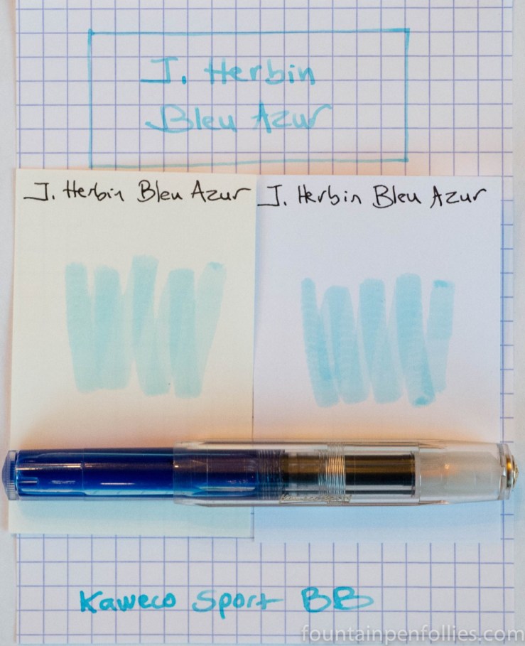
My friend just gave me a sample of this lovely ink, J. Herbin Bleu Azur.

I have a strange fondness for inks that are nearly invisible.  One favorite is Pilot Iroshizuku Kiri-same, a delicate, pencil-like gray ink.  I also like very light greens, like J. Herbin Vert Pré and Lamy’s recent Charged Green.  I don’t know if this stems from my childhood love of spy stories, or just an interest in things that are different.  An ink you can’t easily read? How different.  I like that!

I loaded Bleu Azur into a Kaweco Classic Sport because that’s a wet pen, and I can interchange the nibs.  The above photo shows it with a double-broad nib.  Bleu Azur is pretty legible with a wide nib and good ink flow.

I do like the color of Bleu Azur. It’s like another sky, which is from a beautiful poem Emily Dickinson wrote to her brother:

There is another sky,
Ever serene and fair,
And there is another sunshine,
Though it be darkness there;
Never mind faded forests, Austin,
Never mind silent fields –
Here is a little forest,
Whose leaf is ever green;
Here is a brighter garden,
Where not a frost has been;
In its unfading flowers
I hear the bright bee hum:
Prithee, my brother,
Into my garden come!