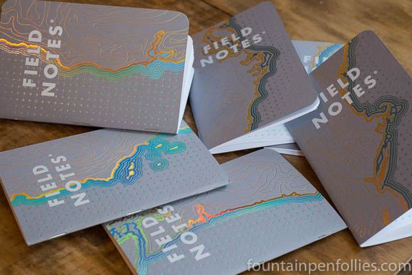
The Field Notes Coastal Spring 2018 quarterly edition has a fun theme and very splashy covers. It looks spectacular in photos. The paper inside is good for with writing with fine- and medium-nib fountain pens, though I’m not crazy about its grid marks.
(click Page 2 below to continue)
Pages: 1 2

Reblogged this on Words (about) Pictures (about) Words and commented:
Love Field Notes, currently doing all the Practical Applications in the West Coast Edition and posting them in my WordPress Blog
LikeLike
These are so pretty! I might have to get a set even if they sit collecting dust like the other hundreds of notebooks I have haha
LikeLiked by 1 person
They really are nice! I love seeing them on the table or desk while I’m using them.
LikeLike
They totally missed a golden opportunity by not having the Left Coast edition open in the opposite direction. Way too corporate, not nearly hippy enough. And when the paper itself finally sheens, we’ll have it all together: covers, pages and ink, all sheening like the devil. What a great time to be alive.
I might pick up the West coast ones, but they’ll never beat the stiffleXible “California” series books. All in all, my favorite thing from this edition was the very cool video they did.
LikeLiked by 1 person
You crack me up. 🙂 It was a good video, though.
LikeLiked by 1 person
I was being very serious, you should not be laughing! 😀🤡😺
LikeLiked by 1 person
Too late! 🤣😇
LikeLiked by 1 person
Thanks for that. I am indeed more of a broad/wet person (that doesn’t sound very glamorous does it?) so the advice was good.
LikeLiked by 1 person
I find it very difficult to write about these matters with a straight face. My inner 11-year-old comes to the fore, every time. Which reminds me, have you heard about Aurora’s new Urano fountain pen?
LikeLiked by 2 people
I emailed the people at Field Notes yesterday and got an answer straight back saying that honestly, Coastal is not fountain pen-friendly as it uses the same innards as Camp Fire etc. They also suggested some previous editions that were. Good customer relations. I’ll be buying them for the covers anyway I expect.
But as a Lunacy enthusiast it set me off on a trail and I have tracked down and purchased what may be the last ones in the UK. So I can look at some and use some others. (Only slightly smug).
LikeLiked by 1 person
I’m so happy to hear that they’re so responsive! And that you found some more Lunacy. Yay! I’ve got a few extras socked away myself. 🙂
Okay, don’t tell anyone the following (wink). I think they are prudent to give that advice. But … I really do find Coastal fine for my fountain pens. I see no feathering, showthrough or bleedthrough using my fine and medium nibs (which may not be the same as everyone’s). I’m not saying Coastal is Rhodia-like: it certainly isn’t (Lunacy is close). But for regular paper, Coastal has worked just fine for my fine and medium nibs. I do know many fountain pen users say they only use broad nibs or very wet nibs, and I would definitely not recommend Coastal to those people. But for people who use finer nibs, like me, it seems good enough. That’s all I can say. 🙂
LikeLiked by 1 person
I am a huge fan of Nanami Crossfield journals. They have the cross/plus sign in their grids. A faint color for these Field Notes would’ve been fine for their grid. I love green, but that color does seem to grab your attention. So when you write, you would constantly be aware of it. Smaller cross/plus signs that were lighter would make this a great FN edition to have.
LikeLiked by 1 person
Yes, exactly. You put it much better than I did, but that’s exactly how I feel about this colored reticle grid. It’s fine, but it’s just a little too much for me, personally.
I think it’s still a good FN edition, though. In fact I suspect it will be pretty popular. The radiant foil effect on the covers is awesome, especially in photos. Coastal may look better in photos than any Field Notes I’ve ever seen. So it seems perfect for Instagram et al., and those are powerful promotion tools.
LikeLike
>> and taking some from different angles was an inspired idea.
Unlike me getting out of bed this morning. What was I on about? I haven’t actually been able to type a remotely coherent sentence all morning! What I wanted to say was, “… and taking some pictures from different angles was an inspired idea.”
I need more coffee 😦
LikeLiked by 1 person
I always need more coffee. But I got what you meant just fine!
LikeLiked by 1 person
Those covers look great, and taking some from different angles was an inspired idea.
I have to say that I’ve never bought a Field Notes notebook. Although I’m tempted by Lunacy, the size doesn’t suit anything I use a notebook for, being either too small or too big. I’ve never much liked their paper either, and as a fan of subtly lined pages, dot grid and these heavy crosses don’t suit me.
But you’ve sold me on the covers–inside and out! I wonder if they’ll sell me a set of covers? 🙂
LikeLiked by 1 person
They would absolutely sell you a set of covers! $12.95 for a set of three! And hey as a special bonus, they throw in the interior paper. Lemons to lemonade!
LikeLiked by 4 people