

The Coastal collection has two different sets, East and West. Each set has three notebooks, with different covers. The covers show a different part of each coastline, with topographical features stamped in foil. The photo above shows one notebook from the West Coast, on the left, and one from the East Coast, on the right.
Here are all six.
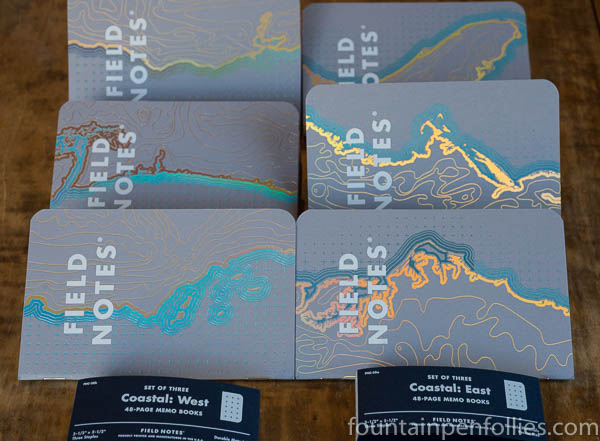
Though it looks in these photos like West and East feature different colors, in fact, they both are stamped with only blue and gold foils. It’s just that the foils reflect different colors as the light hits at different angles.
The foil color effect is really neat: a friend on Instagram compared it to ink that sheens.
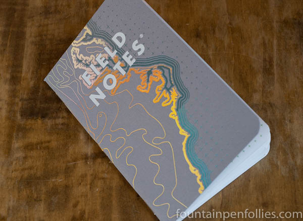
I think the best way to appreciate the effect is to look at the same cover from different angles, so the next four photos do that. Here’s the first one.

At this angle, the gold foil at the very top looks pink. Note that the blue foil seems to change color in the lower third of the cover. That’s because the blue foil on this notebook was applied slightly differently there, on the lower third. I only see that on this particular notebook. It may be intentional, or may be a printing flaw, but it looks fine.
Now here’s the same notebook again.
From this angle, what used to be pink at the very top now looks more beige. All I did was edge over a bit, and take that shot from a slightly different angle.
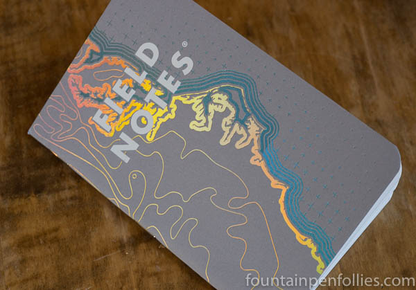
Here’s a third angle.

Now the uppermost part is green, and the gold part below looks darker and less bright.
Finally, one more change of angle.
We’re back to pink on top, as in the first photo, but look how much more yellow there is now under the word Notes.
So the covers are fun. With the foil and the color change, Coastal reminds me of the Field Notes Black Ice edition from Winter 2016. Black Ice had a foil cover and orange binding, and the play of the light on foil made that cover change from black to silver. Coastal’s foil has same effect, though in much more dazzling colors.
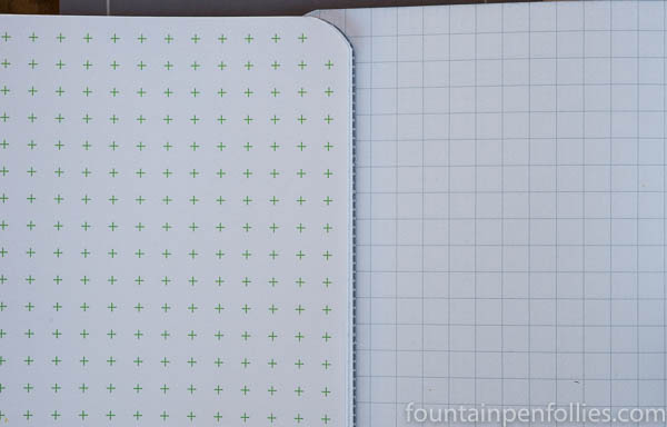
The writing paper inside Coastal is marked with a “reticle grid” or plus signs. Some pages have green, some blue. This is the same motif used on the covers to show the oceans.

There are two things I don’t love about the Coastal grid marks.
The first is that each notebook contains both green and blue pages, which I find a little jarring, or at least, very noticeable when I turn the pages.
The second issue for me is that the reticle grid marks (the pluses) are fairly dark and prominent, especially in green. Here’s a comparison of a page of Coastal, on the left, with the lighter grid lines on a County Fair edition notebook.
I’m not sure I like having the paper’s markings be such a prominent design element when I’m writing.
Nor do I want to see the paper’s markings when I’m reading something back. Here’s what the Coastal looks like with writing on it.

So all in all, I’m not crazy about the Coastal’s reticle grid. It’s interesting that the same reticle grid marks are in the Lunacy edition, which is one of my favorites. But in Lunacy the colors are are relatively recessive — gray pluses on gray paper. Coastal’s color scheme of green and blue on white paper sticks out more.
That said, it’s probably also a matter of taste. Some might find the colorful reticle marks sprightly rather than distracting.
Coastal does have 60-pound writing paper, which should please those who write with regular fountain pens. I’ve tried fountain pens with fine and medium nibs on Coastal, and had zero issues with feathering, showthrough or bleedthrough. The Coastal paper is also very nice for other writing instruments, including pencils and rollerballs. I didn’t test the paper, however, with broad fountain pen nibs or thick markers.
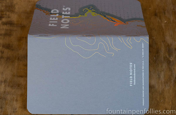
In its other details, Coastal is the usual nicely-made Field Notes set. The gray and white color scheme seems a little dull to me on the inside covers, where there is no foil, but the Practical Applications are always nice.
Below is the Practical Applications from the West set, with reference to Portland, Oregon.

And here is the East, referencing Portland, Maine.

I am in the enviable position of having a ton of Field Notes, which makes me more picky than most. So I like these, but don’t love them. But I have the feeling that others might love them to bits. In that way, too, Coastal reminds me of Black Ice.
If I were only going to buy one set, I’d pick the East Coast. Just because I find those covers more visually interesting. Even the backs are nice on the East.

Reblogged this on Words (about) Pictures (about) Words and commented:
Love Field Notes, currently doing all the Practical Applications in the West Coast Edition and posting them in my WordPress Blog
LikeLike
These are so pretty! I might have to get a set even if they sit collecting dust like the other hundreds of notebooks I have haha
LikeLiked by 1 person
They really are nice! I love seeing them on the table or desk while I’m using them.
LikeLike
They totally missed a golden opportunity by not having the Left Coast edition open in the opposite direction. Way too corporate, not nearly hippy enough. And when the paper itself finally sheens, we’ll have it all together: covers, pages and ink, all sheening like the devil. What a great time to be alive.
I might pick up the West coast ones, but they’ll never beat the stiffleXible “California” series books. All in all, my favorite thing from this edition was the very cool video they did.
LikeLiked by 1 person
You crack me up. 🙂 It was a good video, though.
LikeLiked by 1 person
I was being very serious, you should not be laughing! 😀🤡😺
LikeLiked by 1 person
Too late! 🤣😇
LikeLiked by 1 person
Thanks for that. I am indeed more of a broad/wet person (that doesn’t sound very glamorous does it?) so the advice was good.
LikeLiked by 1 person
I find it very difficult to write about these matters with a straight face. My inner 11-year-old comes to the fore, every time. Which reminds me, have you heard about Aurora’s new Urano fountain pen?
LikeLiked by 2 people
I emailed the people at Field Notes yesterday and got an answer straight back saying that honestly, Coastal is not fountain pen-friendly as it uses the same innards as Camp Fire etc. They also suggested some previous editions that were. Good customer relations. I’ll be buying them for the covers anyway I expect.
But as a Lunacy enthusiast it set me off on a trail and I have tracked down and purchased what may be the last ones in the UK. So I can look at some and use some others. (Only slightly smug).
LikeLiked by 1 person
I’m so happy to hear that they’re so responsive! And that you found some more Lunacy. Yay! I’ve got a few extras socked away myself. 🙂
Okay, don’t tell anyone the following (wink). I think they are prudent to give that advice. But … I really do find Coastal fine for my fountain pens. I see no feathering, showthrough or bleedthrough using my fine and medium nibs (which may not be the same as everyone’s). I’m not saying Coastal is Rhodia-like: it certainly isn’t (Lunacy is close). But for regular paper, Coastal has worked just fine for my fine and medium nibs. I do know many fountain pen users say they only use broad nibs or very wet nibs, and I would definitely not recommend Coastal to those people. But for people who use finer nibs, like me, it seems good enough. That’s all I can say. 🙂
LikeLiked by 1 person
I am a huge fan of Nanami Crossfield journals. They have the cross/plus sign in their grids. A faint color for these Field Notes would’ve been fine for their grid. I love green, but that color does seem to grab your attention. So when you write, you would constantly be aware of it. Smaller cross/plus signs that were lighter would make this a great FN edition to have.
LikeLiked by 1 person
Yes, exactly. You put it much better than I did, but that’s exactly how I feel about this colored reticle grid. It’s fine, but it’s just a little too much for me, personally.
I think it’s still a good FN edition, though. In fact I suspect it will be pretty popular. The radiant foil effect on the covers is awesome, especially in photos. Coastal may look better in photos than any Field Notes I’ve ever seen. So it seems perfect for Instagram et al., and those are powerful promotion tools.
LikeLike
>> and taking some from different angles was an inspired idea.
Unlike me getting out of bed this morning. What was I on about? I haven’t actually been able to type a remotely coherent sentence all morning! What I wanted to say was, “… and taking some pictures from different angles was an inspired idea.”
I need more coffee 😦
LikeLiked by 1 person
I always need more coffee. But I got what you meant just fine!
LikeLiked by 1 person
Those covers look great, and taking some from different angles was an inspired idea.
I have to say that I’ve never bought a Field Notes notebook. Although I’m tempted by Lunacy, the size doesn’t suit anything I use a notebook for, being either too small or too big. I’ve never much liked their paper either, and as a fan of subtly lined pages, dot grid and these heavy crosses don’t suit me.
But you’ve sold me on the covers–inside and out! I wonder if they’ll sell me a set of covers? 🙂
LikeLiked by 1 person
They would absolutely sell you a set of covers! $12.95 for a set of three! And hey as a special bonus, they throw in the interior paper. Lemons to lemonade!
LikeLiked by 4 people