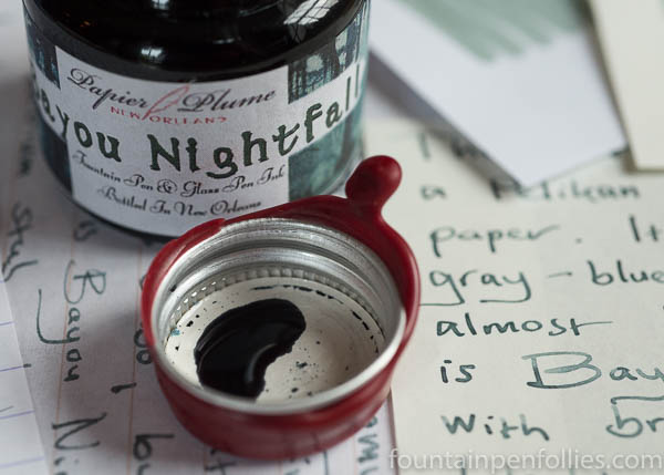
Papier Plume Bayou Nightfall. The newest edition to the Papier Plume New Orleans collection is Bayou Nightfall, a serene, elegant and gorgeous slate-gray ink. It does suggest nightfall, and also perhaps a Japanese rock garden.
(click Page 2 below to continue)
Pages: 1 2

Thanks for your review. Currently have Diamine Grey in my Pel 800 Stressman Anthracite fine nib. Color wise, in your opinion, would this be a good match for this pen and how does it compare to D Grey?
LikeLiked by 1 person
Thank you!
I think this ink is a more complex and unusual color than Diamine Grey, which looks more like a standard or straight gray. Bayou Nightfall has the green-blue tint. It is also a light-colored ink, so I’m not sure a Pelikan fine is the best nib to bring out its best. I personally prefer it in the medium and wider nibs, even with Pelikans. For fine nibs, Papier Plume Oyster Grey is the one I use, because it’s darker. But I love Bayou Nightfall, so I’m not trying to discourage it.
I love your pen — I someday want to add the M405 version myself. I am not a strict ink-pen matcher. I’d have no trouble using this ink in a gray pen or black pen: in fact, I have the black lizard Pelikan M101N with a medium nib, and I’d definitely ink that with Bayou Nightfall. But if you want the closest match, I’m again thinking Oyster Grey…. 🙂
LikeLike
Wow, thanks for the fast and thorough reply. Darn it, now I have yet another ink dilemma, I mean purchase, to consider.
LikeLiked by 1 person
The hallmark of a very good review: even though this is not an ink I would purchase or use, I enjoyed reading about it through your words. Thanks!
LikeLiked by 1 person
Thank you! Also, more for me, then. 🙂
LikeLike
I shall be leaving Southampton by ship, at nightfall, tomorrow so will look out for the subtle colour references…
LikeLiked by 1 person
Wow!
LikeLike
Wow, your review seemed to step it up a notch, if that is even possible. I am speechless.
I must try this. It looks quite lovely to me!!!
LikeLiked by 1 person
A really interesting looking ink, nicely reviewed.
LikeLiked by 1 person
Very classy. I’ve had my eye on Oyster Grey for a while but haven’t managed to obtain a sample. Thanks for putting together this post.
LikeLiked by 1 person
Ooh, I really like that color!
LikeLiked by 2 people
A very soothing read. The Whistler painting is a great match, rather like Visconti have done with Van Gogh, only with pens rather than inks.
LikeLiked by 2 people
Thank you! Actually, Papier Plume came up with the color itself, inspired by nightfall over bayous in the New Orleans area.
The Whistler thing is a coincidence: it just came to me while I was writing, that this color I like so much, but can’t really describe, happened to resemble a painting I’ve looked at for years, here in Chicago. Maybe I need to clarify that. 🙂 They both capture the color of the early night sky over water, though, which is really cool.
LikeLiked by 2 people
I’ve been looking for a nice daily writing grey. Black is too boring! And I do love my Papier Plume inks so this is definitely on my wishlist.
LikeLiked by 2 people
I also really like Papier Plume Oyster Grey which is one of their regular inks. 😊
LikeLiked by 2 people
I like it.
LikeLiked by 2 people