

That photo above captures the blue-green color, and the marvelous shading, of Lake Michigan Summer. That’s the ink in a Pelikan with broad nib.
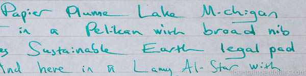
I’ve also been using Lake Michigan Summer in a Lamy Al-Star with medium nib, and here is a writing sample with that pen, on Rhodia.

It’s been an excellent performer in both pens. It’s nicely saturated and doesn’t need the width of a broad nib to look its best.
Lake Michigan Summer’s color is on the border between blue and green, but I think of it as a blue. Perhaps a robin’s egg blue, if I had to venture a description.

Actually, it may be easiest to see the blue of Lake Michigan Summer in conjunction with an ink that really is green. If you missed it yesterday, scroll down on this page, where Lake Michigan Summer is identified as a “mystery ink.”
Back on its own, here’s Lake Michigan Summer in the Pelikan with broad nib on Tomoe River paper. It looks greener on this cream-colored background, but it’s still blue-green.

For me, Lake Michigan Summer has been fantastic on lower quality paper. Even in the broad nib Pelikan, the ink has hardly feathered.
Here is a writing sample on Staples Sustainable Earth legal pad paper, my everyday paper that isn’t fountain-pen friendly.
No feathering there.
Lake Michigan Summer has a color that’s a little tricky to convey in photographs, but I think it’s gorgeous — summery and full of light, without harshness.
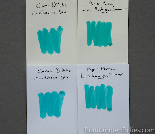
The minute I inked it up it reminded me of Caran d’Ache Caribbean Sea, a sadly discontinued ink with many fans. Lake Michigan Summer is greener, but it’s got the same feeling, and similar shading.
Papier Plume Lake Michigan Summer is limited to only 60 bottles, and available only at the Chicago Pen Show, from Friday, May 5. However, Papier Plume also has graciously agreed to give away one bottle through Fountain Pen Follies, which will be sent to whomever wins, even if you can’t be at the pen show. Watch the blog for that — it’s coming soon.
Meanwhile I’d love to hear what you think of Lake Michigan Summer in the comments.

This reminds me a little of Herbin Vert Reseda, except this is more pigmented. Still shading, but the dark parts of the shading are deeper than with Vert Reseda. I like that! Reseda is a favourite of mine, but sometimes when I use it for notes (rather than headers and detailing) it can be a little too light to read easily, depending on the paper. This looks like it wouldn’t have that problem.
LikeLiked by 2 people
This is very legible for me. In fact I love it in the Al-Star. I’ve never tried Vert Reseda, though. 😊
LikeLiked by 1 person
Do you want some Vert Reseda? I’d love for it to get another fan. It’s really pretty! I bought it at the same time as Cacao du Bresil and got Rose Cyclamen soon after, and as I tried out the inks I realised they all created this slightly 1950s palette. Great inks!
LikeLiked by 1 person
J. Herbin are favorites but I haven’t tried Vert Reseda. 😊
LikeLike
Ugh what a gorgeous color. I neeeeed this ink. Neeeeed.
LikeLiked by 2 people
How exciting that this is such a rare commodity and that you Chicagoans get your own Lake-inspired ink:) Wish I could be at the Chicago Pen Show. (Penvious).
LikeLiked by 3 people
You know, I bet airfares would be pretty cheap right now on Chicago’s own United Airlines… 😬
LikeLiked by 2 people
I bet you’re right! Somebody reads the news!!! 🙂
LikeLiked by 1 person
I wish I could as well
LikeLiked by 1 person
Looks like a lively fun summer color! Look forward to seeing it in person.
LikeLiked by 3 people
I so look forward to seeing you there! Yay! 🙂
LikeLiked by 2 people
This is my favorite color! I love these light blue/greens! I wonder if I can convince anyone in my Chicago clan to brave the convention to get me a bottle LOL.
LikeLiked by 3 people
Totally! We’re really very nice. We might even convert them to fountain pen and ink use, and think how good that would be for you!
LikeLiked by 2 people
That would be ahhhMAAAZing!
LikeLiked by 1 person
Don’t forget to enter the giveaway, too. It’s up now. 👍🏻
LikeLiked by 1 person
Thanks for the heads up! Entered 🙂
LikeLiked by 2 people
Yay! But still send friends and family to the show! 😝
LikeLiked by 1 person
This color is dreadful. Aaargh. It’s precisely the kind of hue that I viscerally hate 🙂 It’s cool they offer new inks but this one makes me clench my teeth )
LikeLiked by 3 people
Sorry! There are some inks that do that to me, too, even though I know they are fine inks and fine colors — for other people. 🙂
LikeLiked by 2 people
HAHAHHAH, you´re funny
LikeLiked by 1 person
I think the color is gorgeous. It sort of reminds me of Diamine-Steel Blue too. Chrissy said Kaweco-Paradise Blue is close to that Caribbean Sea ink. I do love that color too. I really love the blue green, and green blue colors. I don’t know what it is, but I just LOVE THEM. Papier Plume has really been making some lovely colors. I’m quite impressed!
LikeLiked by 3 people
Yeah there’s a whole post about Kaweco Paradise Blue and Caribbean Sea on the blog. Here it is.
This is a lovely color, especially in real life.
LikeLiked by 2 people