
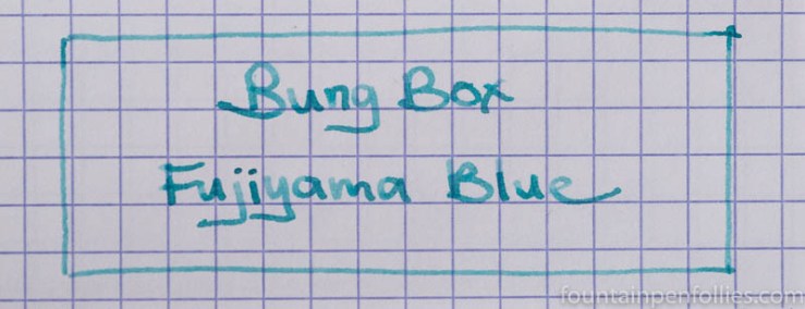
A friend very kindly sent me a sample of Fujiyama Blue. I actually used this ink in three pens. Above is what it looks like from a Kaweco Sport with double broad nib. It looked very similar in a Lamy Al-Star with broad nib.
I also used it in a vintage Pelikan 400nn with medium nib, a very wet writer with some flex. In that pen, Fujiyama Blue looks really different, not only darker but also blue-green. The middle three lines on this next writing sample are Fujiyama Blue from the Pelikan on Tomoe River paper, bracketed by Fujiyama Blue in other pens.
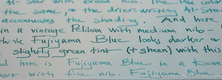
Here’s a larger slice of that writing sample on Tomoe River showing Fujiyama Blue from the Sport with double broad nib, the Lamy with broad nib, and then the vintage Pelikan.

I also tried putting a fine nib on the Kaweco Sport, just to see if such a light ink would be legible. Here is Fujiyama Blue on Rhodia, first from the vintage Pelikan with medium nib, then the Kaweco Sport with fine nib.

I find Fujiyama Blue a little too light to read easily from a fine nib.
In contrast, here is Fujiyama Blue on Rhodia from pens with the double broad and broad nib pens.

As an aside, I normally prefer a pure white paper like Rhodia for writing with fountain pen inks. But I think Fujiyama Blue really looks spectacular on the cream-colored Tomoe River paper.
I think Fujiyama Blue has sheen potential from a wet enough and wide enough nib. My Pelikan 400nn puts down a lot of ink, but the nib is a narrow medium. With that in mind, here is a closeup of the closest I got to sheen on Tomoe River paper with the Pelikan.

Just a smidge of sheen. In that pen.
Behavior in all three pens was good. Fujiyama Blue is a wet ink. I kept the Kaweco Sport and Lamy Al-Star inked for over a month, and never had one issue with ink flow or start-up, not even in the Al-Star, which is a dry writer. I did, however, get considerable nib creep in the vintage Pelikan.
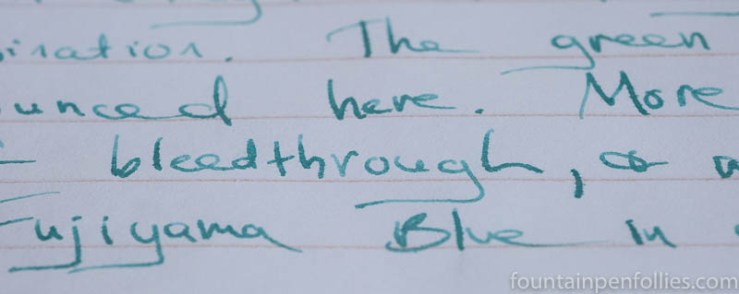
I didn’t get the greatest performance on lower-quality papers. In the pens with broad or double broad nibs, Fujiyama Blue resisted feathering pretty well on both copy paper and my everyday Staples Sustainable Earth paper. But there was significant showthrough on the other side of the Sustainable Earth paper.
Unfortunately, the vintage Pelikan was so wet I got the trifecta of bad on Staples Sustainable Earth: showthrough, some bleedthrough and fairly noticeable feathering.
For such a light-colored ink, I was impressed that Fujiyama Blue had some water resistance, not only on regular paper but also on Rhodia.
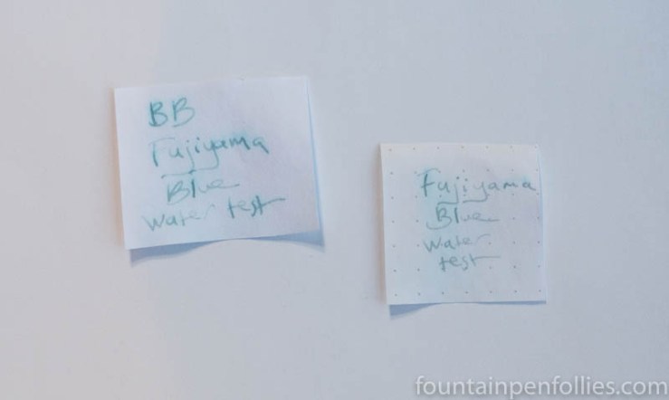
Yet Fujiyama Blue cleaned easily from the pens with only water.
I have mentioned before that I have a soft spot for inks that are very light in color, but not glaring, like the light green J. Herbin Vert Pré. They have a soft and gentle aspect that isn’t very common, which I find restful. Fujiyama Blue is such an ink. And another is J. Herbin Bleu Azur, which is the closest ink I have in color to Fujiyama Blue.

Fujiyama Blue is darker than Bleu Azur. I used the same Kaweco Sport with double broad nib to review both inks, and Fujiyama Blue is the most legible of the two. Bleu Azur, however, is closer to pure blue in color. Bleu Azur is more airy. The difference is that Bleu Azur reminds me of a summer sky, and Fujiyama Blue reminds me of the Caribbean Sea.
When I got a bottle of Pelikan Edelstein Aquamarine, I wondered if that might be similar to Fujiyama Blue in its blue-green guise. So here’s a writing sample of Fujiyama Blue in the vintage Pelikan with medium nib, first, and Pelikan Edelstein Aquamarine from a modern Pelikan with medium stub nib, second.

So, no, not really similar. Pelikan Edelstein Aquamarine is much darker and easier to read, and has more dramatic shading. In its lightest bit, Aquamarine approaches Fujiyama Blue at its darkest.
Here is paper towel chromatography of Bung Box Fujiyama Blue.
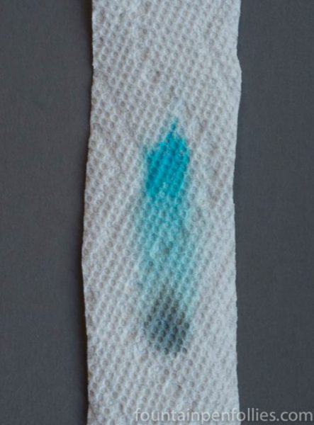
There isn’t a subsidiary green dye in Fujiyama Blue, but a gray dye.
Here is paper towel chromatography of Bung Box Fujiyama Blue, on the left, and J. Herbin Bleu Azur on the right.

Thought the secondary dye color differs, it’s interesting how similar the central blue dyes are. But you can see why Fujiyama Blue, on the left, would be easier to read.
I really enjoyed Fujiyama Blue. It is very light in color, so it won’t appeal to everyone. It appeals to me, but even I can’t really use it in a fine nib. But in a pen with a wide or wet nib, I’m a fan. In fact, I like it either blue or blue-green, though my friend prefers the blue-green you get from a very wet pen.
Of course, it is a Bung Box ink, which means it’s limited in number and expensive outside Japan. Were it half the price, I’d already own my own bottle.


The Bung Box ink is a bit light for me. The Aquamarine ink you posted is much darker than what mine looked like with the sample I got. Diamine-Eau de Nil may be similar, but to me it is a lighter version of Yama-dori. I also tested samples of Aquamarine, and Deep Sea Green (Faber Castell). The Deep Sea Green wasn’t as green as the Aquamarine. I went to the pen show recently and tried Franklin-Christoph Midnight Emerald. To me it is similar to both colors, and I definitely remember it being darker than Aquamarine, but neither was as dark as what you posted here. Midnight Emerald is more blue than Aquamarine for sure. I guess it depends on pen, and paper quite a bit. I have only used Midnight Emerald in one pen so far, I will try it in other pens as I’m able to do so. It had excellent flow and lubrication.
LikeLiked by 1 person
I like the colour, but I have some very similar inks that cost less. So I probably would not invest in a bottle.
LikeLiked by 1 person
I do like this one, but the cost is prohibitive for me. I’m hoping to stumble across one used, or rather have someone tell me when they stumble across one used, since I don’t check ads. 🙂
Which inks do you think are similar? I thought there might be a Diamine, but all mine are darker or different, like Eau de Nil. It’s a tricky color space for me: if a blue-green ink gets too green I don’t love it.
LikeLike