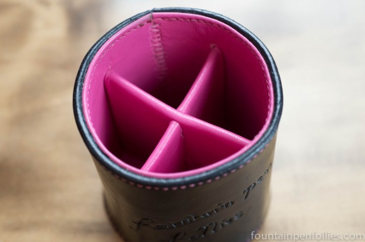
He even put the blog’s name in it. Talk about taking my little blog from zero to hero.
Michael lets you choose the colors for anything he makes. That is excellent for those with high executive function and a firm sense of “my colors.” Like, Lamy would choose green, with a slightly different green interior.
Me? I waffled for ages, thinking of unusual and apparently unobtainable combinations like “eggshell” and “cappuccino.” Michael’s very gentle guidance led me to black with pink. Phew.
Not only is the stitching a beautiful pink, but the inside is matching pink leather. It’s like a party in there. It’s almost a pity to put pens inside and cover it up. Almost.

I love the stitching detail. Also how the colors blend with my beloved pink Safari pencil and ballpoint. The Vista pencil of course goes with anything.

I usually talk about the pens in the pen cup, though they are all upstaged by the cup itself this time. However, sigh, since it’s Fountain Pen Follies, I will do a quick survey of the boring old pens.

There’s my Edison Urushi Mina, still. Because I can’t let go of KWZ Maroon (actually Maroon #2), even though my review of both Maroons is done.
There are three Lamy Safaris or Al-Stars. One is always inked with Pelikan Brilliant Black, which matches the pen case now. The other two contain KWZ inks I am testing for review.
There’s my mom’s Parker 51 double jewel. It’s been inked since I bought it, and I’m on my second fill of J. Herbin Bleu Nuit. I may have to sell my other 51s. Except that doesn’t sound like me, does it?
I have a lot of pens in there this week. There are also two Pelikans. One is my Toledo with KWZ Iron Gall Green #2, an ink I’m just about to write up. And there’s Tuesday’s Pen of the Day, a Pelikan 400 with KWZ Iron Gall Turquoise, which is fabulous, fabulous, fabulous.
I can also see my ballpoint, pencils and rollerball. I should do a week of “non-fountain pens,” I think. They need love, too.

oooh, that’s wonderful! Great color choice, and I love the little dividers inside, they just look so plush! And the personalizing, wow! The font really compliments your style, I think.
It’s so nice to see some of Michael’s work again – I’ve been away from pen forums for several months now so I’ve rather been missing it! I also didn’t know he had a blog, so thanks for linking to it. These days I find it much easier to keep up with a blog than with a forum.
LikeLiked by 1 person
Beautiful. Michael is the best. I think picking colors is the hardest part – so many options. The pink really pops out against the black. Congrats.
LikeLiked by 1 person
That is just too awesome!!!! and LOL at the Lamy comment.
LikeLiked by 1 person