
Of the four Shimmertastic inks I’ve tried so far, Red Lustre is one of the more restrained. The gold is there, but the effect is often quieter than with Purple Pizzazz or Golden Sands. If you want a dramatic or bold ink, you’ll probably pick a different Shimmertastic.
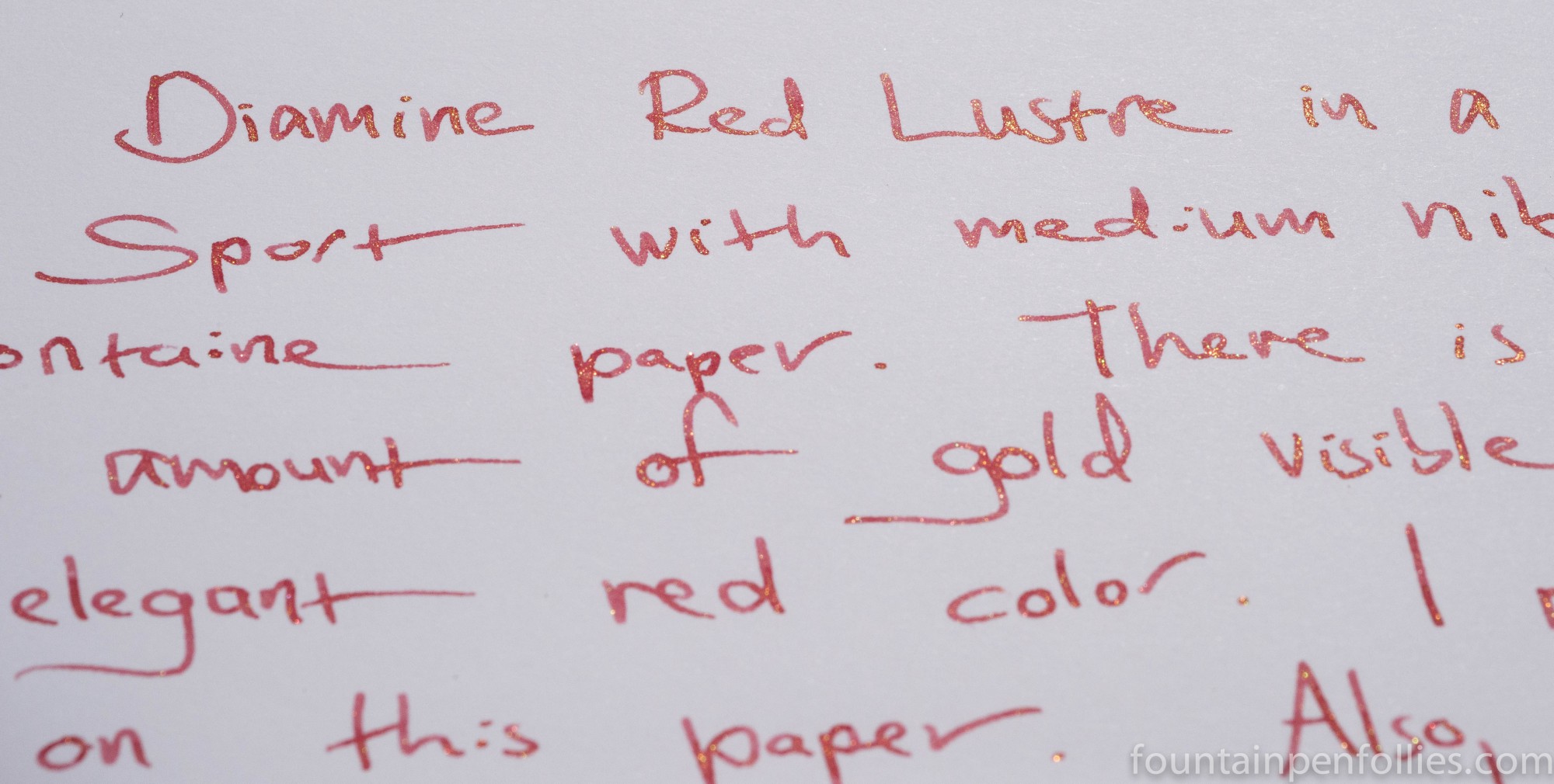
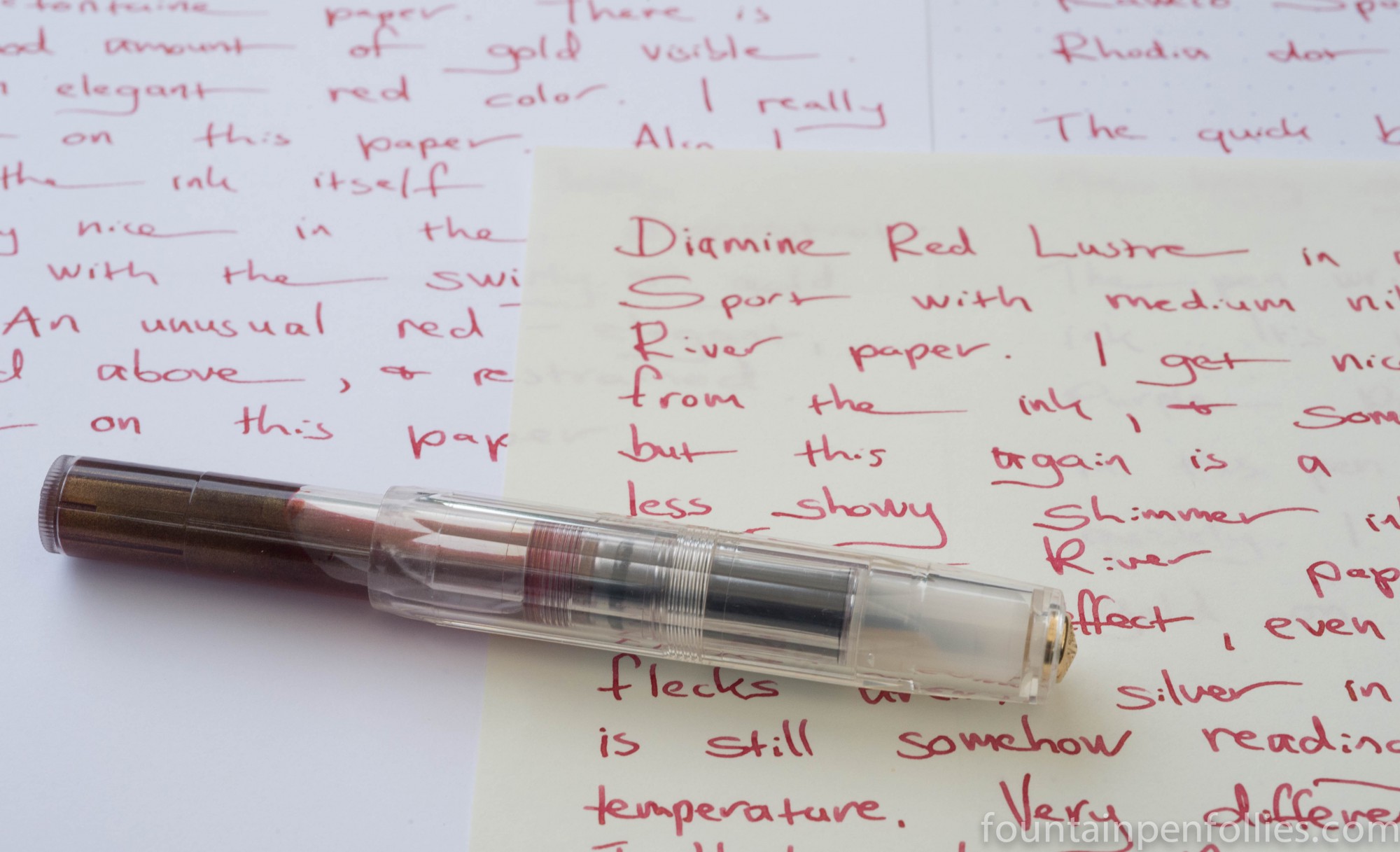
I used it in a Kaweco Sport with a medium nib, which is a more “everyday” nib. I thought it worked well with the thinner nib, which is a credit to Red Lustre. The ink behaved very nicely, starting up immediately and flowing well, but drying fairly quickly.
Here is Red Lustre on Clairefontaine paper, placed in direct sunlight to show the gold shimmer.
Here it is, not in sunlight, with Rhodia dot paper.

Next comes Red Lustre on Tomoe River. Had I placed the paper at an angle you would have seen the gold, but this straight-on view instead shows the color of the ink in normal light.
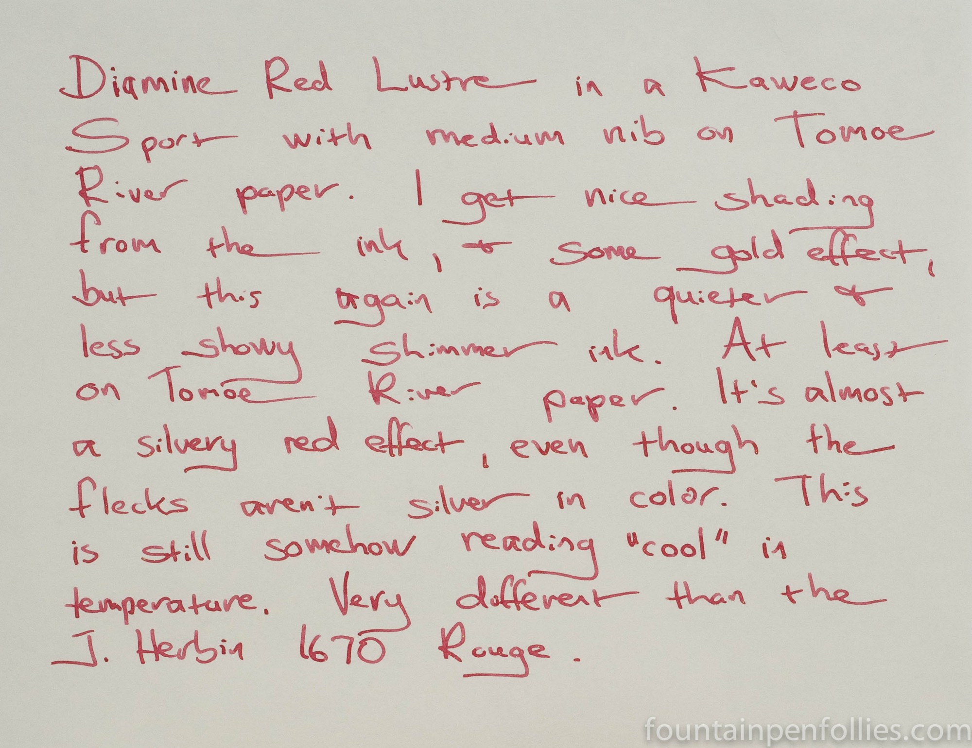
As you can see, Red Lustre is a light-to-medium shade of red. I think the gold actually lightens it and lifts it. For some reason, even though the particles are gold, I feel like the red looks a little silvery. I like that. It’s unexpected. Red Lustre is calm and almost understated — those aren’t terms I would think to apply to most red inks, with or without gold shimmer.

Yes, I did, both Blue Lightning and Red Lustre. With Blue Lightning, the shimmer comes through nicely and it’s not particularly feathery. On poor paper, Red Lustre is susceptible to feathering but the ink color darkens and the shimmer is even more noticeable. With the feathering possibility, I would probably sample these first if you are going to have to use them on bad paper.
LikeLike
I like understated, cool tones. Have you tried this one on ryn of the mill, everyday copy paper? Does any of the shimmer come through, or does it come out flat?
LikeLike