
Blue Lightning is subtle. The silver particles don’t jump off the page, perhaps because silver complements, rather than contrasts with, the light blue color of the ink. But the silver particles lend the ink a depth and richness, and almost a three-dimensional effect. The look is not glittery, but more like the glow from the inside of an oyster shell. I think this ink really does shimmer.
Here is a closeup on Clairefontaine paper, which gives the best sense of its luminous quality.

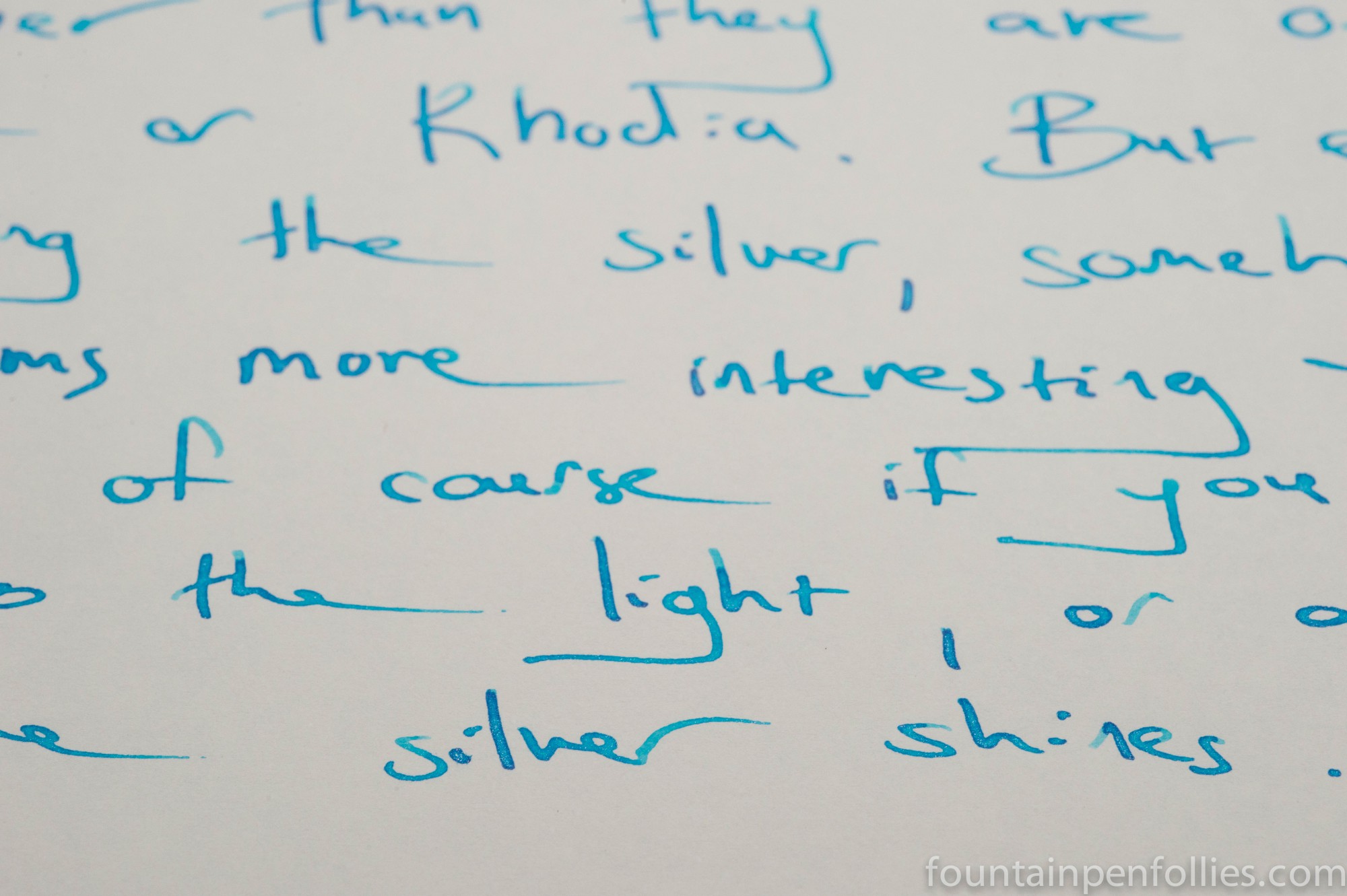
And here, on Rhodia dot paper.

Finally there is Tomoe River paper. Blue Lightning is less showy on Tomoe River than many inks, but if you hold the paper up to the light at an angle, the silver does shine. I didn’t do that for this photo, however, choosing instead to show how it usually looks.
Blue Lightning is quiet. It will not wow, so if that’s the effect you want, another ink will better suit. But I found it unexpectedly interesting, as well as beautiful. It reveals its qualities slowly. It’s now on my to-buy list.
The Pelikan proved a nice choice for the ink. Ink flow has been smooth, with no hesitation in starting, and the silver particles seems to be evenly distributed from the nib.
There are some excellent and more complete reviews of all the inks on Fountain Pen Geeks and Fountain Pen Network. This link will take you to one for Blue Lightning.


I have swab tested all of my Diamine samples next to Blue Lightning and IMHO Havasu Turquoise is the closest.
LikeLiked by 1 person
Hey there, would you know what’s the closest non-shimmer ink that matches the blue of this Blue Lightning? I love how vibrant it is, but I can’t really tell on my computer which Diamine Ink matches it!
LikeLike
My guess would be either Aqua Blue or Turquoise. Beau Blue is another possibility, but I remember that as fairly light in color. Hopefully someone with more expertise in the light blues and turquoises will chime in. 🙂
LikeLike
Do the sparkly bits stay on the page if the papers are shuffled?
LikeLike
Hi Bob, the short answer is yes. You can remove a few ultra-tiny fragments of flakes if you rub your finger across the paper, but that is all. Shuffling has no effect. The shimmer effect also survives when a letter is folded and mailed, and then unfolded and read. It seems very stable.
I’m happy to say that is not at all like children’s glitter, which sheds and goes everywhere.
LikeLike
This is one of my favourites. Thanks for the excellent review.
LikeLiked by 1 person
I’ve been waiting for the day that another brand would have a go at an ink with shimmery bits like the Herbin 1670, and here it is! Only I guess Diamine have their usual lack of moderation and are doing the whole spectrum in one go instead of in a trickle like Herbin 😛
I agree, the bright white really makes this one pop!
LikeLiked by 1 person
Me too! I don’t have a sample of Blue Pearl, but I do have Shimmering Seas, which I will try soon. I’ve used four of these so far and liked them all.
LikeLike
Looks nice, but I am really looking forward to the Blue Pearl ink.
LikeLiked by 1 person