
Indigo Blue is the second De Atramentis blue I’ve reviewed this week, along with Jeans Blue, and the third medium blue ink when you add KWZ Azure #5. De Atramentis and KWZ may be less well-known than larger ink makers, but these three blues are all very fine inks, in my opinion. Here are all three together.
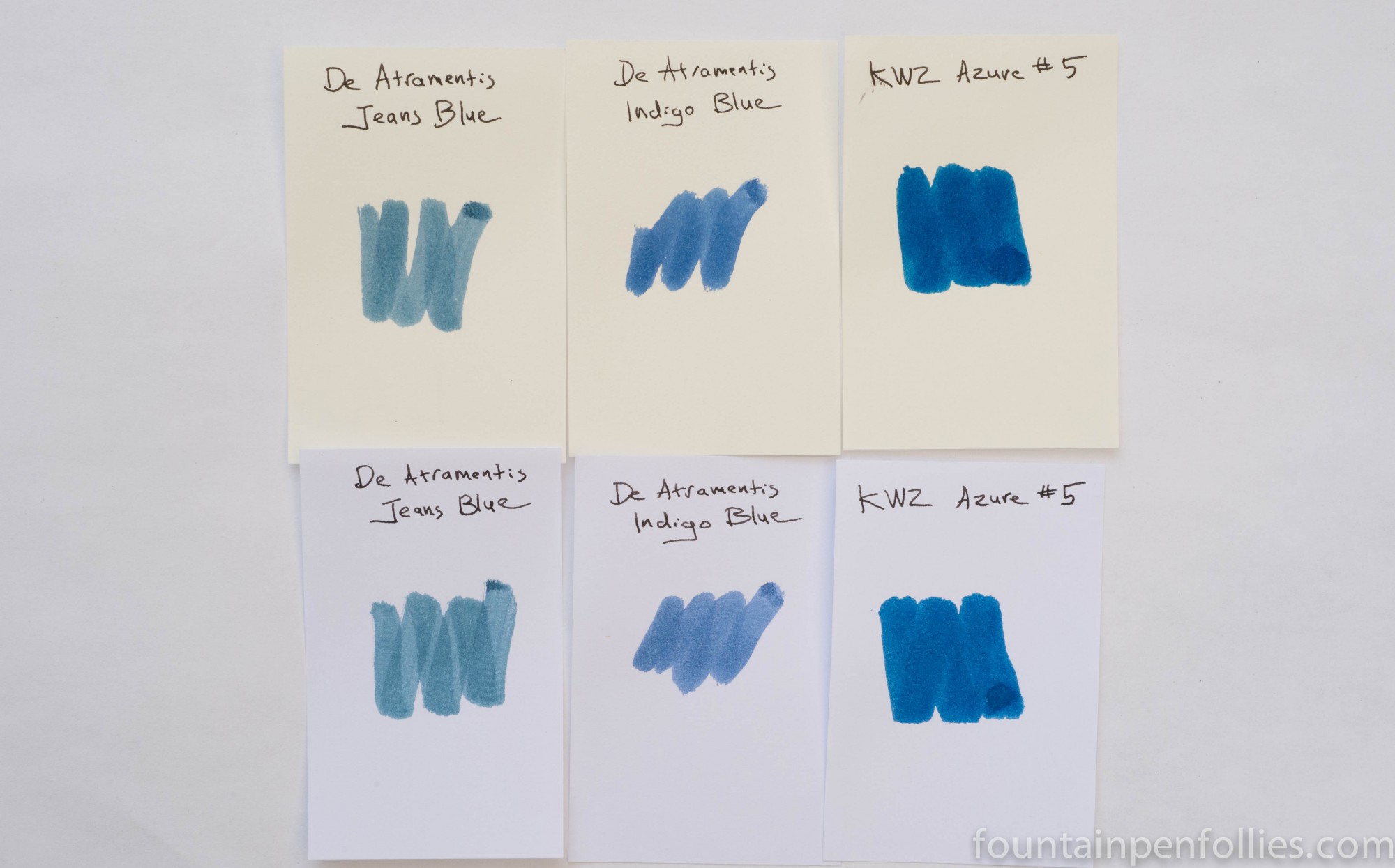
Indigo Blue’s color surprised me. From the name, and the color chip De Atramentis had online, I expected something darker. Also, to me the name “indigo” connotes a blue that leans purple. In real life the color is softer, lighter and there are no red tones. It is a blue blue.
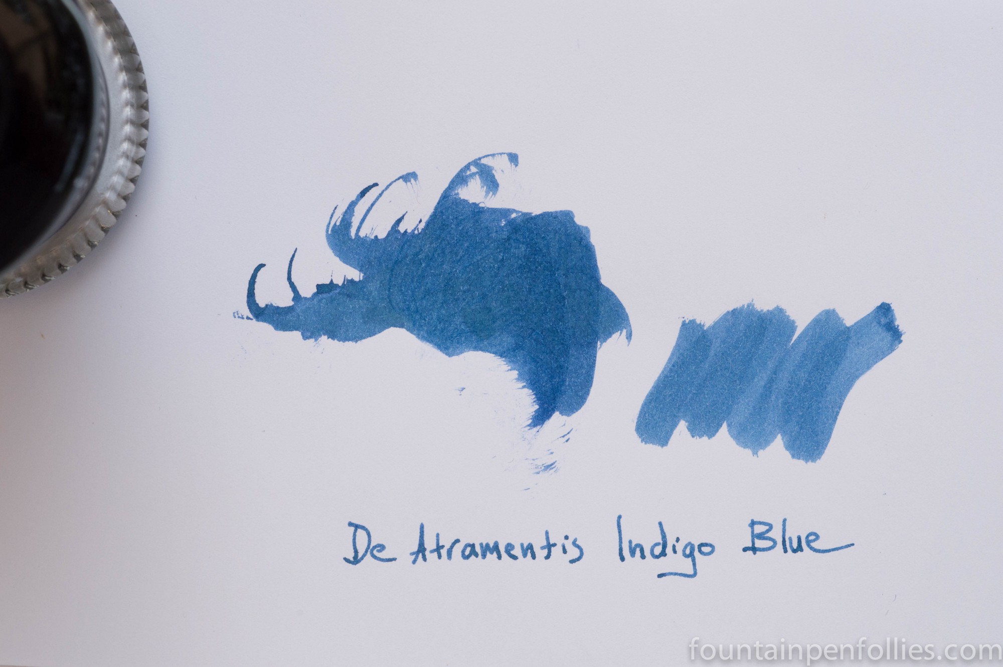
Indigo Blue feathered just a bit on my cheaper, made-to-feather paper, but its performance was well within the normal range; even Pelikan Brilliant Black feathers a bit on that paper. Indigo Blue has absolutely no water resistance on smoother, nicer papers, but on cheap, absorbent paper it does soak into the fibers. It seems like a very low-maintenance ink: it cleaned up from my pens incredibly quickly with only water.
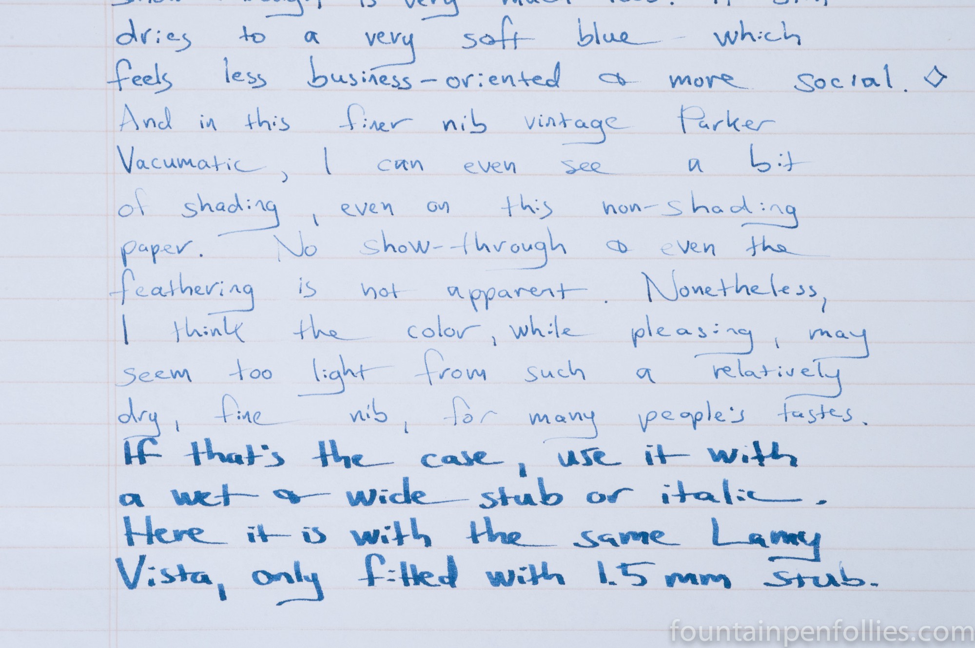
I think Indigo Blue flows on the normal to dry side. I had to work a little harder to match it with the right pens. With an older Waterman Laureat and a vintage Parker Vacumatic, Indigo Blue was lighter in color than I like, and harder to read. A dry nib just does not show off the qualities of this ink, especially on more absorbent paper.
Here is Indigo Blue on Staples Sustainable Earth paper, written with the Waterman Laureat, Parker Vacumatic and a Lamy Vista with 1.5 mm nib. In the Vista with wet flow and a wide nib, it looks like a completely different ink than with the first two pens.
With wetter pens, the extra ink flow brought out a darker, attractive color that was easy to read and really popped off the page. So Indigo Blue looked and behaved wonderfully in my vintage Pelikan 400 with OBB nib. And that nib is so wet that I usually need to tame it with iron gall ink. Indigo Blue also worked perfectly in the Lamy Vista that I had previously modified for more ink flow. I liked it in the Vista with nibs from fine to 1.9 mm stub.
Here is Indigo Blue on Rhodia, starting with the Vac, then the Laureat, the Vista and the Pelikan.

Of course, the wetter the pen and the wider the nib, the more time Indigo Blue will take to dry. With the Pelikan 400 OBB, on Rhodia paper, it took about 20 seconds for the ink to dry fully. And I think the color was well worth it.
Indigo Blue will sheen with wider, wetter nibs on Tomoe River paper.

Here are some ink comparisons, including Parker Quink Washable Blue, which is another pure blue. As you can see, Indigo Blue is much darker than the Quink.

And again, Indigo Blue with some other medium to dark blues. Indigo Blue has the liveliest and the bluest hue of this particular foursome.

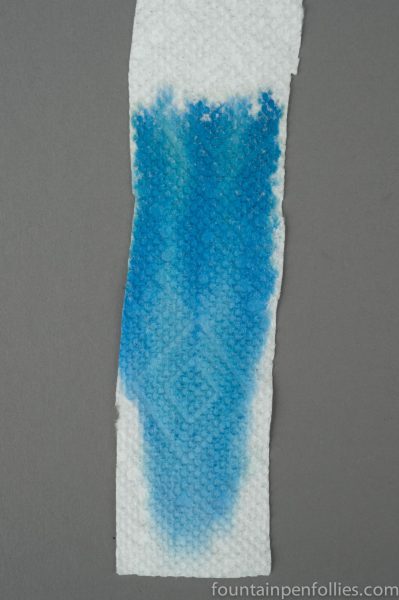
I was surprised when I did ink chromatography on Indigo Blue, to discover a tiny amount of blue-green almost hidden among the blues.
The nice thing about Indigo Blue is that in a wetter pen it can provide a color you’d normally see in more saturated inks, while still having the easy clean-up of a lighter color. I’m targeting this for fire-hose vintage pens like some of my Pelikans and Parkers.

Look at those ink chromas! I know I’ve said it before but I love that you include these 🙂
On the cream paper it does look vaguely jeans-y (like dark jeans) but still, not indigo, which I too picture as a bit more purple-y.
LikeLike
Great review. Thanks.
LikeLike