Sailor Manyo Inks

Sailor Manyo Ink

Yo, Manyo. Looks like Sailor is giving us even more new inks. This Manyo collection is coming later in the fall, to pen and ink dealers outside Japan (per my own ink dealer, Dan Smith, the Nibsmith).

The Manyo inks come in Sailor’s new square bottle, the 50 ml size, at the MSRP of $24. Now the Nibsmith is listing them for sale at $19, which in the new world of premium ink prices, isn’t bad. It’s 50 ml. The price is better than my new Penlux inks ($26 for 50 ml, albeit limited) and much better than Sailor Ink Studio inks and Bungubox inks in 20 ml bottles.

And, I hate to say this, but, I kind of … like them all?

Well, of course I would. But they are a nice range, like the Pilot 100th Anniversary inks. They look nice individually and together.

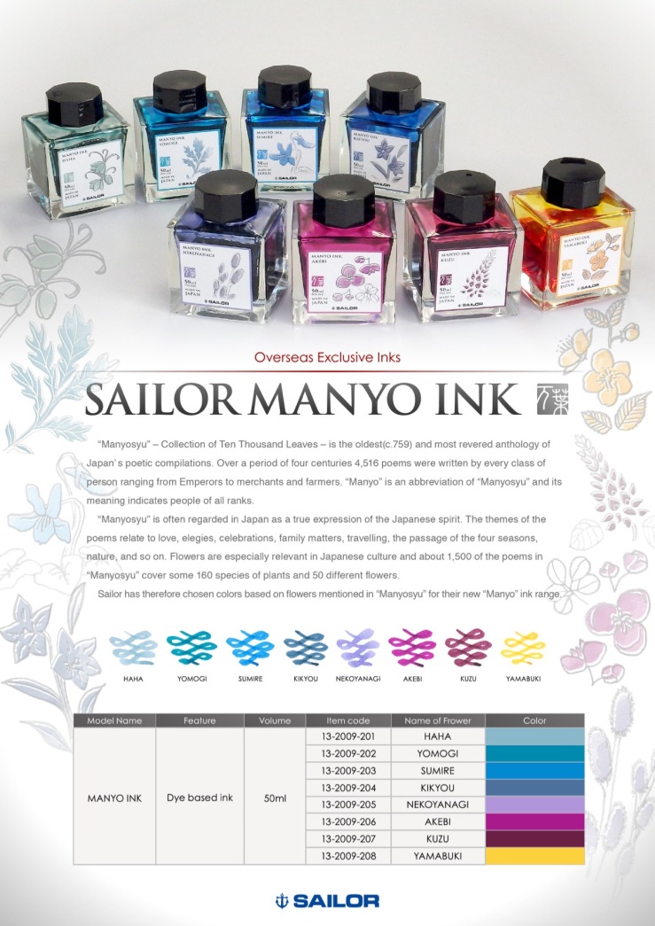
Now, I’m not clinically insane. I’m not going to buy the Yamabuki (Saffron), because I just don’t use yellow-gold inks to write. But it does look nice; I could see artists wanting it. Personally, I can resist the three inks in lavender, magenta and interesting purple/burgundy shades, because as lovely as they look, these aren’t colors I use. But they look good. In fact, the lavender one (Nekoyanagi) is so captivating I almost want it. And the burgundy one (Kuzu) could prove to be a lower-priced alternative to Bungbox Sweet Potato Purple.

But my sweet spot is blue and blue-ish inks, so I’ve preordered the four on the left. I predict the one I like the best will be Haha (Glacier Blue), be still my heart; and the one that will be most popular will be Yomogi (Cerulean Blue), because it’s in the teal range that everyone loves.  Sumire is like Sailor Sky High and Sailor Souten, so it’s bound to be pleasing. Lastly, Kikyou (Mariner Blue) looks perfect to me as a work ink that I’ll use often. I love a blue-black with a greenish tint.

Here is  a closeup of the swatches, just flagrantly stolen from the Nibsmith site.
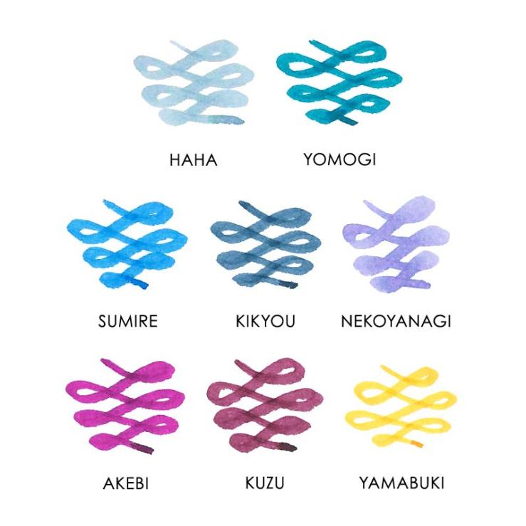
Sailor Manyo Inks

Sigh. Sailor is just unstoppable. I want them to stop, intellectually. But maybe not deep inside.

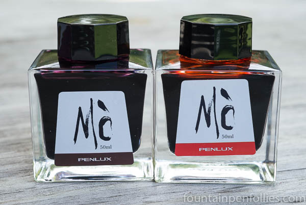
Mo Ink, No Mo Problems: Penlux Mò Tangerine and Plum

Penlux Mo Plum and Tangerine

My two Penlux inks arrived, and they are just lovely.

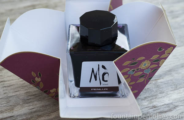
Obviously I’m over-inked, but I have to say, I’ve enjoyed the presentation of these just as much as the ink. The Plum, as I mentioned the other day, is a not-annoying shade of purple that purple fans are bound to really enjoy, since I, a purple foe, don’t mind it at all. The presentation, from folding box, to square Sailor bottle, to attractive label, makes a beautiful object that I’ve kept on my desk just because I like how it looks.

Penlux Mo Plum box

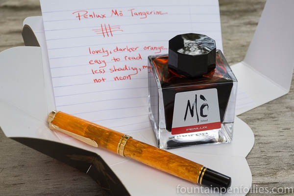
Tangerine is a very nice orange ink, not a color I use very much, but a color I love to see in  demonstrators, and even in the bottle.

Penlux Mo Tangerine

I put Tangerine in my Vibrant Orange Pelikan M600, and can attest that it’s a nice orange ink. This one I’ve actually been using. It’s good to circle the really important part of notes. No nib crud (so far), good flow and no hard starts.

I like a lot of orange inks, especially from Caran d’Ache and Sailor. But among orange inks, this is a very usable one. It’s mixed by Sailor, so I think I see Sailor’s lovely tints of yellow and blush pink in there, but it’s also darker and shades only a little. It’s easy to read and not even a little eye-searing.

Penlux Mo Tangerine writing sample

Even though I mostly use blue and black inks, and pens that are “good users,” it’s nice to also have some things that are less utilitarian than visually stimulating. I’ve gained much enjoyment from this lovely package.

Penlux Mo Tangerine

One Minute Ink Review: Penlux Mò Plum

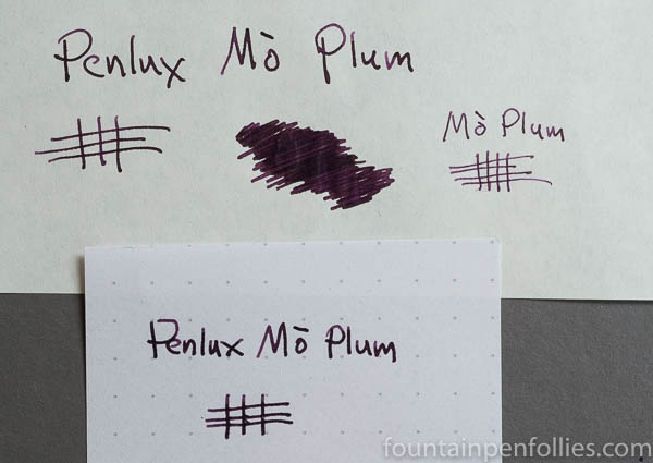
Penlux Mo Plum writing sample

Penlux Mò Plum. I don’t like purple inks, so explain why I ordered this one right after trying it yesterday at my pen club? It’s really attractive. And, because it’s made by Sailor for a store in Taiwan, it’s somewhat limited.

The color of Penlux Mò Plum is a dark plum. With just a hint of shading, it looks good in a fine nib and is dark enough for work. Penlux Mò Plum is like a darker, more saturated, and, I’d wager, slightly bluer, version of the wonderful KWZ Brown-Pink. That probably also helps explain the instant appeal to me.