How Fine is a Pelikan M600 Extra-Fine Nib?

How fine is the Pelikan M600 extra-fine nib? Not very! At least, not “very fine” in the sense of “narrow.” But “very fine” in the sense of “excellent.”

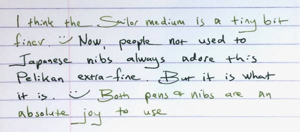
I happen to have a Pelikan M600 with extra-fine nib inked up at the same time as a Sailor 1911L with medium nib. The two pens have different inks, but here’s a comparison writing sample.

Pelikan extra-fine nib writing comparison

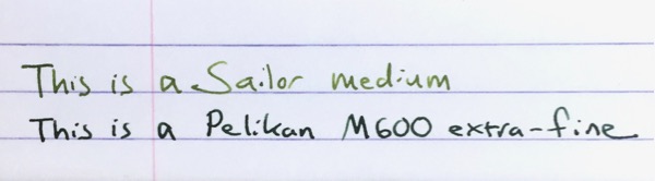
I’m not particularly surprised by this. I often use two modern M600 Pelikans with extra-fine nibs, and I always jokingly call those nibs “alleged extra-fines.”

Partly that’s because I tend to think of nib widths in line with vintage Parkers and Pelikans, and modern Japanese pens — all of which run narrower than modern Pelikan gold nibs. But also because I use a lot of modern Pelikan fine nibs, and I find those pretty darn close to Pelikan extra-fine nibs. In fact, I swear that a few of my Pelikan fines write a narrower line.*

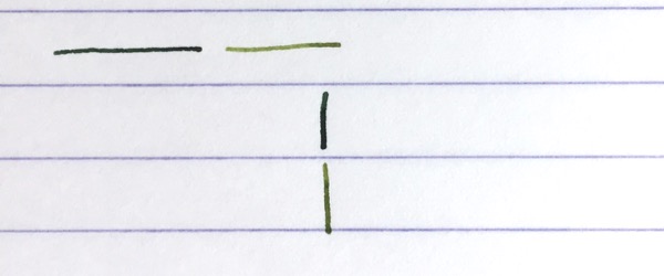
Here’s another writing sample. The Pelikan gold extra-fine uses the dark green of Pelikan Edelstein Olivine, and the Sailor medium is inked with the lighter green of Sailor Waka-Uguisu.

Pelikan extra-fine nib writing comparison

I bring this up now because Pelikan has decided to start charging extra for their extra-fine nibs. They apparently implemented the price increase in Europe earlier this year, and it just reached the US with the M600 Vibrant Orange, which will cost $440 with fine through broad nibs, versus $476 with an extra-fine nib.

I’ve never bought many Pelikan extra-fine nibs. I tend to use vintage fine nibs and modern Japanese fine and extra-fine nibs when I want a finer lines. So my extra-fine nib needs are covered. But I don’t think Pelikan extra-fine gold nibs are bad, just because they may be wider. In fact, I think Pelikan’s gold extra-fine nibs are very good.

To me, what makes Pelikan’s gold extra-fine nibs good, and maybe a little special, is that they are extremely smooth and easy writers. I’ve noticed that people who don’t share my love of very narrow nibs always love my Pelikan extra-fines.

Modern Pelikan gold nibs are beautifully ground to almost float on the page, so you can write very fluidly with them, and they reward a light touch. That’s true for the extra-fine, as well. Sure, it may write wider than many extra-fine nibs, but it also writes wetter and smoother.**

Sailor gold nib also are beautifully ground, but at size medium and below, Sailor nibs feature a characteristic feedback. Instead of floating across the page, a Sailor nib feels more like writing with a pencil — it’s a different kind of smoothness. Or look to the extra-fine nibs of Lamy and Aurora: in those the extra-fine nib tends to have a smaller sweet spot and put less ink down on the paper. All these brands’s extra-fines will generally write finer than Pelikan’s gold extra-fine, but the experience is different.

So I can think of a lot of reasons why many fountain pen users prefer the Pelikan extra-fine.

And even though it’s not particularly narrow, I enjoy using it myself. I’m not sure it’s different enough from the Pelikan gold fine nib for me to buy another, given the price increase, but I’d heartily recommend it to those who don’t already own one, especially those who don’t necessarily seek the narrowest line possible.

Pelikan extra-fine nib writing comparison

————–

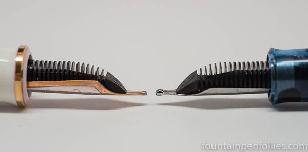
*Please note that I’m only talking about modern Pelikan gold nibs here. Modern Pelikan gold nibs differ from (i) the steel nibs found on pens like the M200 line, and (ii) vintage Pelikan nibs.

**There will be sample variations in any nib, so these are generalized statements based on my experience across a range of pens. Some individual extra-fine gold nibs from Pelikan may be narrower or dryer, than normal, or may exhibit other variances.

Richard Binder’s Nib-Smoothing Workshop at the Ohio Pen Show

Richard Binder's Nib Smoothing Workshop materials

One of the highlights of the Ohio Pen Show for me was a nib smoothing workshop given by Richard Binder, with help from Linda Kennedy of Indy-Pen-Dance and Brian Gray of Edison Pens.

I pre-registered and paid $20 for the materials, shown above, and for the workshop. There were probably about 18 slots for paid participants, but Richard let anyone else audit the class from seats in the back.

It was really worth it, and I highly recommend it. According to Richard Binder’s website, the next show he and Barbara will attend is Baltimore on March 3 through 5. If I were in the area, I’d keep checking Baltimore and other upcoming shows for the seminar.

Richard also has a wonderful website, and I’ve spent a lot of time over the years looking through the reference pages and the blog. You can find the reference pages here. A lot of what Richard talked about in the seminar can be found in his writings about nibs, just organized differently.

I can’t teach anything about nib work, myself, but I thought I’d share a few of the workshop’s biggest lightbulb moments for me, in hopes of helping someone else.

The workshop covered the basics of nib alignment, tip shapes and nib smoothing. Richard talked about the principles, then had us practice, while Richard, Linda and Brian walked around giving individual instruction.

I learned some interesting things about loupes. For basic nib adjustment and smoothing, Richard recommends a loupe between 7x and 12x. He emphasized that an unlighted loupe is better for nib evaluation and adjustment, to avoid reflections. If, like me, you already have a lighted loupe, just keep the light off when working on nibs.

The first step is to hold the loupe and pen in the right orientation. That’s basic, but believe it or not, it was also the hardest for me and the people around me to do consistently. Richard counsels that you should hold the loupe up to your eye and look straight ahead, at the wall essentially. Then you hold the pen in your other hand, at a 45 degree angle, nib toward the ceiling (at that 45 degree angle), with the top surface of the nib facing toward you and the feed side facing away. You move the nib in that position toward the loupe until the nib tip is in focus.

That was hard, for this rank amateur, because it felt odd: you’re only seeing a very small portion of the nib tipping.  My instinct, and that of most of us, if we weren’t being conscious of following the directions, was instead to hold the nib more straight on, so we saw more of the tipping material. Or even to bend our necks and look down at the nib from above, again seeing more of the tipping material. Before the class, I would have held the nib pointing straight up and with the feed directly facing me — which lets you see a lot of tipping material, but is pretty much the opposite of what Richard counsels.

Richard explained his reasoning: when you hold the nib at a 45 degree angle, with the feed facing away, and look across the top, what you are seeing is the part of the nib that touches the paper when a person writes with the pen at a 45 degree angle. You are forcing your perspective to be that of the paper. And that makes perfect sense. It was an aha moment. This way, you are checking that the nib is perfectly aligned where it hits the paper.

As an aside, not everyone holds a pen at a 45 degree angle — I for one write at a steeper angle. So keep that in mind. (It’s also really important to mention your writing angle when you’re asking for nib work, or buying a new pen from someone who’ll adjust it to your preferences.)

Another key lesson, that was helpful right away, because I bought something at the pen show, is to know that modern, newly manufactured nibs can frequently have issues out of the box. After the workshop, I knew enough to look at my new nib before trying it, and sure enough, it needed a slight adjustment in the slit alignment.

What is slit alignment? The slit in the nib should be tapered from the breather hole to the tipping, so that the slit is wider at the breather hole and narrower at the tip. And you should be able to hold the uninked nib up a light source, look through your loupe and see light through the (hopefully tapered) slit all the way along. If the slit alignment is not correct, you can adjust it by moving the tines gently with your finger nails. That’s fairly easy to fix, but I hadn’t really been conscious that I should check for it on new pens.

And that’s a key word: conscious. I think after taking the seminar I have a better sense of the nib and how so many little things come together in the writing experience.

Back at the workshop, we also practiced gently adjusting tines if they are out of alignment at the tip, by moving one of the tines. My practice pen gave me a run for my money there. It kept jumping back out of alignment when I smoothed the nib on the buff stick or the mylar sheet. In a way, that was frustrating, but in a way helpful, because I started to be able to tell right away when the nib was out of alignment again. There’s a distinct kind of scratch when one tip is above the other.

And that brings up another critical lesson: whatever you are doing on a nib, keep double-checking that the step you just took didn’t undo a previous step. For example, if you spread the tines for a wetter flow, make sure you didn’t misalign the tines accidentally. If you did, realign, then go back and double-check the flow. And so on.

Nibwork is clearly one of those things you learn, and improve, by doing. But I feel like having Richard Binder’s instruction gives me a solid base from which to go forward. It was very gracious of Richard, Linda and Brian to share their knowledge and time in this way. I think that’s the spirit that represents the best of the pen community.

Doubling Down: Pelikan’s Double-Broad Highlighter Nib Isn’t Just for Highlighting

Pelikan M205 with double broad BB nib

That is the Pelikan double broad nib I bought at the Ohio Show this weekend from Dan Smith, the Nibsmith. I put it on my M205 Blue demonstrator.

I don’t know if the size of that tipping material can be adequately appreciated, but there’s a lot. I call the nib The Blob. In a good way.

Here is a comparison of an M600 BB nib on the left with the M205 BB nib on the right.

Pelikan M600 BB versus M205 BB highlighter

And the other side, again with the M600 BB nib on the left and the M205 BB nib on the right.

Pelikan M600 BB versus M205 BB highlighter

I’m guessing that Pelikan wanted to make the M205 BB more round for highlighting. That said, I first tried a Pelikan M205 Highlighter fountain pen at the Chicago Pelikan Hub, and that nib was more stubbish than mine.

Having seen the nib, you won’t be surprised that it writes a gigantic line. It’s almost marker-like, and very smooth. It’s kind of fun writing with such a wet and wide nib. Also good for making your points forcefully. Or writing with yellow ink.

Here is a writing sample with the M205 double broad writing in blue and the M600 in pink.

writing sample Pelikan M600 BB versus M205 BB highlighter

The M205 has Pelikan Edelstein Tanzanite ink, which is a wetter ink than the Sailor Sakura-Mori in the M600. But the M205 double broad is just bigger, and it writes wider.

writing sample Pelikan M600 BB versus M205 BB highlighter

I’m a person who loves a good fine nib, but I think most fountain pen people prefer broader nibs, and this makes an intriguing choice. Because you can buy this one separately. And it will fit into any Pelikan from M200 through M700.

In the US it’s $60. Which means every else in the world it’s probably only $20 or less. (A little black humor, for those of us in Chartpak territory.)

I decided to buy the nib only. You could instead buy it on the highlighter pen. Or if you’re buying a different new M205, ask for the BB nib instead of the usual choices. I’d probably do that, if I ever bought another M200-sized pen, and I’d have the BB modified into a stub or architect’s nib. Because The Blob has tipping material to spare.

Looking Forward to 2016

DSC_7291

Boy, 2015 turned out to be a fun year.  What’s ahead for 2016?

I’ve got an amazing envelope chock full of samples from Konrad & Agnieszka at KWZ Ink.  I’ve swabbed them all.  They all look great, and  I’m super excited to use and report on these inks.  We’ve got iron gall and regular.  Some blues, reds and greens and interesting browns.  They all look fantastic.

DSC_7306

A few people have asked for a post about the pen that’s pictured in the blog’s banner, a Montblanc Agatha Christie.  I can do that!  It’s just a killer pen.  No pun intended.

DSC_7256

I’ve also got some Kaweco inks to review.  I’ve really enjoyed using these excellent inks.  I’d like to see more attention paid to small companies like KWZ and Kaweco that are putting out really great products at a great price.

DSC_6666

I’ve got some more fun nib grinds to show off.  One of my favorite things is to try something new.  These are pretty great.

On the Flip Side of the Nib

DSC_6897

Do you ever need your fountain pen to write a bit narrower?  Try flipping it over.

The photo above shows two Kaweco extra-fine nibs.  You can see that there’s still a little tipping on the top, or reverse, of the nib, but it’s smaller and thinner.  So the reverse of this extra-fine nib is an extra-extra fine.

(click Page 2 below to continue)