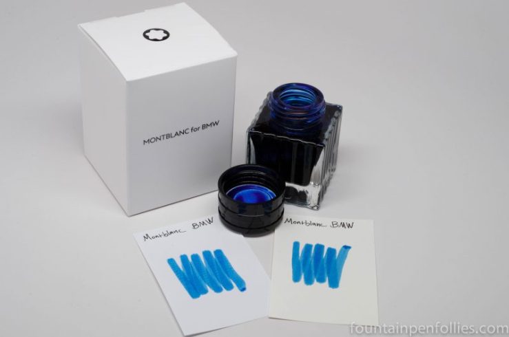
In need of an orange ink for a thread on Fountain Pen Geeks forum, I put Diamine Gerbera in a vintage Pelikan and started writing with it. And I like it.
(click Page 2 below to continue)


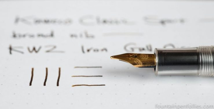
Kaweco Classic Sport with broad nib. Not so much a Pen of the Day this time, because I’m more interested in the ink, the new-to-me KWZ Iron Gall Orange.

If you read this blog regularly, you will not be surprised that KWZ Iron Gall Orange is not so much orange as brown. After all, this is KWZ, the imaginative ink maker that offers a black ink called Dark Brown and a fairly purple ink called Brown-Pink.
I look forward to putting Iron Gall Orange through its paces. This pen is my old reliable, the Kaweco Classic Sport, here with a broad nib.

At the end of a dreadful week in the news, I want to take refuge by delving into something utterly insignificant, but at least diverting. That would be ink. I’d like to talk about Jane Austen ink by De Atramentis.
I’ve always maintained that the least interesting aspect of any ink I review is how the color strikes me personally. Instead, I try to be more neutral. Everyone’s taste is individual, but there are certain objective qualities to note about an ink. Is it dry or wet? Does it shade? What does it look like on different papers?
But I’m going to step away from that model here. Because I knew the minute I inked up De Atramentis Jane Austen that I liked it, but didn’t love it. Further, what I like most about De Atramentis Jane Austen is that it’s named after one of my favorite authors. That presents something of a mild conundrum for me.
(click Page 2 below to continue)
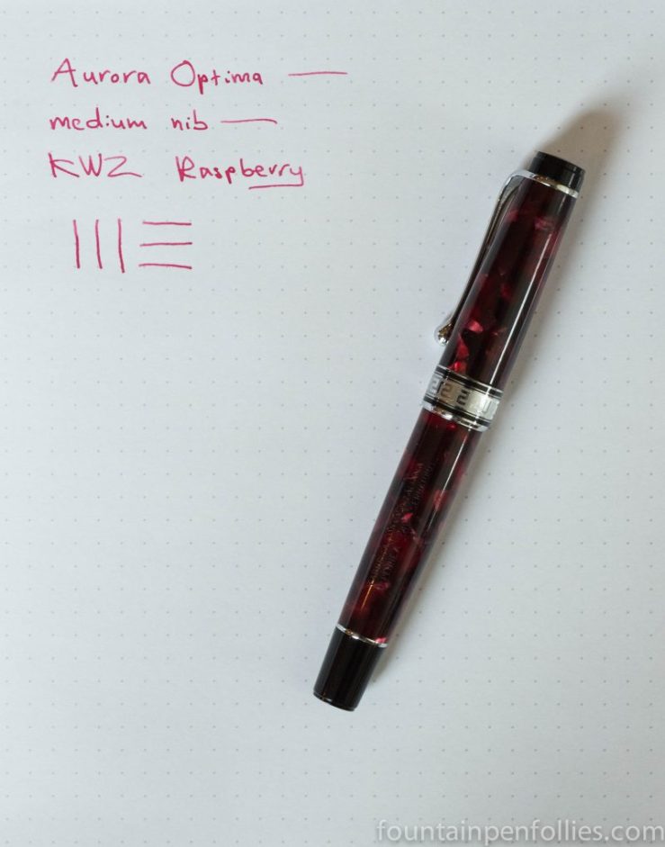
Aurora Optima Burgundy with medium nib. It took a good two weeks to kill it, but Blue Week is finally dead. All hail KWZ Raspberry.

This looks like a nice pink. Not bright or flashy, and neither sweet nor girlish. It’s the perfect antidote to an overdose of blue.
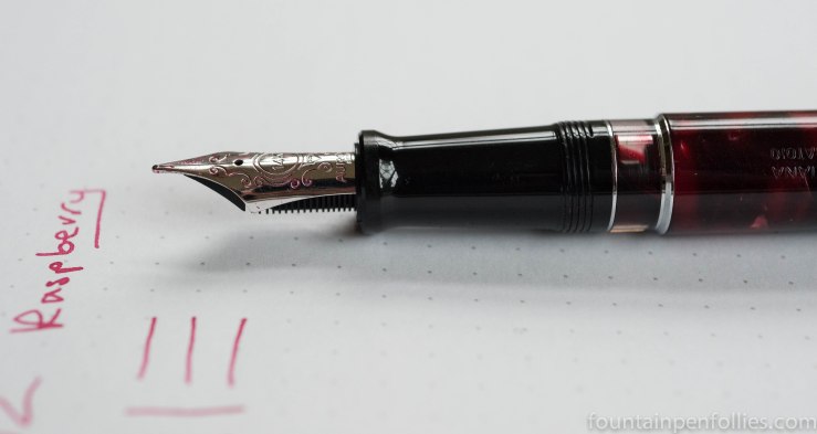
I use this lovely pen a lot. It’s part of my Red/Pink Triumvirate, together with a Pelikan Pink and Pelikan Ruby Red. The Aurora is the most dignified. And I like Aurora’s narrow sort of medium nib.

It’s been Blue Week here at Fountain Pen Follies for more than two weeks. Which surely has created a gap in the space-time continuum, because it seems that even the world’s biggest blue ink fan has grown weary of blue ink.
So I cleaned out three pens filled with blue ink, and searched for an ink that was appealing and not-blue. It took a while, but eventually I found a tiny amount of De Atramentis Jane Austen, left over from the Chicago Pen Show. And Jane Austen is one of my favorite writers.
I was very happy to put De Atramentis Jane Austen into a Pelikan 400 with OBB nib. It turns out to be a lighter forest green, with shading. Not perhaps my favorite color, though the shading is nice. And not the color that I would have chosen for Austen, who was acutely attuned to the comical and the absurd, whereas this ink seems very serious.
But maybe it has a Regency flavor. And it’s a nice color.
It’s an ink that seems to be on the dry side. That vintage Pelikan is a firehose, and the ink doesn’t look very dark, does it? So that could be nice for wetter pens.
Here’s a look at the ink from a different angle, because I think you can sometimes get a better feel for the color when you don’t think about what’s written. Also, shallow depth of field always makes a person feel artsy. Even if the reason for it was just dusk.

Jane Austen, incredibly, was born in 1775. Here’s what Anthony Trollope, another English novelist, said of her in 1870:
Miss Austen was surely a great novelist. What she did, she did perfectly…. She wrote of the times in which she lived, of the class of people with which she associated, and in the language which was usual to her as an educated lady. Of romance—what we generally mean when we speak of romance—she had no tinge: heroes and heroines with wonderful adventures there are none in her novels. Of great criminals and hidden crimes she tells us nothing.
But she places us in a circle of gentlemen and ladies, and charms us while she tells us with an unconscious accuracy how men should act to women, and women act to men. It is not that her people are all good; and, certainly, they are not all wise. The faults of some are the anvils on which the virtues of others are hammered till they are bright as steel. In the comedy of folly, I know no novelist who has beaten her. The letters of Mr. Collins, a clergyman in Pride and Prejudice, would move laughter in a low-church archbishop.
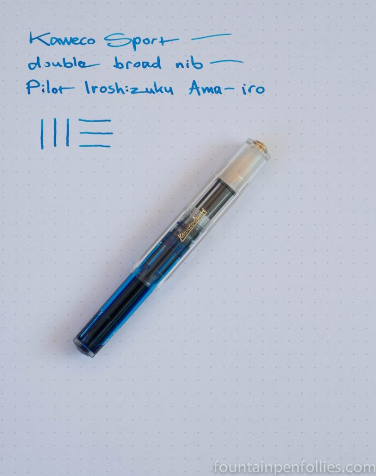
Kaweco Classic Sport with double broad nib. Here’s an ink I had never used, but I found a leftover sample vial with just a little bit remaining. That’s a perfect situation for the Kaweco Classic Sport. I don’t need to go through contortions to fill a Sport from a small sample — I can syringe whatever ink is left into the pen body or a converter.
Here is Ama-iro with the Kaweco double broad nib.

The Kaweco Sport also lets one easily swap nibs. So here’s Ama-iro from an extra-fine nib, for Fountain Pen Geeks forum.

But I’m in it for the bling, frankly. So for me the eyedropper is key. Especially when the ink is a beautiful sky blue like Ama-iro.

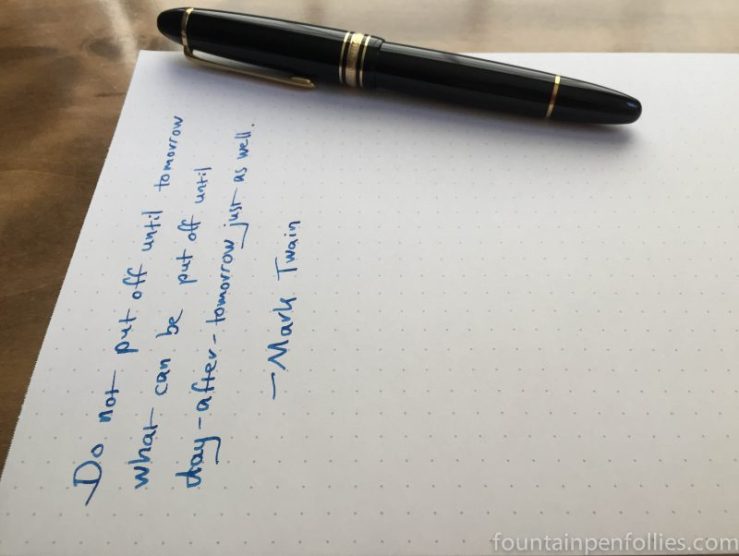
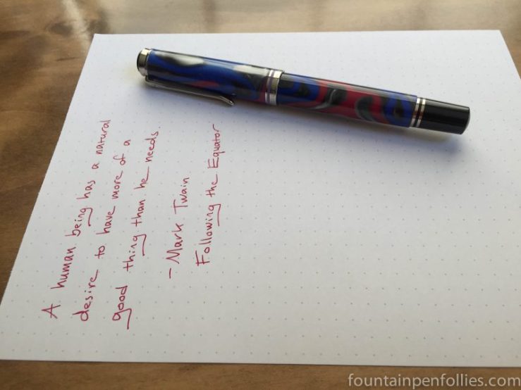
I have been in something of a reading funk for the last four months, but I recently found a book I sped through with a smile: a collection of Mark Twain quotes.
Like the foregoing, which is certainly my motto: “Do not put off until tomorrow what can be put until day-after-tomorrow.”
And this one, which encapsulates my pen and ink problem, but makes me feel better about it: “A human being has a natural desire to have more of a good thing than he needs.”
And then there’s this comment that Twain had Satan make to a newcomer to Hell.

I guess even in the late 1800s and early 1900s, we Chicagoans must have been enthusiastic civic boosters, and a little hard to take.
Ah well, we love our city. At least we’re number one.
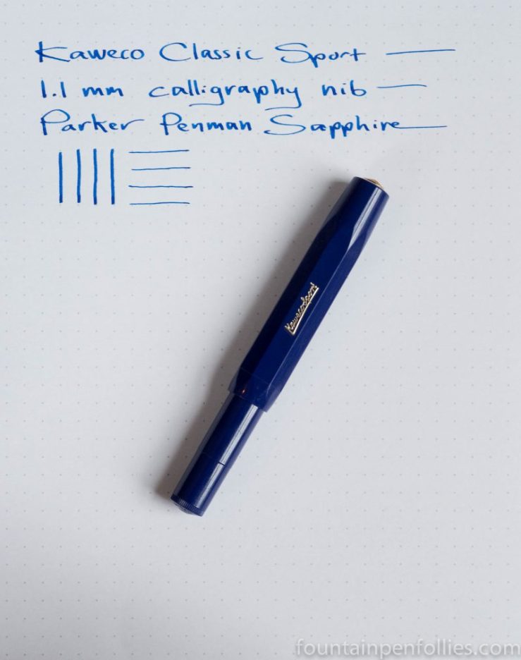
Kaweco Classic Sport with calligraphy nib. Again we have what’s really an Ink of the Day, but, shhh, don’t tell anyone. This is the sample of Parker Penman Sapphire a friend very kindly sent me.
Is it the world’s most beautiful blue ink?

The pen is my son’s Kaweco Classic Sport in blue, which is a very good pen at an excellent price. I swapped in Kaweco’s 1.1 mm calligraphy nib, which is a smooth writer with excellent line variation, and another real bargain.

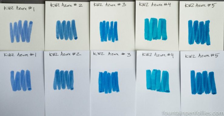
I have used and reviewed all five of the KWZ dye-based Azure inks, and I like the whole family, but I think we could use a sort of cheat sheet.
Here are links to the full reviews:
Together the five Azure comprise a nice range of blue inks that are low-maintenance and nicely saturated. Azure #1 kicks things off as KWZ’s traditional or standard blue, and it is the lightest and least saturated of the five. Azure #2 is a darker blue but still in the standard range. With the next three Azures, we get more fun, offbeat and vibrant shades of blue.
My quick summary goes something like this:
Most standard: Azure #1.
Most serious: Azure #2.
Most lively: Azure #3 wins by a whisker. But Azure #4 and Azure #5 also have a great kick.
Most uncommon shade of blue: Azure #4.
Most like Parker Penman Sapphire: Azure #3. Not a clone, though. Azure #5 has something of the PPS feel, too.
Best on poor paper: Azure #2 and Azure #5.
Most dry: Azure #2 and Azure #3.
Most wet: Azure #4 and Azure #5.
Best shading: Azure #4.
Best sheen: Azure #4.
Easiest to clean: They all clean out wonderfully easily.
Most water resistant: Azure #2. With a big “but.” On normal paper they’ll all soak in sufficiently. On fountain-pen friendly paper, none is actually water-resistant, but Azure #2 seems to survive the best of the five.
Best for a Lamy Safari: Azure #4. This is a category of interest to exactly one person in the entire world. But that would be me.
Most swoon-worthy: Azure #3 (more dry) and Azure #5 (more wet).
I think they are all excellent. I received samples of Azure #2 and Azure #3 from KWZ to do those reviews.