

Full disclosure: initially, I didn’t think much of Sepia Black. When I first excitedly dipped into the six new Platinum Classic inks, I hardly even noticed Sepia Black among its more colorful and dramatic siblings. The first two I tried were Citrus Black and Cassis Black, both of which I loved.
This time I thought I’d try one of the not-so-exciting Platinum Classic inks, so it was Sepia Black’s turn. I put it in my Franklin-Christoph 03 with medium stub. This pen has a stainless steel nib, which I felt confident using because the first two Platinum Classic inks have proven to be so low-maintenance.
In terms of behavior, I find Sepia Black just like Citrus Black and Cassis Black: beautiful shading; well-lubricated, though on the dry side, which means the ink starts up and flows well in a wetter pen, and feels smooth as it flows, but the output of ink is less than average. These Platinum iron gall Classic inks do best with wetter pens.
Here is a writing sample on Rhodia of Sepia Black. Words and music by the New Pornographers (“Play Money” from their excellent new album Whiteout Conditions).

Iron gall inks darken as they dry on the page and the iron gall component oxidizes. With Citrus Black and Cassis Black, that effect is dramatic and also involves a most excellent and entrancing color change. Sepia Black is milder: at least with this pen, the ink does darken, but on most paper not a huge amount.
Now, a much wetter pen would make the ink darken more — see the results from my first look at the Platinum Classic Inks, linked above, when after dipping heavily, Sepia Black turned almost black.
But I don’t actually want that. Here is a writing sample on cream-colored Tomoe River.

When I used Sepia Black on cream-colored paper, my eyes nearly popped out of my head. Sepia Black didn’t seem as milquetoast after all. On white paper like Rhodia, it’s more brown, with a greenish tint. Whereas on cream-colored paper like the Tomoe River, it looks more green
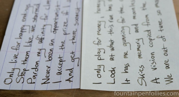
Same pen, same ink, different papers.
Okay, I love inks that look different on different paper, and I love the odd green-browns and brown-greens. In fact, it was an odd green-brown called Stipula Verde Muschiato that awakened my interest in fountain pen inks in the first place, making me realize how special some could be. (Nine million dollars ago.)
So Sepia Black: not boring, just quiet.
It performs beautifully on very poor paper, one of the strengths of iron gall inks. Sepia Black resists feathering, showthrough and bleedthrough incredibly well, even on terrible copy paper. Here is a writing sample on my everyday (not terrible, but lower-quality) Staples Sustainable Earth legal pad paper.

As an iron gall-based ink, Sepia Black also has good water resistance.
Here again is the test of all of the inks on Rhodia paper, which is the hardest test for water resistance: Rhodia is fountain-pen friendly precisely because it does not absorb all the ink.

Though some of the dye runs off Rhodia after running water over it, Sepia Black remains legible. As all six of these inks do. Water resistance is even better on regular paper.
I always test inks for ease of cleanup, but I haven’t yet here. I feel confident that it will be as at least as easy-to-clean as Citrus Black and Cassis Black — which were very easy. But I’m not done with Sepia Black yet. It’s the Precious. That’s perfectly normal, right? I’m going to end up just fine, right?
Here is a swab comparison of Sepia Black with three favorite brown inks I have that fit in the sepia category.

Sepia Black obviously has a very different hue than these more gray inks.
I also pulled out my two favorite soft, natural greens, as well as Sailor Jentle Rikyu-Cha, darker than these but so many people’s favorite green-brown.
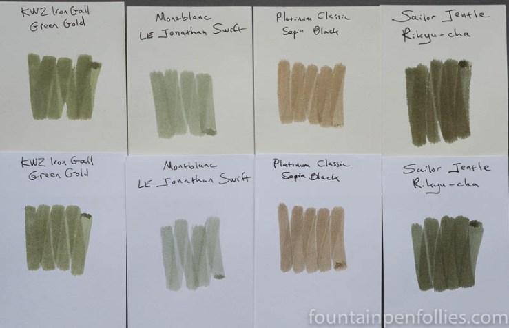
I could do green swab comparisons all day, but the results will be the same. Sepia Black is browner than these three inks, and also browner than my other unusual green-brown inks like Stipula Verde Muschiato.
Looking at both sets of ink comparisons, if we just compare Sepia Black to the ink on the far right of each array (Sailor Kobe Sepia and Rikyu-Cha), what stands out, beside a different hue, is that Sepia Black is much lower in saturation than either of those Sailor inks.
But look only at the first three inks in each array, and you’ve got closer comparisons in saturation, and feel, to Sepia Black. But again Sepia Black differs in hue. What these inks share with Sepia Black is the muted, natural feel — the softness.
If you like this kind of soft and natural color, Sepia Black is another ink to add to the list. It’s a beautiful mousy brown with green. Or a beautiful mossy green with brown, depending on the paper.
There may well be fourteen other inks close in color to Sepia Black, but I don’t know them. Nor do I care: Sepia Black is the one for me. It’s also one ink that can do a lot, since there is so much variation possible with different papers and pens.

Excellent review. You outdid yourself on this review today. It is tempting to try, that is for sure. Nice color and I love highly lubricated inks!
LikeLiked by 1 person