

I freaked out, just a little, when I picked De Atramentis Document Red out of the box of misfit inks for this Ink Dip. I do not have a good history with permanent inks, and I have no use for permanent inks. So my first thought on seeing De Atramentis Document Red in my hand was, “stick it back in the box.”
The rule of Ink Dips, however, is: use the ink. But I did spend a little time looking for a pen I could sacrifice, if worse came to worst. Maybe you’ll understand if you look at De Atramentis Document Red ink, on the left, next to a regular red ink.

I like and trust the De Atramentis brand. I own De Atramentis dye-based inks, and have used a lot of them, and they’ve been good, safe inks I’d put in any pen I have. But De Atramentis Document Red ink looks like tempera paint, not fountain pen ink. It’s opaque.
So I wasn’t going to put this in an Aurora or Pelikan. I ended up choosing my JetPens Chibi with fine nib. It’s not that I don’t like the Chibi. It’s just that it’s the cheapest pen I have.
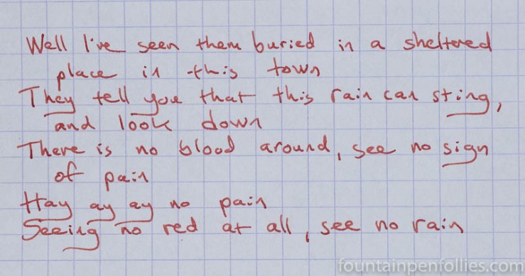
This is De Atramentis Document Red on cream-colored Tomoe River paper. Words and music this time by Peter Gabriel.

That color is more wan than red, but with one exception, discussed later, that’s what I got on every paper from Document Red — a pale, washed-out, creamed tomato-soup red.
What about the ink otherwise? All I know, courtesy of its title, is that Document Red is a document ink. Broadly speaking, that means ink guaranteed to be permanent for records. The De Atramentis website says its document inks are made for fountain pens. It also says Document Red is waterproof, lightfast, and (I kid you not) heat-resistant. I chose not to set fire to a writing sample to test exactly how heat-resistant.
Otherwise, the De Atramentis website, at least the English version, is as opaque as the ink when it comes to a description. There is no information as to what category of ink Document Red falls into. Some document/permanent inks are iron gall, some are pigment inks. Some could be something else, I suppose. In my experience, permanent inks can be harsher in pens, or a little harder to clean, and different kinds of permanent inks interact differently with different pen materials.
Absent identifying information, I found it hard to pick a safe pen for De Atramentis Document Red, or to judge how long to keep it inked. Hence, the Chibi, and for a week. A wild guess that would only cost me $3 if I were wrong.
Here’s the ink on Rhodia.
I do believe Document Red is pigment ink. This is based on how it appears, and how it behaves. It reminds me of Sailor Storia inks, which are pigment inks. But that’s only a hunch.
Document Red has a very strong chemical smell, which doesn’t inspire confidence when filling a pen, but wasn’t noticeable later when I used the pen.
In terms of behavior in the pen, however, Document Red was flawless. It flowed very well. It felt normally lubricated in the Chibi. The line it wrote seems the same as I usually get with this pen — not too wide, not too narrow. In the Chibi, which does have a fine nib, Document Red did not feather for me on poor paper, and showthrough was perfectly controlled.
Here it is on Staples Sustainable Earth, my normal everyday paper.

De Atramentis Document Red started up perfectly every single day, even when I’d left the pen unused for a day. I’m a skeptic, but in the pen I couldn’t ask for a better behaved ink than Document Red.
The color, however, killed it for me. I’m a red fan. But on almost every paper, Document Red is a very pale, very attenuated, almost-brown red. Dull and not even easy to read. Not vibrant, not fun — on almost every paper. The one exception is on copy or printer paper that is white.
Yes, on my worst paper, the color of De Atramentis Document Red became a nice, normal red.
I like that color. That’s a sports-car red.
To really see the difference between Document Red on bad paper and Document Red on fountain-pen friendly paper, here are the little water resistance test papers, before soaking.
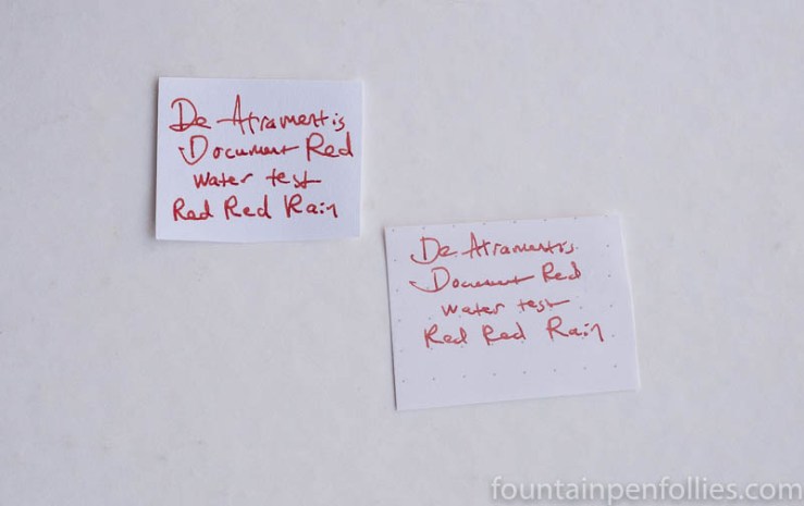
You can see how much more vibrant and attractive the ink looks on poor paper.
When it comes to water resistance, Document Red is perfect. Here are those test pieces after soaking in water.

If I wanted a pale red ink that would perform well in extremely wet conditions, or stand up to watercolor or wash, I couldn’t think of a better choice than De Atramentis Document Red. Especially if I were using the kind of paper that makes it look redder.
Pen-cleaning turned out to be better than I had feared, but results were mixed. Internally, not so bad. I did have to pull the nib and feed, and disassemble the converter, to get all the traces of ink out. But that might be the $3 pen’s fault. I think I got everything perfectly clean inside the pen with water flushing and a bit of scrubbing. That was after I kept Document Red inked for a week.
On the pen’s exterior, red traces remained on the section, where the ink appears to have dried onto the very end of the plastic Chibi section. I also found some red inside the cap, where the inner cap lining ends. A lot of scrubbing removed almost all the red from the exterior of the section. What little remains inside the cap seems stuck there under the lining.
I can live with that on the $3 Chibi. However, were I ever to use another one of these inks, I would continue to choose lower-value pens, maybe up to and including a Safari. I’d rather be safe than sorry.
Here’s paper towel chromatography, since I wondered if that would give me any clues to the ink’s contents.

It’s definitely not iron gall, which of course was obvious anyway. I suppose the pale color is due to all that light pink dye. Otherwise, nothing revelatory here.

Very thorough, informative and entertaining. It’s good to know the pros and cons of this ink. The sports car red sample looked nice. But the clean-up does sound “a little bit of an adventure” as you so beautifully put it:)
LikeLiked by 2 people
Early on in my FP ink obsession, I was looking for a vibrant red that was permanent and good on crappy paper for engineering print mark-ups. I grabbed a sample of this ink thinking: I need it for documents, so this should work.
I dropped it into my TWSBI, and boy was that a mistake. Not because it did anything to the pen, but because of the opaqueness of the ink itself! It was rather unsettling. Every time I looked at it, I had to remind myself that it wasn’t a solid mass in there.
Like you, I was completely underwhelmed by the color. And like you, everything else about it was fine. What I find interesting is that it was still the sad, pale red on our crappy white copy paper. What are the details of your crappy paper? For comparison, I’ll take a gander at what we carry at work. It would be interesting to see if there is a difference with crappy paper that seem the same on paper. (I suppose pun intended!)
LikeLiked by 2 people
Oh my gosh, I sympathize so much with your TWSBI experience. This ink calls for an opaque pen. 🙂
Unfortunately, I don’t know what this particular copy/printer paper was! I tried this on a bunch of “bad papers” — newsprint even — and it only looked nice on that one paper. It behaved well on all of them.
Perhaps I’ll add some DA Document inks in blue to our pen station ink array, to see if those have decent color. Or, actually, maybe I can see about getting samples of a few Sailor Storia inks for the ink station instead. Leveraging for the greater good my dictatorial power over the ink station (devious chuckle here)….
LikeLiked by 1 person