

Montblanc released Tolstoy Sky Blue ink in connection with its Writers Edition pen honoring Leo Tolstoy. Montblanc’s website states that the ink color refers to the color of Tolstoy’s desk. Well, pardon the pun, but color me intrigued.
Did Tolstoy actually own a blue desk? That would be not just awesome, but artistically resonant: it reminds me of Wallace Stevens and his poem The Man with the Blue Guitar: “Things as they are / Are changed upon the blue guitar.”
Stevens’s poem was supposedly inspired by Picasso’s painting The Old Guitarist, from Picasso’s Blue Period — a very beautiful, rather dolorous painting that is in the collection of the Art Institute of Chicago. “You have a blue guitar / You do not play things as they are.”
Alas, from what I could find on the internet, Tolstoy seems to have owned just a regular wooden desk, with a large blue blotter or desk pad on the writing surface. But I did enjoy the brief association.

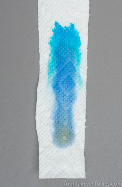
The ink color is medium blue, with the tiniest suggestion of green, I thought — although that turned out to be not exactly the case.
Here it is next to Montblanc Royal Blue from the regular line.

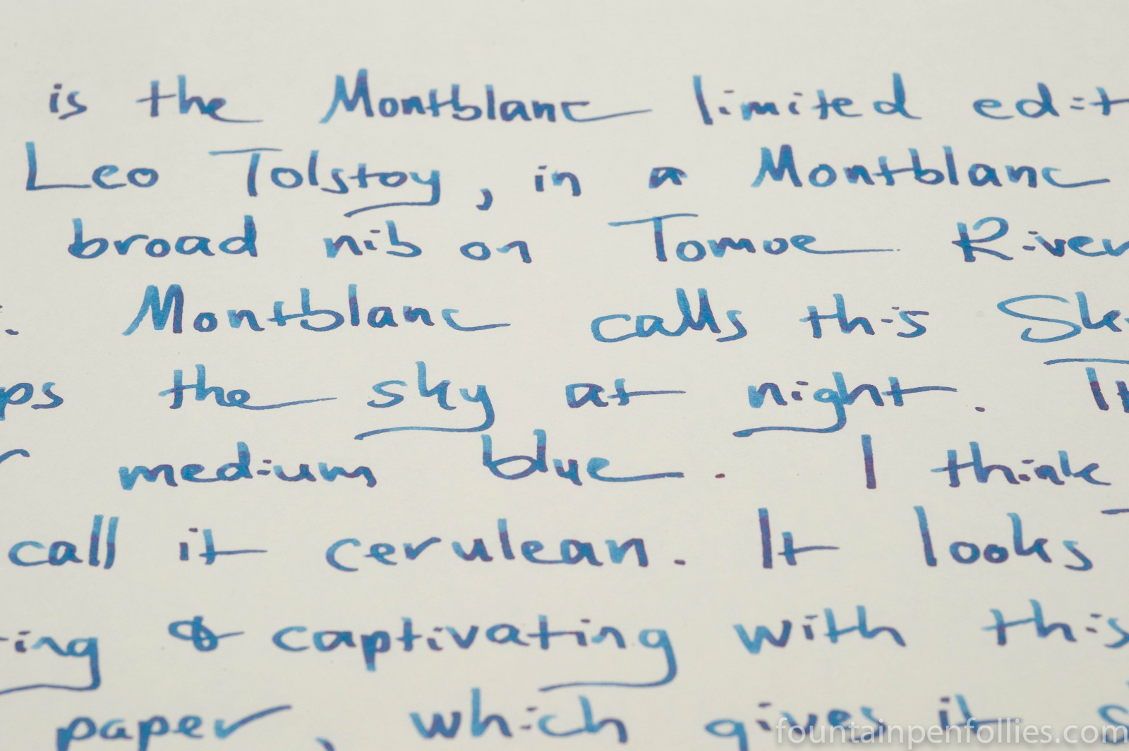
From a pen, as opposed to a swab, Tolstoy Sky Blue is a medium blue that I would describe as cerulean. Perhaps it’s like the sky at dusk.
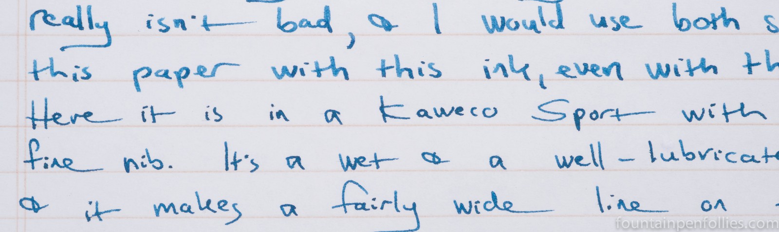
I used the ink in both a Montblanc 146 with broad nib and a Kaweco Sport with extra-fine nib. Both of those are fairly wet writing pens, but the ink color did vary between the two extremes of nib width.
The broad nib Montblanc 146 accentuated the ink’s shading and gave a slightly lighter medium blue color. The extra-fine Kaweco made the ink look darker. It has the saturation to asset itself nicely in an extra-fine nib. There was, however, less shading.

Tolstoy Sky Blue seems fairly easy to clean, but it is not very water-resistant. It behaved well generally, with nice lubrication and no rough starts. But it did not seem to like my ultra-smooth Clairefontaine Triomphe paper: I noticed inconsistency with both pens on the Triomphe. Some words or sentences could show slightly heavier ink flow than others, as you can see from the Kaweco in the photo above.
I wonder if Tolstoy Sky Blue might be too lubricated for Clairefontaine. Or perhaps neither pen was the right match with Tolstoy Sky Blue and Triomphe paper, and I’ll find a better one in the future.
On my everyday Staples Sustainable Earth paper, Tolstoy Sky Blue worked very well. Showthrough and bleedthrough were about average for this paper. There was the slightest tendency to feather here, perhaps, but the ink on paper still looked nice.
When I tried Tolstoy Sky Blue on Tomoe River, I got a surprise. Talk about changing things as they are: Tomoe River brought out not just the ink’s shading, but a hitherto unexpected red sheen.
The color is not exactly ground-breaking or revolutionary, but if I compared it to other inks I have, I didn’t see an exact match. The following swabs are arranged from the more green to the more blue.

In some ways, it resembles a Montblanc limited edition ink from a few years ago, Meisterstück Diamond Blue, although Diamond Blue is lighter in color. Here are the three Montblanc inks together.

When I did paper towel chromatography, it turns out that what I thought might be a slight green tint was really more of a grayed-down green tint. There is a bit of khaki in there.
I think Tolstoy Sky Blue is a good blue ink. I liked it both in the extra-fine nib, where it was stronger, and in the broad nib, where it was softer and shaded more. But this ink really sings on Tomoe River paper. If that is a paper you frequently use, and you like medium blue, then Tolstoy Sky Blue could be a must-try.

I’d want that ink alone just because it’s dedicated to Tolstoy… Glad I have Tomoe River!
LikeLiked by 1 person