

One of the Follies commentators mentioned liking Infra Red, so I put a sample in the cart when I placed my next order. I was sure I was safe: red is not really my favorite ink color. But sometimes the arrow strikes the target, and Infra Red did with me.
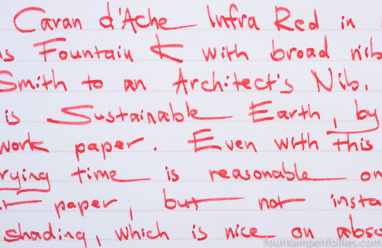
I used it in two pens, a Lamy Safari with nibs from extra-fine to a 1.5 mm stub, as well as a Karas Kustoms Fountain K with broad nib ground to an Architect’s Nib.
Infra Red is a friendly red, with a slight orange tint. It’s bright, but not painfully so, and it’s easy to read. Infra Red is a red with joie de vivre, but still a warm, comfortable, embracing red.

The ink worked well in both the wetter Fountain K and the drier Lamy Safari. It feels well-lubricated when you write with it, and has slightly wet flow. I did get a small amount of nib creep (ink migrating to the top of the nib), but nothing leaked into the pen cap.
Infra Red takes takes a bit longer than average to dry on smooth paper that’s fountain-pen friendly. In a Safari with medium nib on Rhodia or Clairefontaine, Infra Red dried between 15 and 20 seconds. Narrower nibs or absorbent paper led to shorter dry times. Once dry it was set.
Infra Red performed just fine on low-quality paper. Showthrough was almost non-existent on poor paper with regular nibs. Only with the wet, wide Architect’s nib would I not write on both sides of the paper. Infra Red also resisted feathering well. This is Infra Red on Staples Sustainable Earth paper with the broad Architect’s nib.
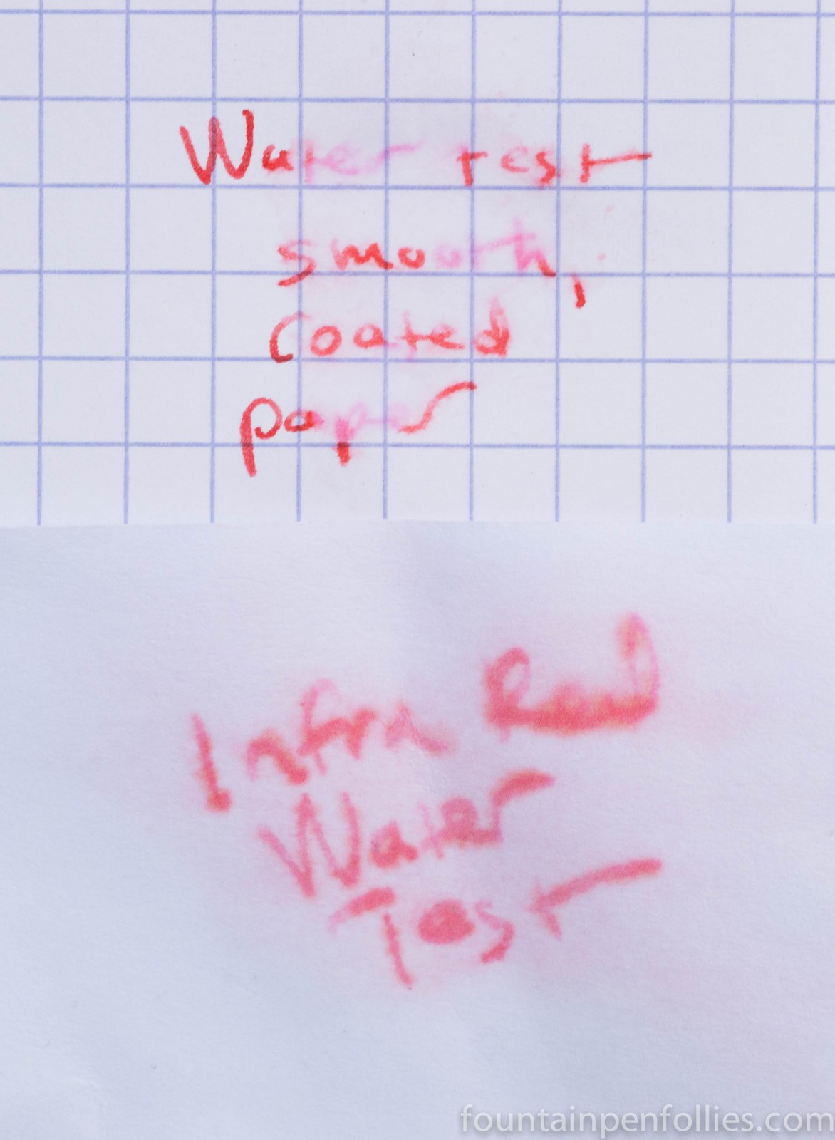
Infra Red has decent water resistance. On smooth, coated Rhodia grid paper, much of the dye runs off the area subjected to water drops, but enough pink remains to be legible. On normal paper, even after soaking a legible amount of ink remains.
I have only cleaned Infra Red out of one pen so far, the Fountain K. With that pen, cleanup was a breeze: I only needed to flush with plain water.
I thought Infra Red’s performance was good, but I really love its look. The shading is gorgeous, and it shaded with all pens and papers I used. It looks especially striking in a broad nib.

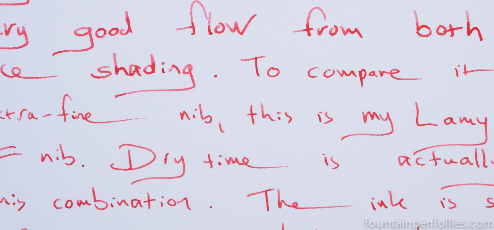
But Infra Red still has enough heft to be legible in the narrower Lamy Safari nibs. This writing sample begins with a Safari medium nib and continues with an extra-fine.
I personally prefer it on white paper, but here is how it looks on the cream-colored Tomoe River. This is written with the Fountain K and the Lamy Safari with medium nib.

Infra Red is more orange than a standard red, but it never reaches a full orange red. Here are some comparisons to show the range. On the left is Sheaffer Skrip Red, a nice standard red. Though Skrip and the Caran d’Ache have a similar brightness and cheer, the orange tint sets apart Infra Red apart, and I think mellows it out. On the right is Pilot Iroshizku Fuyu-gaki, a beautiful persimmon color that is a true orange-red ink.

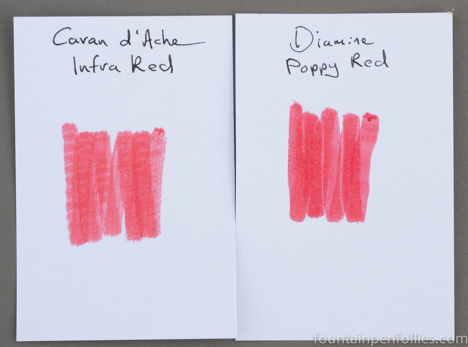
One ink I have that is very close to Infra Red is Diamine Poppy Red. I’m going to compare the two inks at length in a separate post. But in brief Infra Red is less saturated, shades more and is slightly more orange than Poppy Red. They definitely occupy the same color space, however.
Paper towel chromatography shows that Infra Red is a combination of bright pink, orange and a bit of yellow.
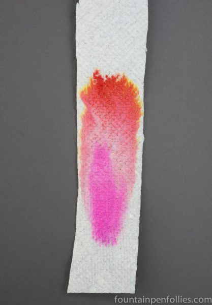
I think Infra Red’s warmth comes from the orange and yellow, and its liveliness from the pink. The mixture creates a delightful red that I really enjoy.

I agree. It’s a very nice ink
LikeLike
I only have a sample though
LikeLike