
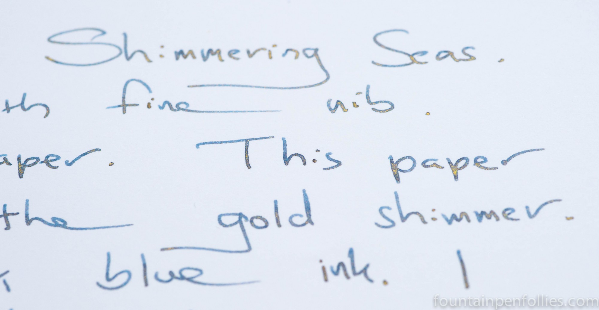
I put Shimmering Seas in a Kaweco Sport with fine nib. I wanted to try at least one of the Shimmertastic inks with a fine nib. These inks look so dramatic with broad nibs, it’s hard to resist testing them like that first. But in real life I use fine nibs a lot more.
Would Shimmering Seas work well in a fine nib? For my tastes, the answer was yes. Shimmering Seas flowed and started perfectly in the fine nib, and the gold flakes did shimmer. However, the shimmer was less noticeable on the page as a whole with a fine nib. So you’ll probably prefer a wider nib if you want more display from it, or from the other Shimmertastic inks. On the other hand, if you’re not sure about shimmering inks, using Shimmering Seas in a fine nib is a great way to dip a toe in the water.
Here is the ink in a fine nib on Clairefontaine paper. It looks a little darker than this in real life, but it is a blue black that leans gray, which is more obvious with the fine nib.
Here it is on Tomoe River with the fine nib.

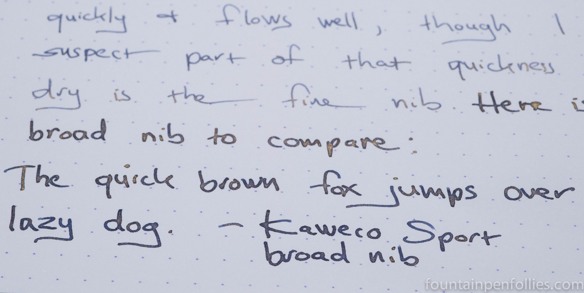
I later swapped in a broad nib, and here is Shimmering Seas with the broad nib on Rhodia paper.
And on Clairefontaine.

So this is an ink that can look pretty different in different pens. I think Shimmering Seas is easy to recommend, and would be fun to experiment with, because it can go from a fine nib to a broad, from a lighter amount of shimmer to a heavier gold appearance. And each variation looks nice.

This is a pretty sober-looking ink, considering the shimmer! It comes out so dark in the wide nib, it looks almost black. It’s not my favorite out of all the inks you’ve shown us this week, but I could still see myself using it because I love blue-black for extended writing and this is a blue-black with a ‘lil extra:P
I love how you match the pens to the ink a lot of the time! And this time it looks like you had the perfect color combo on hand 🙂
LikeLiked by 1 person