
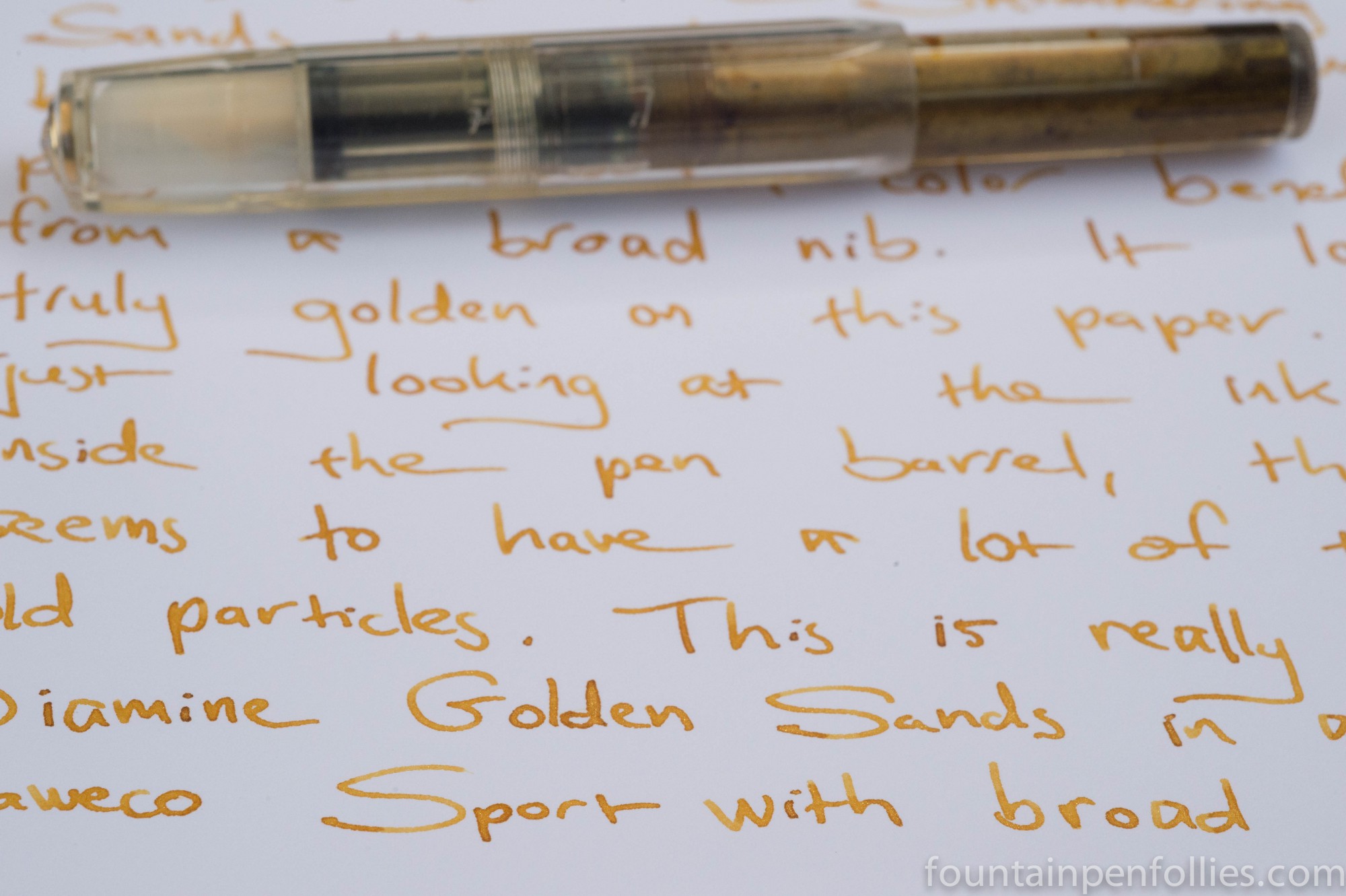
I put Golden Sands into a Kaweco Sport with broad nib, because it is such a light colored ink. My over-40 eyes probably couldn’t handle this from an extra-fine nib, unless it was used on dark paper, which actually sounds gorgeous.
The ink color is a golden yellow, but not a light yellow, more like a light golden brown. The golden particles deepen that, rather than contrast with it. The result is a lovely ink that is almost quiet and autumnal. Until the the page catches the light, and the ink starts to shine.
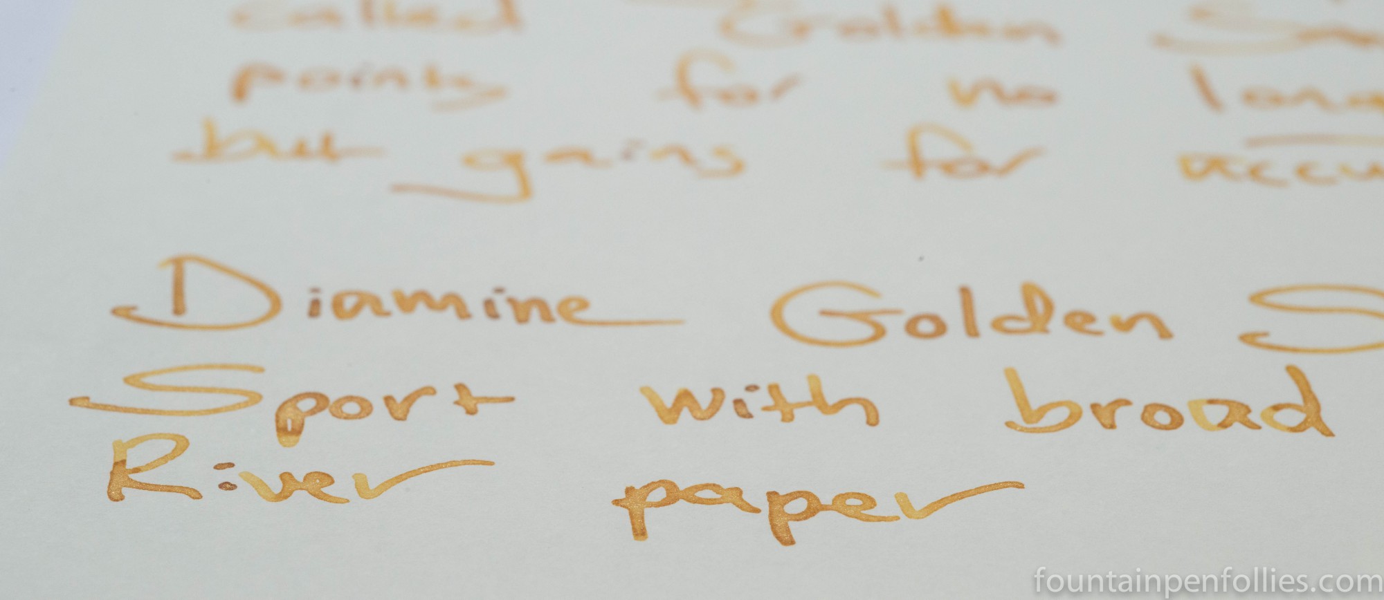
Here is what a Golden Sands writing sample on Tomoe River paper looks like in indirect light.
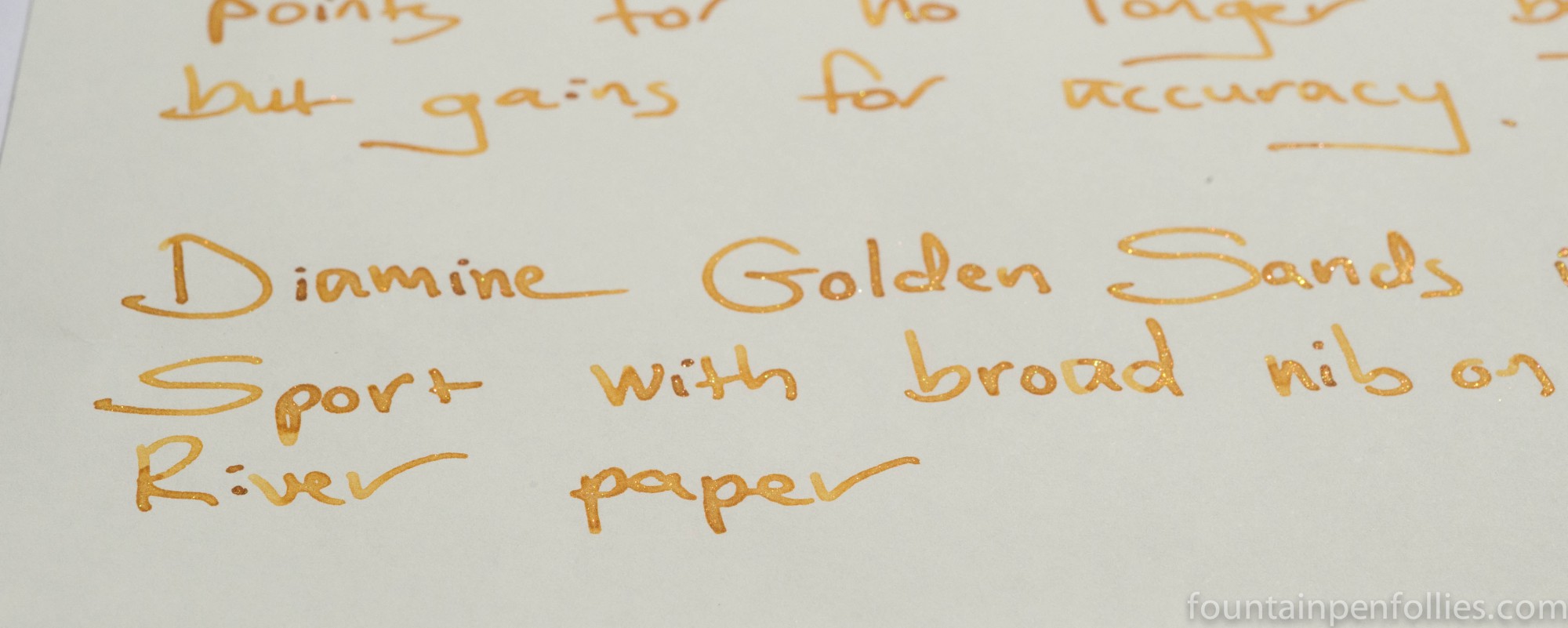
And here, in direct light, you can see that it sparkles.
This is Golden Sands on Clairefontaine paper, without a bright light source.
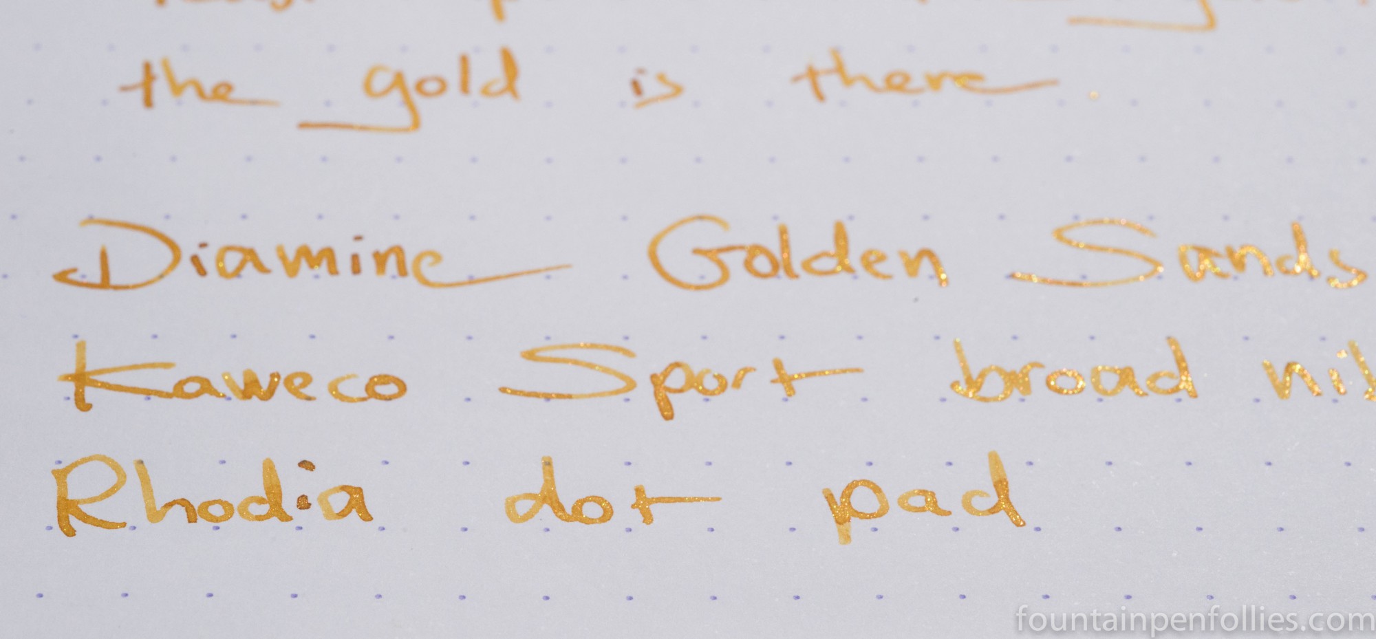
And here is Golden Sands shining in sunlight. This writing sample is on Rhodia.
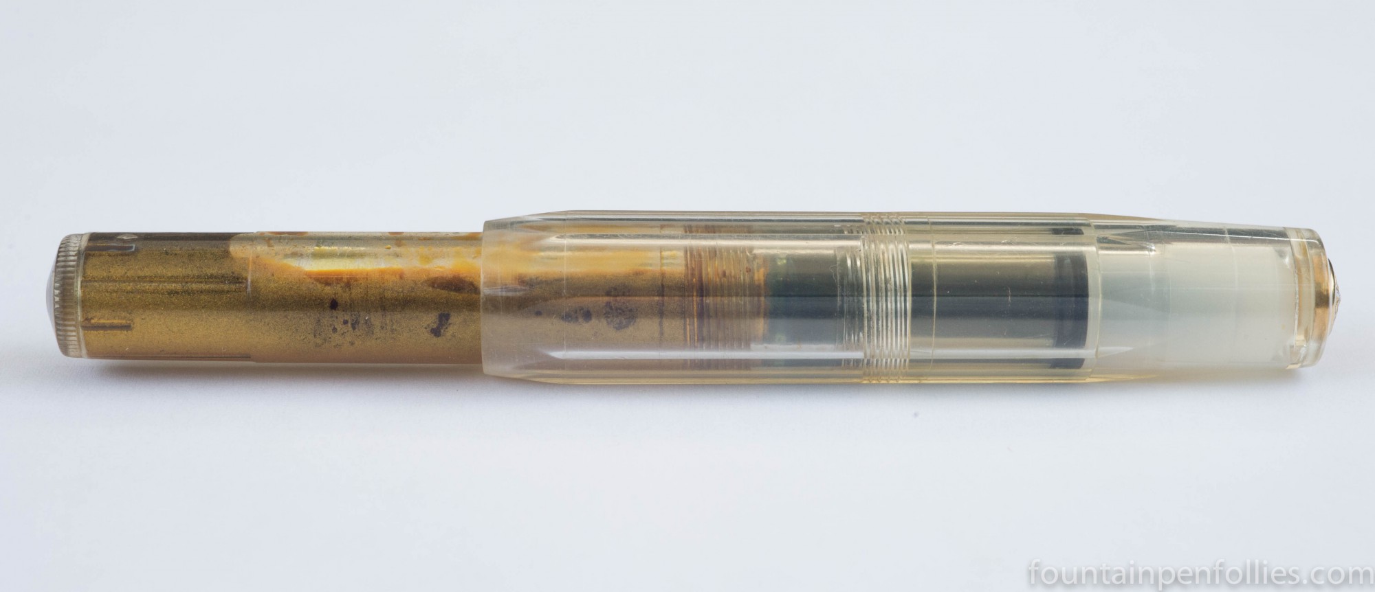
Like the other Shimmertastic inks I’ve used, Golden Sands seems to behave very well. It seems less wet than Purple Pizzazz, and dried quickly on the page. The demonstrator pen shows it has oodles of gold particles.

I think this one will be very popular.
LikeLiked by 1 person
Thank you! And stay tuned for Brandy Dazzle, which Golden Sands’ coppery sibling.
LikeLike
What a beautiful color! The liquid gold is perfect for this time of year. “Autumnal” is an apt description.
LikeLiked by 1 person
I need to check it on dark paper, I really do.
LikeLike
omg – I’m speechless! This is just so, so lush, liquid gold indeed! It really suits your handwriting too I think 🙂
I’m very intrigued by the bit about dark paper – would it really have enough opacity to stand out on dark paper? Because that would be the bee’s knees! I love dark papers but I’ve never found FP ink that would show up on them, only heavier inks for dip pen use or even paint.
LikeLiked by 1 person