
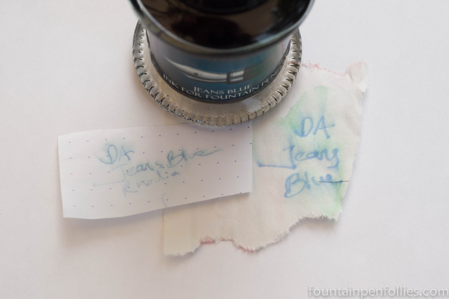
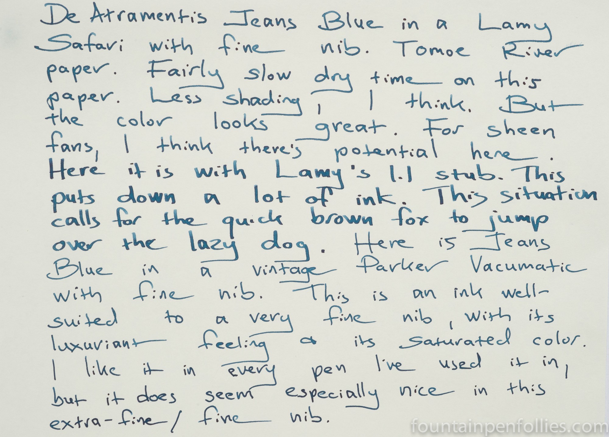
Jeans Blue flows on the wet side and is nicely lubricated. That makes it a good match for any pen, but especially a dry writer. It started up right away, even when I left the pens for four days without using them. Jeans Blue is medium dark in color, and fairly saturated. It does show some sheen potential on Tomoe River paper. Depending on pen and paper, there can be a very slight amount of shading, as here on Rhodia.
Dry time is immediate on poorer quality notebook or copy paper, but can be lengthy on Tomoe River and Rhodia. Once dry, it is set. I saw some feathering on poor quality paper, but only a moderate amount.
Jeans Blue was easy to clean after more than a week in my pens, flushing out relatively quickly with just plain water. Nonetheless, it has some water resistance. Even though most of the dye washed away when soaked in water, a legible remnant remained, even on very smooth paper like Rhodia which does not absorb much dye. Even more dye remained on lower quality paper.
Color is very personal, but these are my impressions of Jeans Blue. I find it dark enough to be easy to read, but never overpowering. The green tint makes it stand apart from many dark blue inks. But it is the sort of ink that doesn’t call attention to itself, instead focusing the reader’s attention on what is written more than on the ink. I like it as an everyday ink for that reason.
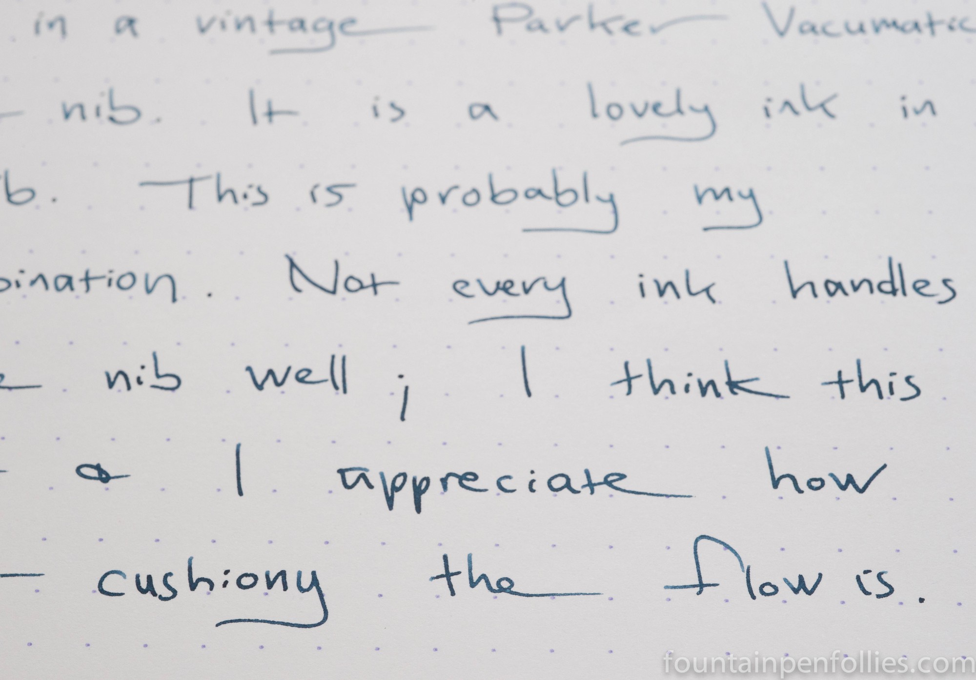
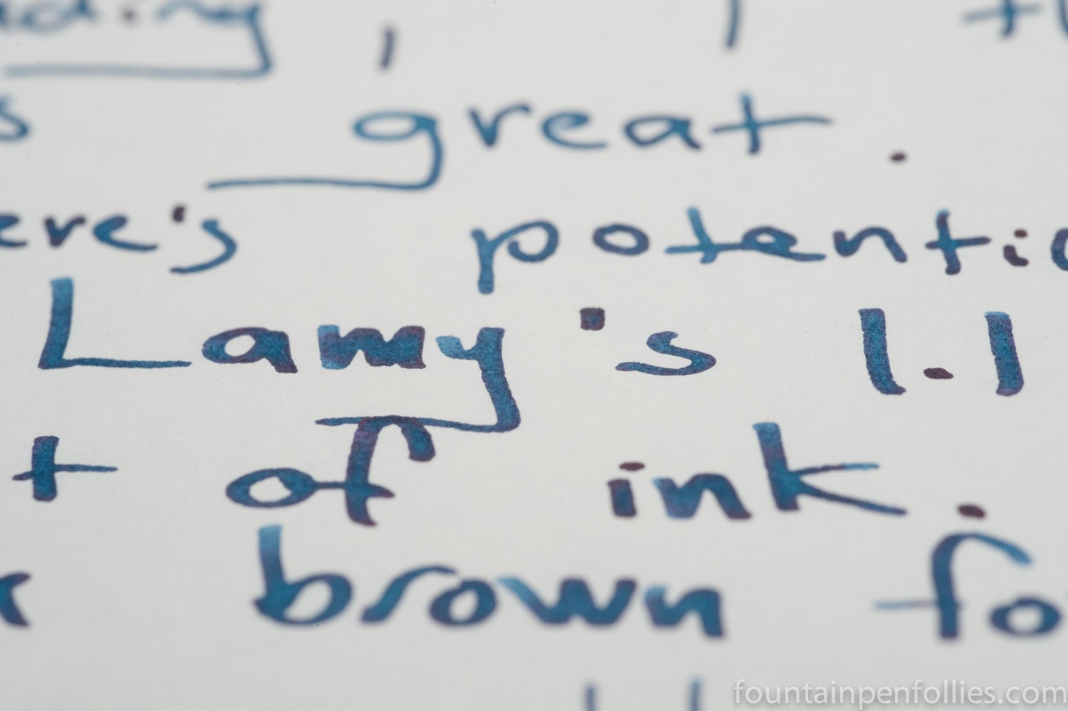
It is an ink that works especially well for me in a very fine nib. Legibility is high, it flows very smoothly but the fine line remains fine. But I also like Jeans Blue in my Lamy Safari 1.1 stub, because that shows off the color. It also shows, on Tomoe River paper, some sheen.
As a greenish blue, there are a lot of other inks that seem similar, but none write the same in a pen.
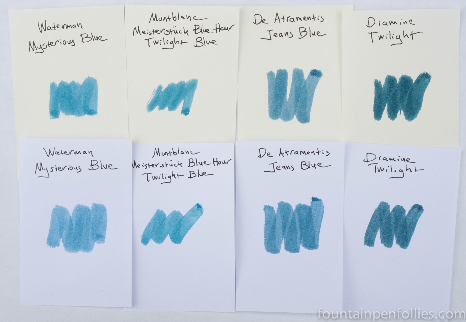
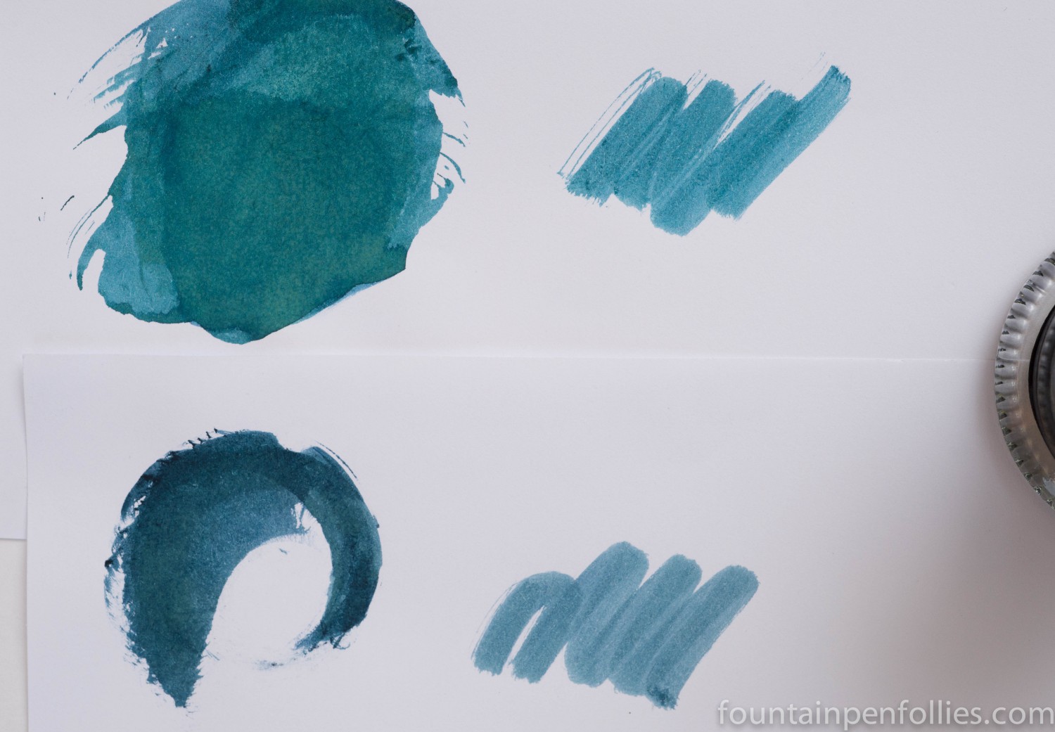
Jeans Blue at first glance looked very similar to Montblanc Blue Hour Twilight Blue, but it is more blue and less blue-green than the Montblanc ink. And the two inks are even more different when written with, rather than swabbed. The Montblanc ink is a dramatic shader, while the De Atramentis is more straight-forward and business-like.
Here is a comparison with Montblanc Blue Hour Twilight Blue, on top, and De Atramentis Jeans Blue below.
I have a friend who always notes whether the ink name matches the color. This ink is not really the color I think of when I think of jeans: the green tint keeps it from resembling either the dark blue of raw denim of the faded soft blue of old jeans. However, it’s interesting that on some paper it can fade down very slightly after it dries.
Since this is my first De Atramentis review, I should mention that De Atramentis inks come in 35 ml bottles that I think are great, because they are sturdy and deep, and thus very easy to fill from until close to the end. I paid $11 for mine.
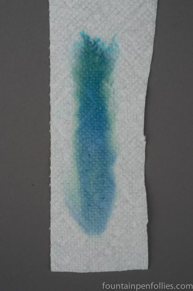
Here is the chromatography for Jeans Blue.
Here is a larger slice of a writing sample.

I really like this when it’s packed on, like in the swab. Might be a nice one to try extra-wide pens that spit out gobs of ink, as well as the fine nibs 🙂
But yes, not very jeans-y!
LikeLike
I really like that color. As you know, I am a sucker for a good blue or blue black. This is going on my short list. It doesn’t really remind me of the color of jeans, but that’s fine, I just like the color.
LikeLike