

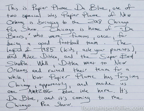
Chicago is a city that loves its sports teams, and the Chicago Bears football team, which many call “Da Bears,” represents the city’s legendary toughness and blue-collar roots. Da Bears wear navy blue. Da Bears are really bad lately, too, so they make fans feel blue, and also curse a blue streak. And if you go to the games in November and December, it’ll be so cold in Soldier Field that your fingers and toes may turn blue. We call that Bear weather.
So Papier Plume has made Da Blue, which is appropriately blue.
I’ve used Da Blue in three pens so far: a Pelikan M605 with a wide fine nib, a Lamy Safari with extra-fine nib and a Sailor Professional Gear with Sailor’s very narrow extra-fine nib.
Here is Da Blue on Rhodia from the Pelikan.
Da Blue is a wetter ink. Startup and flow have been excellent in all three pens, even the two with extra-fine nibs. I’d say Da Blue has slightly higher than average saturation. It’s got some gray to it, and a teensy bit of green. It shades nicely — not too much, not too little.

I’m not just a fan of the Bears, I’m also a fan of blue-black inks; and I think Da Blue is beautiful.
Because it’s a wetter ink, on poor quality paper Da Blue can feather, and there can be some showthrough. Here’s an extreme closeup on Staples Sustainable Earth, my low-quality paper, with the Pelikan fine nib.
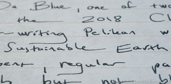
Now, that’s not horrible feathering, but it’s there. If you like to write with wetter and wider nibs, you’re going to want to use fountain-pen friendly paper with Da Blue.
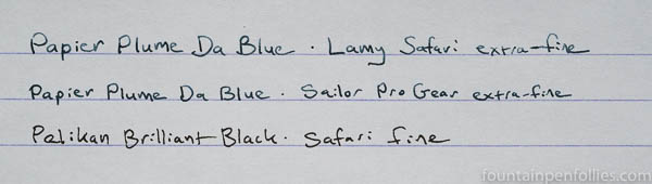
If you do use regular or low-quality paper a lot, you’ll want to use narrower nibs or a pen that puts down less ink. Using Da Blue in my Lamy Safari and Sailor with extra-fine nibs, the feathering either disappears or is hardly noticeable, and there is no showthrough. Da Blue is lighter from an extra-fine nib, but still perfectly legible, even for me. Here’s Da Blue in my extra-fine nibs, alongside a black ink for comparison.
Here is Da Blue, in the Pelikan fine nib, on cream-colored Tomoe River.
On Tomoe River, the shading is enhanced. It’s a similar color on either white paper or cream-colored paper.
Da Blue also sheens. Here’s a writing sample again with the Pelikan with fine nib. This photo was taken during a week of dark and overcast skies, and absolutely flat and dim lighting. Bear weather. Luckily, no sun was necessary to show this sheen.

The closeup writing samples show the ink’s color best. It’s a blue-black ink, and it’s on the gray side, but there’s also a slight green tint, too. Da Blue is blue-black enough to be a perfectly fine everyday or business ink — that’s how I’ve been using it. But the color of Da Blue is a little different than most blue black inks.
Here’s a swab comparison with two good blue-black inks that are fairly close to Da Blue.

Edelstein Tanzanite is a pretty straight blue-black, which I very much like, and Sailor Jentle Blue Black is similar, but less saturated, and a hair less blue than Tanzanite. Papier Plume Da Blue has a noticeably gray-green tint compared to both.
Here are two more comparisons.
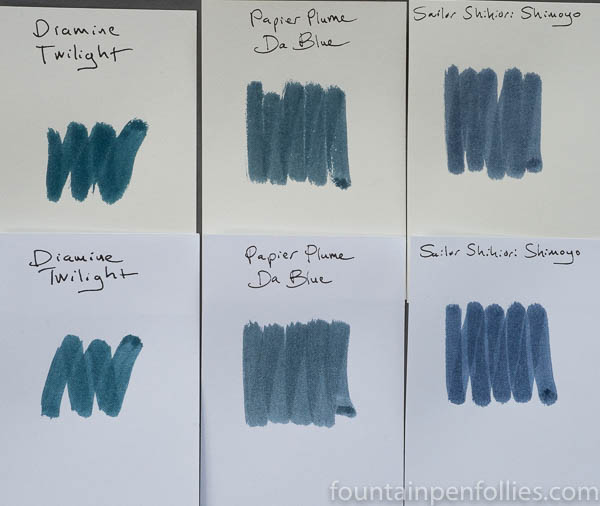
Diamine Twilight is in there because it’s a very green blue, basically a dark teal. Compared to Twilight, Da Blue is more blue and more gray. But then compare Da Blue to Sailor Shikiori Shimoyo, on the right, which has the same gray tint but is more conventionally blue. I’ve used Shimoyo and Da Blue back to back. They are very similar in characteristics, but Da Blue is a bargain in comparison: Shimoyo is $15 for 20 ml, versus Da Blue at $10 for 30 ml.
Now let’s compare Da Blue to two inks that are greener.
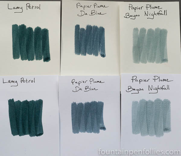
Da Blue looks pretty blue, compared to those.
One final comparison, this time to two standard, conventional blue-black inks, just to set our bearings in the world of blue-black.

Da Blue has more juice, and more color, than Pelikan’s venerable, and excellent, 4001 Blue Black. But Da Blue is a lot less blue, and a lot less ick, than Waterman Mysterious Blue. About the Waterman: I use it, I think it’s a good ink, and it’s here because a lot of people know it. But in this comparison Waterman Mysterious Blue looks like a sickish emerald that should be put out of its misery — and ours. That is so ugly it could kill someone.
I think we all need to look at something better now, to save our eyes.

That’s more like it.
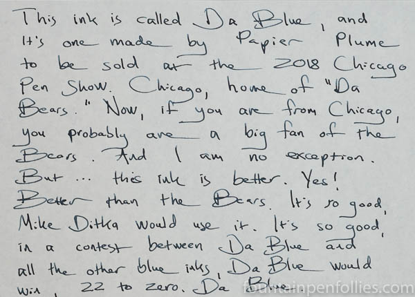
So, we are now in the fourth quarter of the final game of the NFC football championship. Does Da Blue advance to the Super Bowl of inks? Yes. For me, it absolutely does. I really like Da Blue. It’s way better than the Bears. I will buy a few bottles for my little stash of inks.

Thanks for the review!
I wonder how it would fare compared with Kyo No-Oto #05 Aonibi that I happen to have. Aonibi is also a kind of subdued blue-black, bluer than Pelikan 4001 Blue-Black and a tiny bit more grey than Diamine Denim.
LikeLiked by 1 person
You’re welcome! Thanks for the comment!
I’ve never tried Aonibi, but it’s supposed to be in the Chicago Pen Show Ink Testing Station, so …. Until then, I wonder if Aonibi looks similar to Shikiori Shimoyo, which is in one of the swab comparisons here. Shimoyo and Da Blue look fairly similar, especially in the pens with EF nibs — but Da Blue adds that teensy bit of green.
I want to emphasize “teeny” when it comes to the greenish tint. Sometimes when I use a blue-black that’s excessively green, like Quink Blue Black, I’ll need to mix in a little red to pull it back, make it more blue. I’ll never want to do that with Da Blue, because Da Blue is attractive, and crisp on the page, just as it is.
LikeLike
Who knew? Go Bears!
LikeLiked by 1 person
It is a rare color, and I love to read a review with a bit of additional info’ or story to it, these have been great.
LikeLiked by 2 people
Thanks for the great review and helpful comparisons and a lesson in Da Bears. This sounds like another must have ink for Chicagoan fountain pen enthusiasts, of which you are probably a suitable cheerleader. (Think of some chants, involving pens and inks…) “Two Four Six Eight, Cheaper inks evaporate.”
LikeLiked by 1 person
Nice colour. I’ve just inked my Platinum 3776 with R&K Verdigris and can see some superficial similarities in the colour (definitely no sheen with the Verdigris though).
LikeLiked by 1 person
That’s a great comparison, thank you! I want to check into that, now! I wish I knew more about Verdigris — I’ve only sampled it at our Ink Testing Station.
Since we’re talking R&K, if I may geek out a bit…. The R&K Da Blue reminded me of is a special edition from some years back called Blau Schwarz, which I’ve always loved. But I didn’t want to put Blau Schwarz in the comparison because it’s not available any more. There’s also R&K Blau Permanent…. And so many good inks from R&K, but they are a little under the radar, like J. Herbin.
Well, I hope Papier Plume is getting a little more attention, at least. 🙂 And, yes, the sheen on Da Blue is so nice. Da Blue is a very beautiful ink, if you like inks this color. 🙂
LikeLiked by 1 person
I’m only just starting out with Verdigris myself. I had a sample for ages and did nothing with it, but I eventually tried it and liked it enough to take a punt on a bottle. It’s a bit of a complicated, moody ink, but I’m enjoying getting to grips with it.
I suspect Blau Schwarz came and went before I’d even heard of R&K, but it sounds intriguing! 😀
LikeLiked by 1 person
now, that’s a color I rarely see in a ink, with all these hues, and I like it !!
LikeLiked by 2 people
Me too!
LikeLike