

Chicago’s colorful, criminal, past during Prohibition was the initial inspiration for this ink. It became a wine-related color when Papier Plume discovered that during Prohibition sacramental wine, which was exempt from the general ban on alcohol, became a source of stock for bootleggers (and the occasional Church official). William Faulkner’s favorite bootlegger was said to be a New Orleans priest.
I have been using the ink in two pens, a Pelikan M600 with medium nib, and a Franklin-Christoph with medium stub. It has behaved perfectly in both, starting up immediately with no issues. I’d rate the ink flow as either average or slightly on the dry side. The ink dries fairly quickly for me, even on fountain-pen friendly paper.
Here is Bootlegger’s Sacrament on white Rhodia paper, from the Franklin Christoph with medium stub nib.
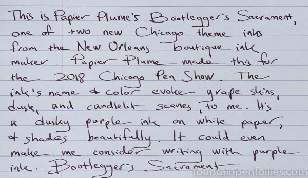
Bootlegger’s Sacrament looks fairly purple on Rhodia, but a muted and dusky purple, like you’d expect from J. Herbin Poussière de Lune. To me, the color looks luxurious. It’s more a color of candlelight winters than flowery summers. Though it also reminds me of grape skins, or at least the grape skins you might see in a painting.
It’s not super dark and saturated, but it has more saturation than other dusky purples. I would expect it to look even darker in a very wet pen.
Now here is Bootlegger’s Sacrament on cream-colored Tomoe River.
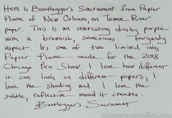
On this paper, the ink looks lighter, and browner. I don’t see any sheen from Bootlegger’s Sacrament with this pen, but there is nice shading.
Bootlegger’s Sacrament also performs very well on lower-quality paper that isn’t fountain-pen friendly. Here it is on Staples Sustainable Earth.
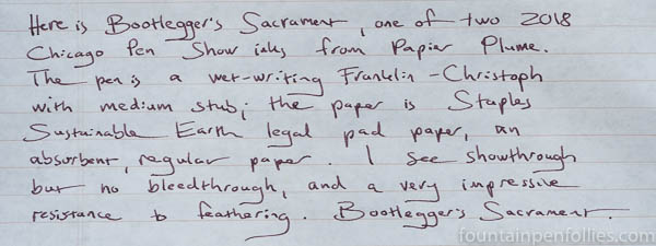
On the Staples paper, as well as my terrible copy paper, Bootlegger’s Sacrament had an impressive resistance to feathering, and just a little showthrough to the other side of the page. It’s a good ink for poor paper.
In terms of comparison inks, here is Bootlegger’s Sacrament in a lineup of some familiar dusky purples.

What’s so interesting about that swab comparisons to me is to see how more complex Bootlegger’s Sacrament is than the others. Certainly it’s more wine-like than the others. I think it’s also richer and more sophisticated, though those are nice purple inks.
The ink I find closest to Bootlegger’s Sacrament is KWZ Brown Pink. Here is a comparison of the swabs, one on one.

I reviewed the very popular KWZ Brown-Pink here, with plenty of writing samples.
I think both KWZ Brown-Pink and Papier Plume’s Bootlegger’s Sacrament are attractive, creative inks. KWZ Brown-Pink is more muted and less saturated. I also think it’s pinker. Bootlegger’s Sacrament is stronger, deeper and slightly easier to read. I think Bootlegger’s Sacrament inches closer to maroon or burgundy, too.
So there you have it. I like this one.
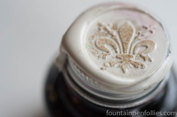
One final shoutout, to the presentation. I really love Papier Plume’s bottles, but the wax seal on the bottle of Bootlegger’s Sacrament is especially nice. It’s a creamy white wax, with a red underlay, and a darker flush that looks like gold. It makes the ink feel extra special. Which, it’s fair to say, being a limited edition, it is.
This ink will be sold by Papier Plume at the Chicago Pen Show, starting May 4, 2018, for $10. They will sell any bottles remaining after the show through their website. Papier Plume made 120 bottles, and said they intend this to be a one-time edition.

This looks like an unusual and very lovely color. I haven’t seen anything like it elsewhere. I took calligraphy in school (many) years ago and am getting back into it – just purchased a few new ink dip pens. I would LOVE to win this color, though I would probably buy it if I don’t win.
LikeLiked by 1 person
I love the name Bootlegger’s Sacrament and the story behind it! It’s interesting when ink makers share the meaning behind the name. Hopefully there’ll be some left online…
LikeLiked by 1 person
This one looks fantastic to me. Great review!
LikeLiked by 1 person
Thank you!
LikeLike
Nice review and a great looking ink… and no, there’s not going to be any left online is there? That looks way too good to survive past the show… and at that price, somebody’ll buy half their stock in one go 🙂
LikeLiked by 3 people
If somebody is there to buy half the stock in one go, they need to introduce themselves to me, so we can discuss them (i) sponsoring the Chicago Pen Show, and (ii) buying me a cup of coffee or a drink. Hey imaginary ink mogul, Go Fund Me! 🙂
LikeLiked by 1 person
I may have exaggerated a touch, but if I had the money, I would love to be a pen and ink mogul… amongst so many other things 🙂
LikeLiked by 1 person
My dude, I’d love to see you as a pen and ink mogul, but you kinda glossed over the “fund Laura” part of that pitch, which was the key part, for me at least. 🙂
LikeLiked by 1 person
Go’s without saying, when I make my first $100m, I hereby promise you at least $2m.
Canadian of course.
LikeLike
Hmmmm
LikeLiked by 1 person
Great review and a really interesting-looking ink. The seals help add to the sense of it being a special ink. Something tells me that there won’t be any left to sell online after the pen show!
LikeLiked by 4 people
Thank you!
About the ink: they are making 120 bottles of it, plus 120 bottles of Da Blue. I wrote a prediction, and then deleted it, because … seriously, what do I know? 🙂 I’ll just say, if you can’t make the show, don’t give up. Check Papier Plume’s website the Monday after the show. 🙂
LikeLiked by 1 person
This colour looks quite special and elegant. I have seen your review only on a small screen so far (it is midnight in London) but will enjoy looking at it again in the morning on my PC. I think the comparison with grape skins in paintings, is a good one. Great review as always.☺
LikeLiked by 3 people