
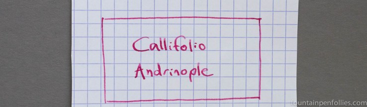
Callifolio inks are made by L’Artisan Pastellier, a company based in the south of France. You can buy 40 ml bottles in the US for $12.
I used Callifolio Andrinople for a few weeks in a Pelikan M600 with a broad nib, and also with a Lamy Safari with an extra-fine nib. It’s a dry-writing ink, rendering a nice tight line, but I never saw the slightest hesitation in startup or flow.
Andrinople did not feel very lubricated, however. Even in the Pelikan, which has generous flow, Andrinople felt almost chalky. It wasn’t scratchy but it wasn’t smooth and silky.
The color is a cheerful, reddish leaning pink, with beautiful shading. At times it looked almost raspberry, particularly on Tomoe River paper.
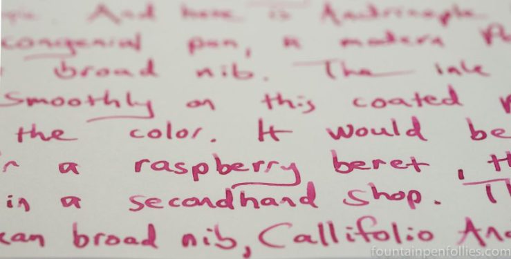
Andrinople is such an unsaturated ink that I thought it looked best with a wet-writing pen with a broad nib, like the Pelikan. Here it is on Rhodia paper.

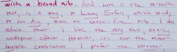
A Lamy Safari is a much drier-writing pen, and I used an extra-fine nib, to boot. Andrinople had praiseworthy, indeed impeccable, flow in the Safari. But Andrinople’s color is weaker and less compelling when you see less of it.
Using the Safari with extra-fine nib made Callifolio Andrinople hard to read on fountain-pen friendly paper. Here it is on Rhodia.
And here it is with the extra-fine nib on Tomoe River.

In contrast, here it is on Staples Sustainable Earth, with both pens. Sustainable Earth is my everyday paper, and it’s more absorbent than Rhodia or Tomoe River. Andrinople looked a bit more legible with the extra-fine nib on Sustainable Earth.
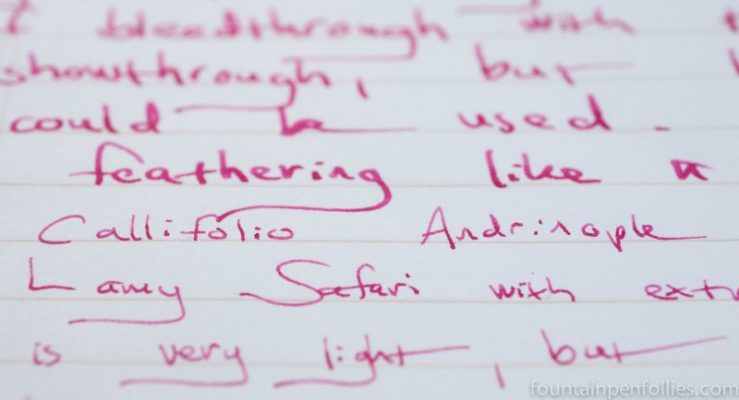
In fact, the low saturation and relative dryness of Callifolio Andrinople seems to make it a superior performer on cheaper or more absorbent papers. The worse the paper, the better the ink did. Andrinople resisted feathering beautifully. And the color became deeper and more legible on more absorbent paper.
I even loved it on Field Notes, even with a broad nib. There was no shading, but it was completely feather-free. And look how much better Andrinople looks with an extra-fine nib on the absorbent paper Field Notes uses.

Andrinople cleaned up very easily from both pens, as easily as any ink I’ve ever used. As a corollary, it’s not very water-resistant. Some ink remained on regular paper, but almost none on Rhodia.
As a red-leaning pink ink, Callifolio Andrinople resides in one of my favorite color ranges, so I actually have a fair amount of similarly colored inks. Here it is compared to three of the closest.
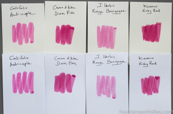
Caran d’Ache Divine Pink and Kaweco Ruby Red are similar in color, but more saturated and darker. The Caran d’Ache and Kaweco inks are more expensive, but both also are more legible and useful in a finer or drier pen. And both are excellent performers, like Andrinople.
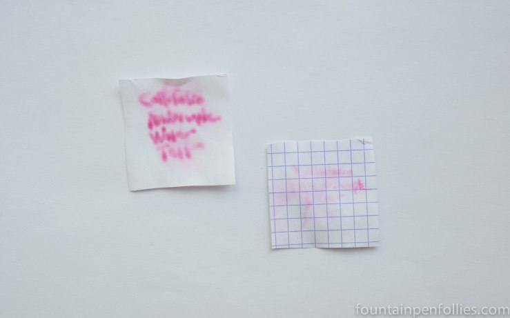
I happen to have had both Andrinople and Divine Pink inked at the same time, so here is a photo showing Callifolio Andrinople, in a Pelikan with a broad nib, next to Caran d’Ache Divine Pink in a Pelikan with a fine nib.
The closest ink I have to Callifolio Andrinople actually is J. Herbin Rouge Bourgogne.
Andrinople and Rouge Bourgogne are not identical. The hue is different. And Andrinople is a drier ink than Rouge Bourgogne, which writes a narrower line. But the two inks look very similar in the pen. And both perform equally well on poor paper.
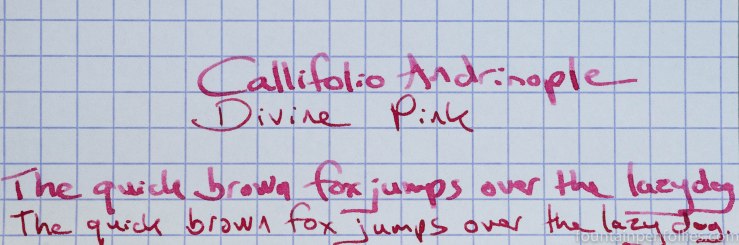
Here are writing samples of both in the same Pelikan with broad nib and in Safaris with extra-fine nibs.

Callifolio Andrinople, the first in each pair, seemed stronger than Rouge Bourgogne with the broad nib, but wrote narrower and had a weaker color with the extra-fine nib. I wouldn’t use Andrinople again in an extra-fine, or perhaps even a fine nib pen. But I would with Rouge Bourgogne.
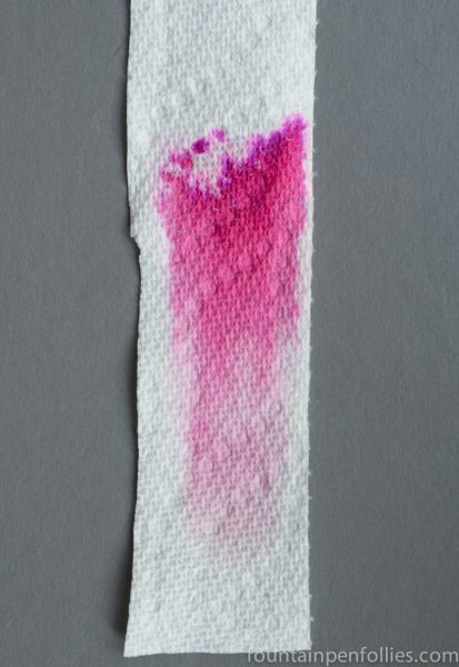
Here is paper towel chromatography of Callifolio Andrinople showing its pink and magenta dyes.
And here is paper towel chromatography from left to right of Callifolio Andrinople, Caran d’Ache Divine Pink and J. Herbin Rouge Bourgogne, just to show the differences among these three.

