
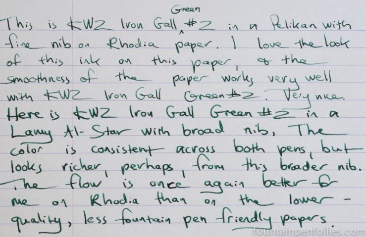
Because I wanted to really compare the two KWZ iron gall green inks, I tested both Iron Gall Green #1 and Iron Gall Green #2 with the same pens, a Pelikan Toledo with fine nib and a Lamy Al-Star with broad nib. I reviewed Iron Gall Green #1 here.
The two are very similar. Both inks flowed perfectly in the Pelikan, with immediate startup and consistent flow. In the drier Lamy Al-Star, I would occasionally see some hesitation on startup, but nothing out of the ordinary for those pens. I do think it’s a slightly dry ink.
Iron Gall Green #2 performed well on lower quality paper, resisting feathering very well. There was no bleedthrough. I had some showthrough on lower quality paper with the broad nib pen. But Iron Gall Green #2 maintained a nice clear color and wrote with a nice tight line on my everyday paper, Staples Sustainable Earth, as shown below.

Even on the Staples paper, you can see that Iron Gall Green #2 shades nicely.
Here it is on Tomoe River, which really brings out the shading. There is a slight hint of sheen, but I don’t really see it as a super sheening ink.

I think my favorite paper for KWZ Iron Gall Green #2 is Rhodia, because it looks so crisp against the bright white paper.
This is another KWZ ink that cleaned up very easily from both pens. Yet it has the water resistance you would expect from an iron gall ink, even on Rhodia paper.

In terms of color, when I look at the green inks I own, KWZ Iron Gall Green #2 is closest to KWZ Iron Gall Green #1. However, Iron Gall Green #1 is cooler and Iron Gall Green #2 is warmer.
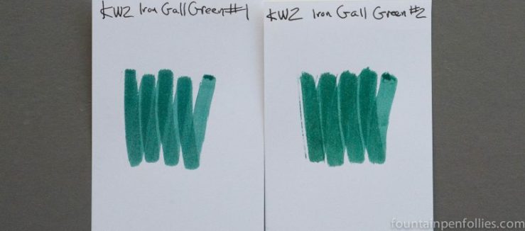
I was really interested in the differences between the two KWZ Iron Gall Greens, #1 and #2. The swabs nicely highlight the difference, but when writing with the inks, I mostly noticed the similarities. They behaved almost identically, and they looked pretty close.
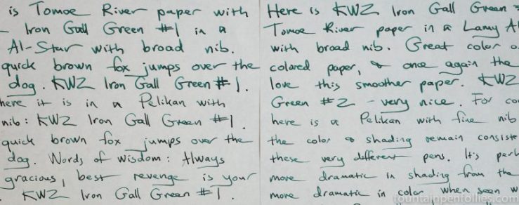
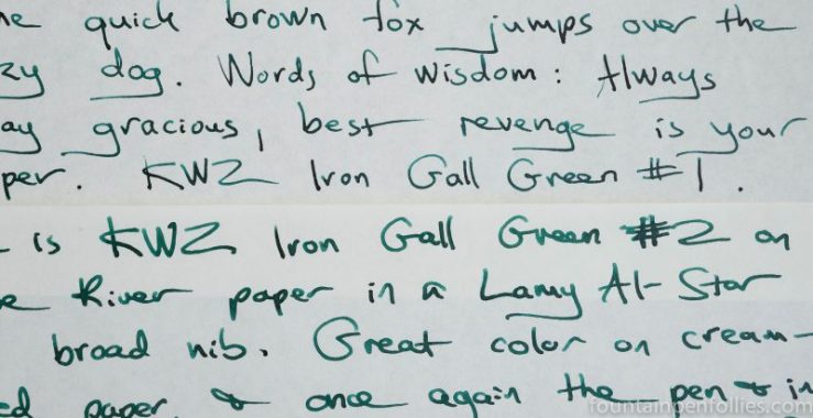
Here are writing samples with both inks on Tomoe River paper, side by side. Iron Gall Green #1 is on the left and Iron Gall Green #2 is on the right.
It’s easier to see the difference between the inks here, with Iron Gall Green #1 on top and Iron Gall Green #2 below. The cooler blue tint of Iron Gall Green #1 is apparent.
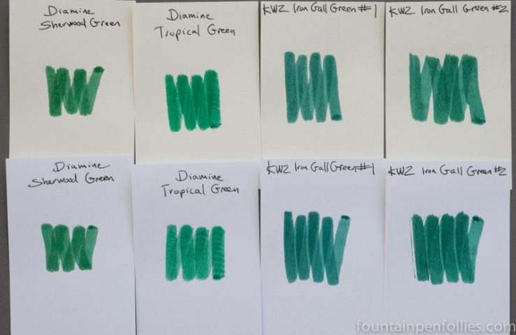
Here is a comparison of both KWZ Iron Gall Green #1 and #2 with two Diamine green inks that lean blue-green. The two KWZ inks lean even more blue.
Here is paper towel chromatography of Iron Gall Green #2.

Notice the yellow-green dye, warming it up.
Now here is additional chromatography of Iron Gall Green #1 on the left and Iron Gall Green #2 on the right. Iron Gall Green #1 has more blue and lacks that warmer yellow-green.


I love the slightly warmer tone of this green, though I’m still a bit reluctant to go for the Ion Gall inks. They might be more water resistant, but since that’s not a big concern for me, I am for now going with the “better safe than sorry” approach.
Still, I love the comparison pictures! The slight differences are so apparent in them. Thank you for that. Personally I’d go for #2 over #1, slight preference from my side. 🙂 Great work on this post!
LikeLiked by 1 person