
I tested Iron Gall Blue #2 in a Pelikan M605 with extra-fine nib and also in a Kaweco Sport with broad Architect’s nib. The ink behaved well with both pens. Iron Gall Blue #2 flowed well and it started up immediately in both pens, even after a few days of disuse. I do think on the wetness scale it’s probably average or very slightly dry.
Iron Gall Blue #2 dried quickly for me, and fully. I didn’t notice the color darkening much, though it is an iron gall. The color is legible and crisp.
Here is what it looks like on Tomoe River paper. It’s a lovely, calm blue-black, with great shading.
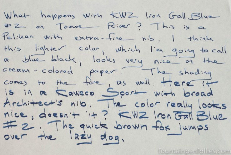
And here is a writing sample on Rhodia paper. In the middle is actually a sentence written to compare Iron Gall Blue #2 with J. Herbin Bleu Nuit, another blue black.
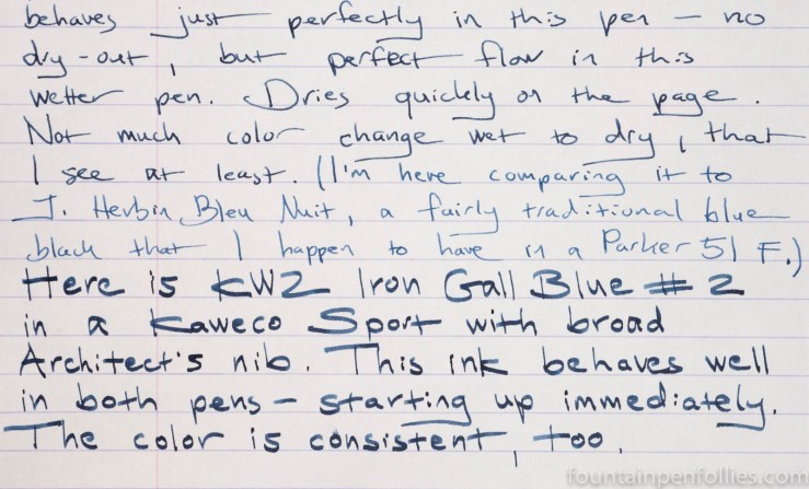
I was surprised how much darker Iron Gall Blue #2 is, because Bleu Nuit is one of the inks I think of when I think of gray-leaning blue blacks. Bleu Nuit, however, is noticeably lighter here, even though it’s in a very wet Parker 51.
Here is Iron Gall Blue #2 on my lower-quality paper, Staples Sustainable Earth, which is more absorbent and less fountain-pen friendly.
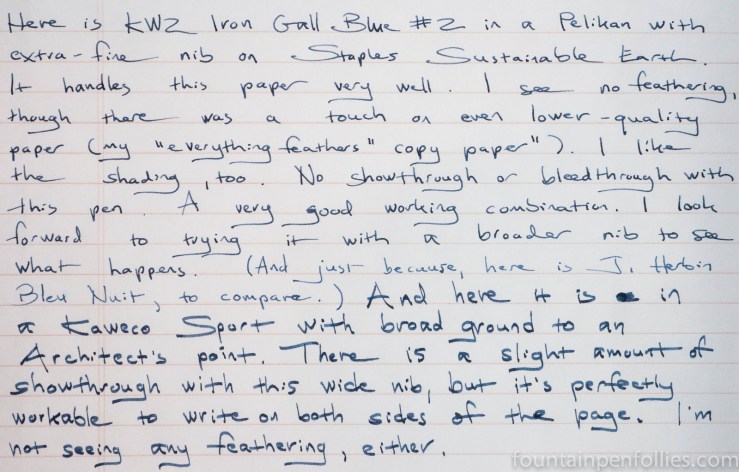
Iron Gall Blue #2 seems like a great performer on poor paper. I had no feathering, and couldn’t get even a little showthrough until I used the broad Architect’s nib, which puts down a lot of ink.
It has excellent water resistance, as one would expect from an iron gall ink.
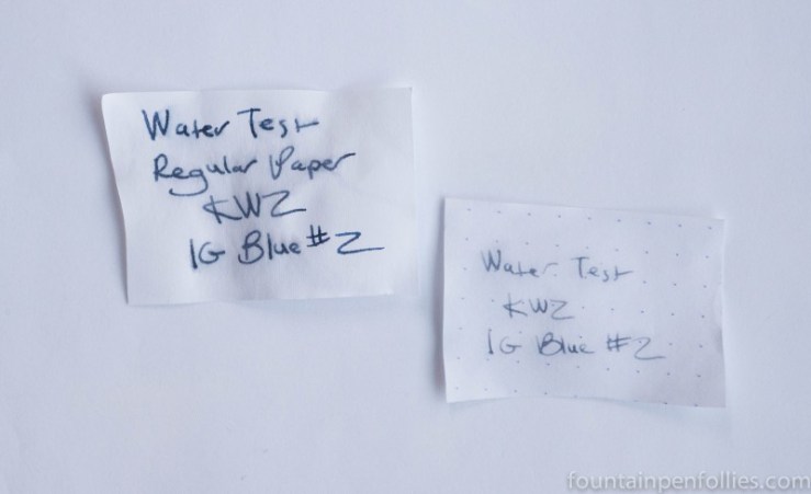
Nonetheless, cleanup was very easy. I’ve actually seen that with every KWZ iron gall ink I’ve seen so far — they have all cleaned up for me with just flushing with water. I’ve had some of these KWZ iron galls in pens for weeks, and when I got sick, I didn’t pick up any pen for at least four days. Yet the KWZ inks were trouble-free.
In terms of color, KWZ Iron Gall Blue #2 is, to me, a blue black. Most traditional iron gall inks tend to be blue black. But I can see why KWZ named the ink “Blue” instead of “Blue Black.” That’s because, compared to many iron gall blue black inks, KWZ Iron Gall Blue #2 is actually very blue.
Here are swabs of KWZ Iron Gall Blue #2 next to three of my favorite iron gall blue blacks. (There has been some question whether Pelikan Blue Black contains iron gall, but I really believe it does, so I’m including it here.)
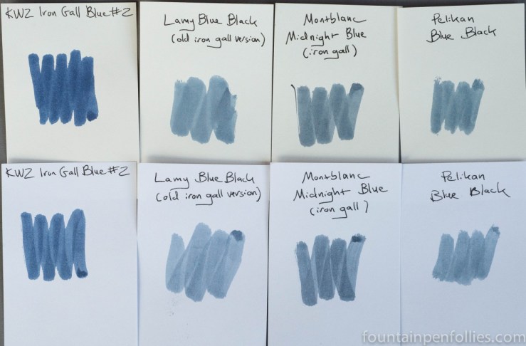
Now, I love iron gall blue black inks like I love chocolate. But it’s pretty obvious that KWZ Iron Gall Blue #2 is bluer and darker than most. Outstanding.
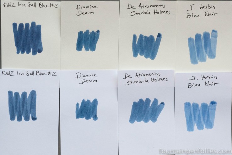
I’ll also compare Iron Gall Blue #2 to currently available inks that I think are similar in color, albeit dye-based instead of iron gall. That also includes J. Herbin Bleu Nuit because it was used in the writing samples above.
Now I want to talk about KWZ Iron Gall Blue #2’s sibling, which is Iron Gall Blue #5. I reviewed #5 last month, here, and, spoiler alert, Iron Gall Blue #5 is totally my Blue Valentine this year. But its color is not really blue black, at least not to me.
Just to try to have some methodology in my madness, I used Iron Gall Blue #2 in the same Pelikan with extra-fine nib that I had used to review Iron Gall Blue #5. This was no sacrifice: I adore that Pelikan.
But here’s the funny thing. Or maybe I should say, here’s how blue Iron Gall Blue #2 looks. KWZ’s two Iron Gall Blues could look similar in color when Iron Gall Blue #2 was in the (wet) Pelikan with extra-fine nib and Iron Gall Blue #5 was in a (dry-writing) Lamy Safari with fine nib. And yet, I knew very well that the swabs were quite different.
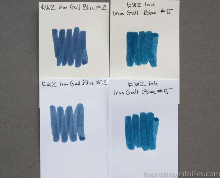
But in most light they looked very similar from my pens. I had to take dozens of photos to show the difference adequately.

In the photo below, Iron Gall Blue #5 is used in the first four lines, and the ink being reviewed, Iron Gall Blue #2, is in the last three lines.

You can see that the second ink there, Iron Gall Blue #2, is a more gray and subtle blue black, while the first, Iron Gall Blue #5, is a brighter blue with just the slightest touch of green.
Paper towel chromatography shows the same. Iron Gall Blue #2 is on the left and Iron Gall Blue #5 is on the right. I believe the faint green tint in Iron Gall Blue #5 is from the turquoise dye.

But, again, these two inks looked very similar a lot of the time in these fine or extra-fine nib pens. Most of the time, I’m looking at this on the page, where Iron Gall Blue #2 looks so blue that it’s harder to distinguish from any other dark blue, even Iron Gall Blue #5, which is really quite different.

So what am I saying? I think KWZ Iron Gall Blue #2 is just fabulous: it’s a very dark blue black ink that cleans up like a dye-based ink, but resists water like an iron gall. And it shades like an iron gall ink, which is to say, beautifully.
I received this sample of Iron Gall Blue #2 from KWZ Ink so I could review it. KWZ Ink is available online from at least one US store and also directly from KWZ in Poland. KWZ’s website contains excellent information about using and cleaning out iron gall inks.

Konrad is a wizard, a Modern Master. I have a vial of this still to try, from when I ordered a couple fistsful of samples from him.
LikeLiked by 1 person
He really is. I am in awe of his creativity and facility, how accomplished he seems, right from the start. You’ll forgive the poetic analogy, but it’s almost like watching Athena springing fully grown and armored from the head of Zeus. 🙂
Also, he and his wife are not only dedicated, but they seem like wonderful, lovely people.
LikeLiked by 1 person
I agree, they are both lovely people. Yes, he is a chemist by trade, but as you say he’s hit home runs from the start.
LikeLiked by 1 person
Those other iron gall inks – in the first swatch photo – well they look positively anemic next to the KWZs!
LikeLiked by 1 person
Great review! I’m impressed with how blue it is, especially compared with the others. I don’t normally do iron gall inks, but I’m interested in this one 🙂 That #5 is also really pretty. I like that touch of green it has 🙂
LikeLiked by 1 person
I see some turquoise on the paper towel chromatography.
LikeLiked by 1 person