
Waterman Pink is available only in cartridges, either long or short international size. I picked up a box on Amazon, after seeing the two of my favorite words for ink — “Waterman” and “Pink” — together on the screen. For less than $8, I was willing to give it a go.
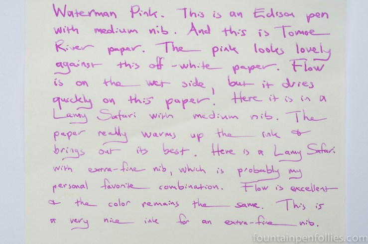
I used Waterman Pink in an Edison pen with medium nib, and I also used a syringe to fill a Lamy Safari converter so I could try a variety of Safari widths.
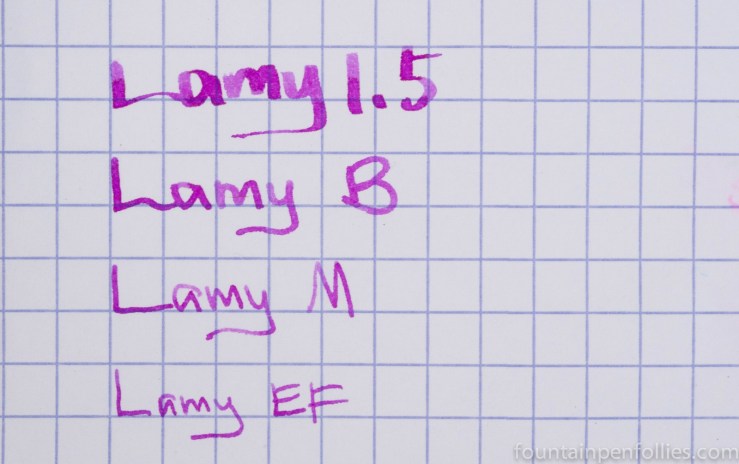
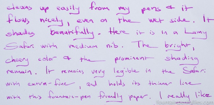
Waterman Pink’s bright magenta color was consistent across all the pens and nibs, although of course the wider the nib, the more ink hits the paper. Shading was excellent, especially on smooth fountain-pen friendly papers. Waterman Pink is a strong and bright enough color to work well with extra-fine nibs, but it’s not overwhelming even with the 1.5 mm stub.
If it doesn’t quite come through in the photos, let me assure you that Waterman Pink is a nice and bright ink. Almost wild and crazy. I kept half-asking myself, “Is this really a Waterman?”
Yes, it is. And best of all, it behaves like a Waterman. It worked well on poor papers. It is a wet ink and flows enthusiastically, but for all that its dry time seemed fine. It also cleaned up easily. I was a little worried seeing such a bright magenta ink inside the section of my transparent Edison, but it rinsed off easily with no staining.
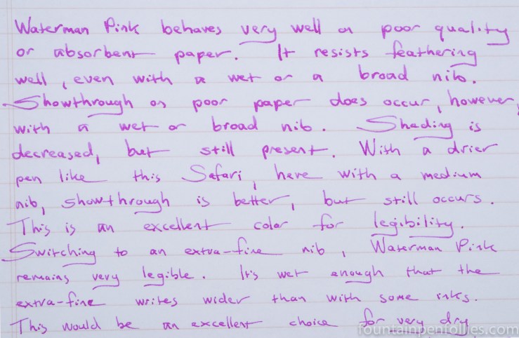
The most absorbent regular paper I used was Staples Sustainable Earth, and the ink handled it well. I saw hardly any feathering. On the Sustainable Earth only, and only with the wet and wide Edison, I saw a bit of bleedthrough. With both the Edison and Safari, Waterman Pink had some showthrough on Sustainable Earth. However both sides of the Sustainable Earth were perfectly usable with the Safari.
Waterman Pink flows freely enough that on Sustainable Earth the extra-fine nib wrote more like a fine . But on fountain-pen friendly paper like Rhodia and Clairefontaine, the extra-fine line remained tight and narrow, and the bright color made it very legible.
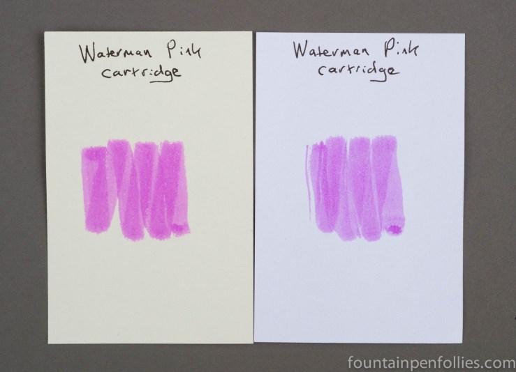
I particularly liked the color of Waterman Pink against the cream-colored Tomoe River paper.
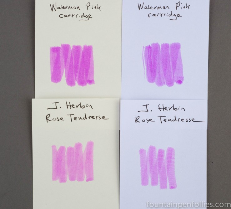
I do not own a lot of bright pink inks, but out of my stash Waterman Pink was closest to J. Herbin Rose Tendresse. However, Waterman Pink is brighter and more vivid, while Rose Tendresse is softer. Waterman Pink has the edge in legibility.
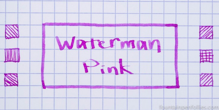
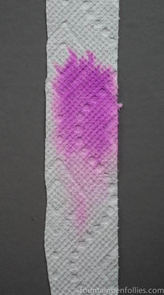
Paper towel chromatography shows that Waterman Pink is dominated by a bright pink dye, but I can see some light pink in the mixture as well.
I found Waterman Pink a fun surprise. It is bright and even a little wild in color, while retaining all the good qualities I expect from a Waterman ink. I sort of wish it were available in bottles, too.
