
Does the fine Architect’s nib work for me? Yes. And I love it. Do I have to pay more attention to writing with a fine Architect’s nib? Yes. And is it worth it? Oh yes. It’s really cool.
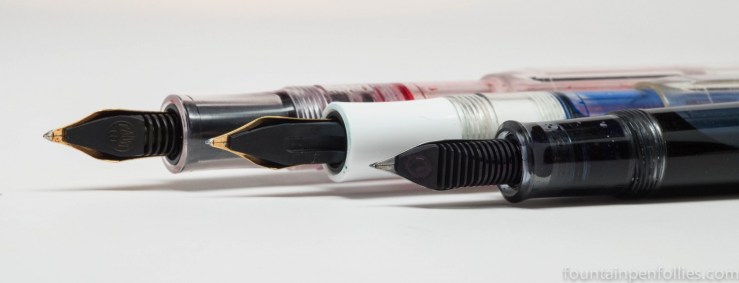
For context, here is a photo comparing Architect’s nibs, with the broad in back, then the medium and then the fine in front. You’ll note that I’ve switched to a red ink for the broad.
A broad Architect’s nibs feels very natural and easy to use, because it has so much surface area. And the line variation is gorgeous and noticeable.

The medium Architect’s nib has a noticeably smaller sweet spot than the broad, so when I start writing with it, I take more care. And I make sure to keep it oriented at the proper angle. That’s become second nature after a few days of use.
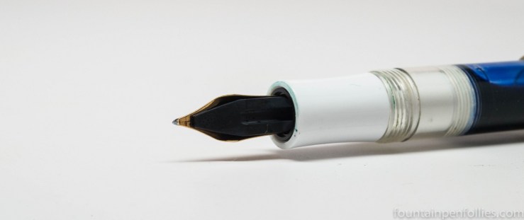
With the fine Architect’s nib, the nib’s position is doubly important. This has a small writing surface.

But even with the fine Architect’s nib, familiarity and use has me grooving along now. People who are more precise and accomplished writers than I might not need any adjustment period.
I really love the effect of the fine Architect nib. It creates clarity and interest, with its thinner down-strokes and wider cross-strokes. When I think of what someone with good penmanship could do, I almost become envious.
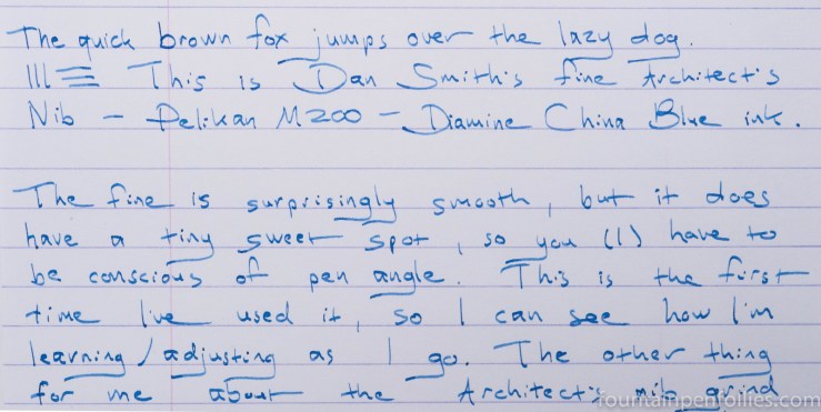
By the way, I am amazed at how smooth Dan has made this nib. You can see what a tiny area of writing surface the nib has. But it’s not scratchy or edgy at all. Dan is the man.
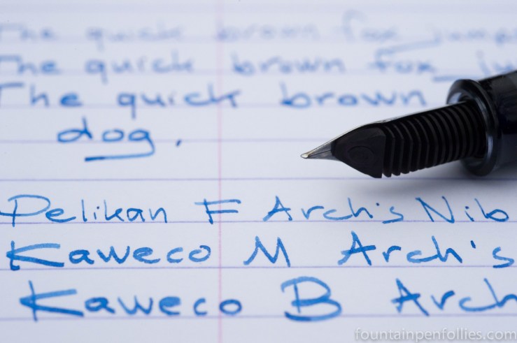
Below is a comparison of the fine, the medium and the broad Architect’s nibs, in order. The ink is Diamine China Blue. The fine nib is a Pelikan, while the medium and broads are Kaweco Classic Sports.

And here is a closeup. The line variation is much more subtle with the fine, of course, because there’s less tipping material.

The broad Architect’s nib has more drama, and it really shows off an ink nicely. The medium Architect’s nib might be the Goldilocks size, because it’s still a narrow enough width for normal writing, even though the line variation is noticeable.
But the fine may be the best for me, personally. It does take a little longer to master. But I can definitely use it every day, and I like the subtle effect.
I am so grateful to Dan for sharing this with me.

Thank you for the comparison and reviews, they are very informative.
LikeLike
Thank you!
LikeLike