

The quick and dirty explanation of the Architect’s nib grind is that it’s almost a reverse stub: cross-strokes or horizontals are very wide, while down-strokes or verticals are very narrow. Below is a comparison of my medium Architect’s nib with the stock Kaweco Sport medium nib. The Architect’s nib grind makes the horizontal line wider than the stock nib, and the vertical line narrower.

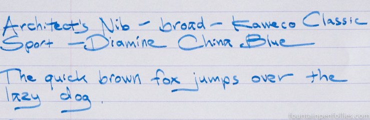
The ink is Diamine China Blue.
I’m going to talk about the broad Architect’s nib today, and the medium tomorrow. The broad Architect’s nib is easy to love, even though I am not the broad nib person. I am the person usually scrutinizing extra-fine nibs and asking if they are a bit too wide.
But Dan had lent me a Karas Kustoms K fountain pen with broad Architect’s nib, so I couldn’t resist getting one of my own. I already knew how much I liked it. Here is that one with Caran d’Ache Electric Orange ink.

I am really thrilled to have my own now. As any frequent blog reader can attest, I have terrible handwriting, just a fast and messy scrawl, but the Architect’s nib gives even my handwriting a tiny bit of elan.
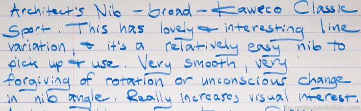
The greatest thing about the broad Architect’s nib is that it’s very easy to use. It’s smooth, and it has a large sweet spot.
The only downside, for some of us, is that it is very broad, at least in the horizontal strokes. That can mean, for me, closed loops in the “e”s if I write very quickly. And I write quickly. But since I often close the loops in my “e”s with round nibs anyway, I’m used to it.
This is kind of a specialty nib for me, since I don’t use broad nibs very much. But I suspect I’ll use it more than all my other broad nibs combined.

I absolutely LOVE Architect’s nibs! They’re gorgeous at writing and perfectly follow your hand on the paper
LikeLiked by 1 person