
Mystery Ink participants and readers made some excellent guesses that include some similar greens. Here is the first batch.
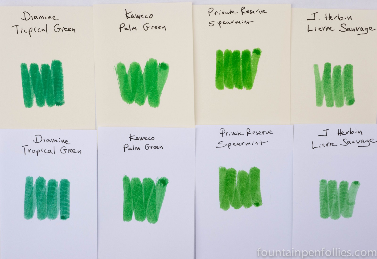
Diamine Tropical Green is more blue. Private Reserve Spearmint much more yellow. J. Herbin Lierre Sauvage looks more yellow and less saturated.
Here are some more Mystery Ink guesses, with Lierre Sauvage repeated again, this time in a heavier swab.

Again, none are quite the same.
Another good guess was Montblanc Irish Green.

I liked the Irish Green guess because Irish Green is another green ink with good shading, like Palm Green. However, Palm Green is brighter than Irish Green while Irish Green is more blue and almost more grayed down.
The word a lot of us used for Kaweco Palm Green was “cheery,” and I’m starting to see why that word came to mind when I look at the comparison greens. All of these other medium greens are great colors. But Palm Green has an extra zip to it.
For me, the closest comparison was J. Herbin Lierre Sauvage, but with a caveat. Lierre Sauvage can be a close match when used in a very wet pen. From a normal or dry pen, Lierre Sauvage is lighter, less saturated and I think slightly more yellow. You can see that in the swab array above.
Consider these swabs.
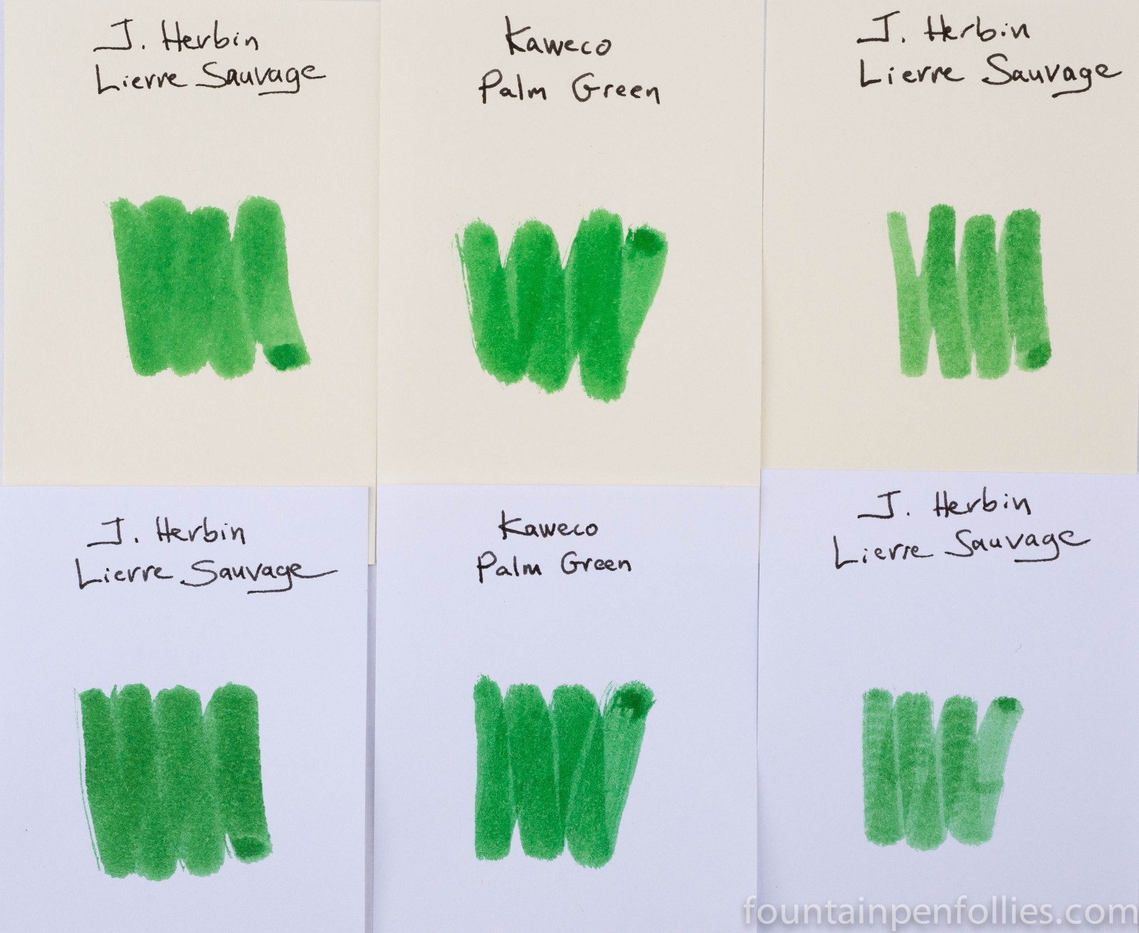
The Lierre Sauvage swab on the left is closer to Palm Green. After getting a letter written with Lierre Sauvage in a very wet pen, I saw how it could resemble Palm Green. So I went back to Lierre Sauvage and this time dipped the cotton swab in Lierre Sauvage several times until it was extremely wet. That gave me the darker swab on the left.
And then there is Caran d’Ache Vibrant Green.

I thought the Vibrant Green looked darker, and more blue, but it shared a brightness, and swabs can be deceiving. So I put Caran d’Ache Vibrant Green into a Jetpens Chibi like the one I used for my Kaweco Palm Green review. And here is the result, with Palm Green on the left and Caran d’Ache on the right.
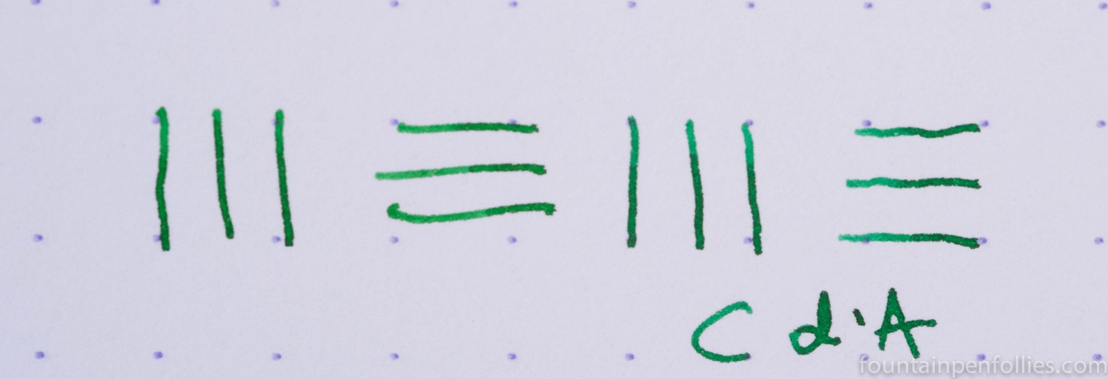
The Caran d’Ache Vibrant Green indeed is more blue, but the shading and the line width and the amount of saturation are very similar.
To see that more clearly, here is a writing sample on Staples Sustainable Earth, where the top two lines were written with Palm Green and the bottom two with Vibrant Green, both in a Jetpens Chibi.

So with Palm Green, I have found a lot of interesting similar inks, but no perfect match. Lierre Sauvage can look similar, but it’s less saturated and more yellow. Caran d’Ache Vibrant Green has similarities in behavior, saturation and shading, but is more blue. Montblanc Irish Green is similar in its shading but is more gray.
Palm Green seems to be bright and almost pure for a medium green (“cheery”). It seems to lean less to either the blue or yellow sides when compared to some of the others.


‘Cheery’ is right, exactly! This comparison is because it really showcases the ink compared to other options, some possibly more well-known. For me it’s handy because Kaweco is one of the few ink brands I can get locally, and I would have passed it over in the bottle (I think I’m awfully biased in favor of ink-specific brands like Diamine and Herbin!)
LikeLike