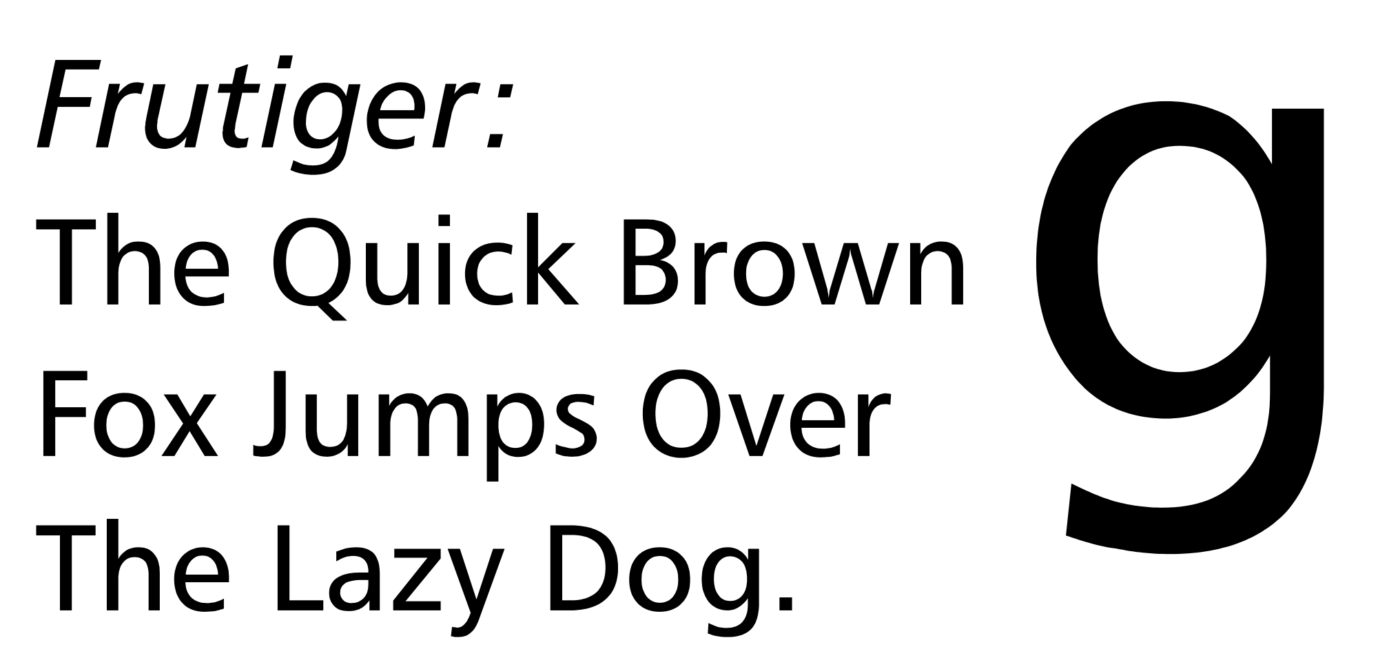
Adrian Frutiger died recently at the age of 87. Frutiger, from Switzerland, was a great designer of modern typefaces. His fonts are known for their clarity and legibility: many of them were used in signage.
Frutiger didn’t just create typefaces; he thought deeply about them and was able to articulate his design principles as beautifully and clearly as he crafted his type.
He believed that a typeface should not draw attention to itself as a stand-alone work of art, but should be seen as a tool to best convey the underlying information.
“Type must be open and clear! It must be adapted to our lives. Type is the clothing a word wears, so it must be subordinate to the content.”
“The whole point with type is for you not to be aware it is there.”
To achieve these goals, he focused on his types’ proportions and on perfecting not only the lines of the letters but also the negative space — the spaces inside and around individual letters.
“Typography must be as beautiful as a forest – not like the concrete deserts of suburbia. A forest is not a single complex – there are distances between the trees which provide space to breathe and live.”
Among his most famous typefaces are Frutiger, illustrated first above, and Univers, second. Both are used for signs in many public spaces — including the Charles de Gaulle airport in Paris, for Frutiger, and BART, the San Francisco Bay Area rapid transit system, for Univers.
Other notable Frutiger typefaces include the serif font Meridien and the sans-serif Avenir.
——————————-
Adrian Frutiger’s quotes are taken from an extensive piece about him on the Linotype website, which can be read in its entirety beginning here.
The Linotype piece is presented in the typeface Frutiger Neue, which I know thanks to a browser tool called WhatFont. If you are a typeface fan like me, WhatFont is available for free here as a bookmark for your browser.
A New York Times obituary of Frutiger can be found here.
Just My Type, by Simon Garfield, a good general interest book about typeface design, talks about Frutiger, too, especially about his Frutiger and Univers typefaces.
The image of Frutiger type is by Dyfsunctional at English Wikipedia (Transferred from en.wikipedia to Commons.), via Wikimedia Commons.
The Univers type image is by Atanamir via Wikimedia Commons
The Meridien type image is by Fiamon via Wikimedia Commons.
The Avenir type image is by Fiamon via Wikiwand.


I don’t know much about fonts, so this is fascinating! My favorite of the ones you featured is the Univers – the Q especially! Thanks for the WhatFont recommendation too – I just downloaded the mobile app version, really nice!
LikeLiked by 1 person
Me, too! And also the Q!
I think Avenir is my second favorite. I love the oversized dot over the “i” — that is such a felicitous touch. I think Avenir is also a really nice example of his work with negative space.
In case you are interested, here is the Avenir page: http://www.fonts.com/font/linotype/avenir
LikeLike
The first example (Frutiger) also immediately made me think of the text in Dr. Seuss books. I may not even be correct, but I saw that in a flash. Font design is a very subtle art.
LikeLiked by 1 person