

It originally was the revolutionary 51, back when it was first introduced. Parker applied for a patent on the 51 in 1939, and started marketing it worldwide in 1941. Parker knew the design was cutting-edge. Playing on the 51 name, Parker advertised the pen at its 1941 debut as “10 years ahead” of its time. Another ad proclaimed that the 51 was “like a pen from another planet!”
Parker wanted a new design that reflected the Jet Age and that would work with Parker’s new ink. Both internally and externally — in function and form — the 51 differs from the traditional cigar-shape or Duofold-style pens that came before.
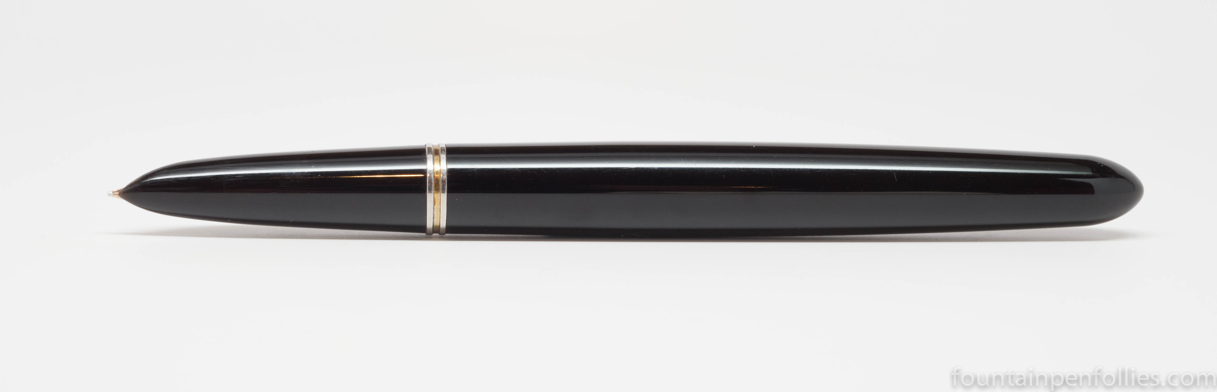
The 51 is sleek, minimalist and Modernist.
In its era the 51 was incredibly popular. Parker made tens of millions of 51s and sold them worldwide. The 51 is so robust that there are still millions floating around. And its design spawned pens in similar styles from Parker and everyone else.
Ubiquitous as it once was, however, today the 51 design is polarizing. If you like minimalism, you’ll probably like it. The 51 is so streamlined it makes you realize that the Lamy Safari actually has a lot of ornamental elements in comparison.

These days, however, the minimalist ethos is not particularly popular in fountain pens. Maybe a minimalist pen doesn’t look special enough.
But I think the other obstacle to the 51’s popularity today may be that it also gives a kind of minimalist writing experience. It writes consistently. It never leaks and never blobs. The classic 51 nib is a fine point, which is hard and smooth, and writes without embellishment or ornamentation. People who don’t like it say “it writes like a ballpoint.”
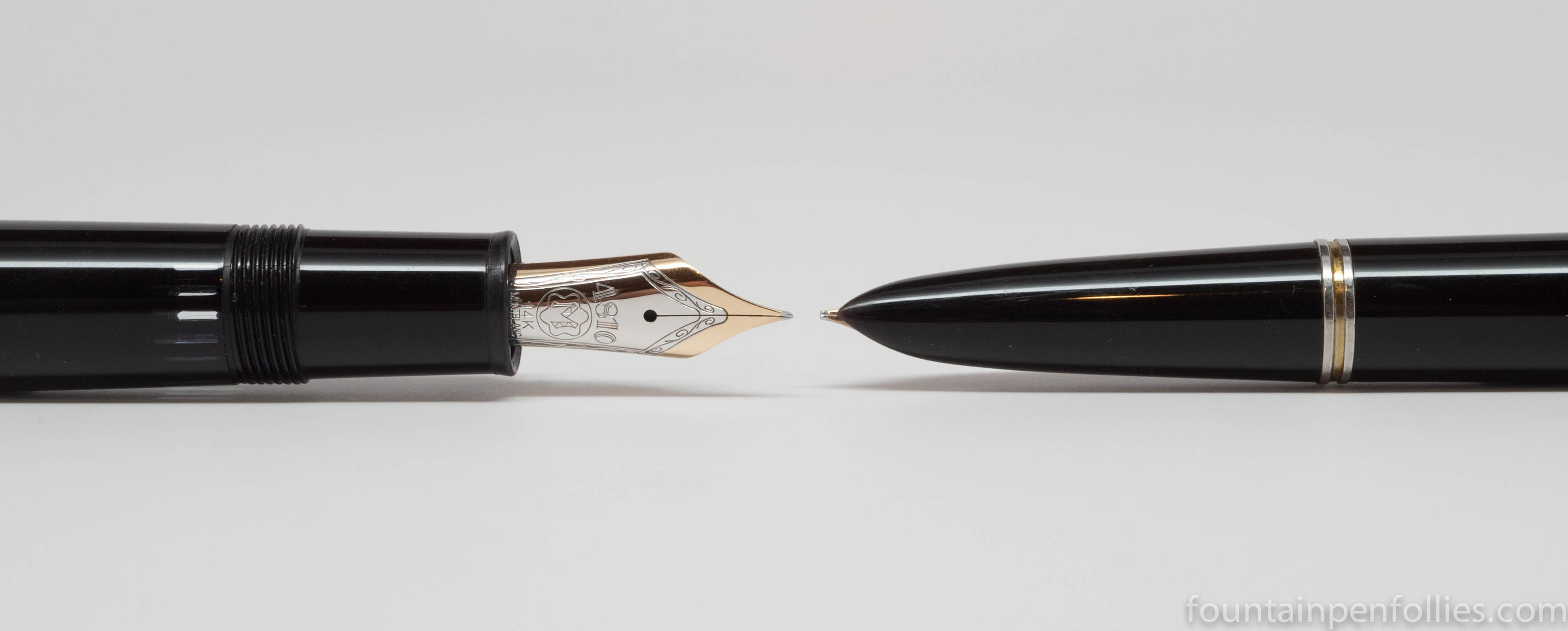
The 51 nib’s doesn’t call attention to its looks either. The 51 nib is small and hooded, to keep ink from drying out, which means you hardly see it. Compare it to an elaborately decorated Montblanc nib.
The 51 is the fountain pen as tool. It’s low-profile. It’s business-like. It’s designed for those who want a pen that writes easily, doesn’t run out of ink and doesn’t create any fuss.
These workmanlike qualities explain the appeal of the Parker 51, but also perhaps explain why so many of today’s fountain pen users are left cold.
And I can see their point of view, though I don’t agree myself. I appreciate its easy-going style of writing. And to me the 51 design is simple, and simply perfect, with nothing that need be added or removed. I think it’s beautiful. I actually favor the most stripped-down 51s, the aerometrics with Lustraloy caps.

But the appeal of any design is personal. That’s why there are so many other pens out there. A lot of fountain pen users prefer something more traditional with a big, beautiful nib. And a lot of fountain pen users want a writing experience with more flourish and expressiveness. I get that. I also have those types of pens.
Ironically, the 51’s greatest strength — its minimalism — also seems to be its Achilles heel today. In our era, a fountain pen is a choice, and some people who make that choice are looking for more.
I suspect the 51’s relative disfavor won’t last forever. I suspect that this wonderful design will find more fans again, when the pendulum swings back. I hope so.

People who don’t like it say “it writes like a ballpoint.”
Funny that. I said almost the same thing recently on FPGeeks, that I considered the 51 to be the “Bic of fountain pens”. Of course I was referring to the writing characteristics and experience of use. As far as the design goes, I tried to love it I really did, but in the end I just found it uninspiring. From an engineering point of view it is very interesting. I don’t buy pens to marvel at their engineering though, I buy them to write things. You know, there are times when I wonder just how influential the hype around the 51 has been: that there may be people out there who say they like it because it is expected of them. That is why I bought mine originally, because everyone said I should. I’ve had six. I have one left. Soon to be none. YMMV is, as ever, so true.
LikeLiked by 1 person
I wholeheartedly agree with everything you say, and I’m glad you said it. I’ve bought pens because of hype and realized that they weren’t for me, too.
LikeLike
Spot on regarding perfection, I like the way you phrase it. That last set in the photo is very elegant.
LikeLiked by 1 person
Well you are very kind to allow me to disagree with you, which is not particularly hospitable of me.
I really love that there are so many different preferences, and so many different pens. It is so much more interesting this way.
LikeLike
Huh. Odd, that – it seems like I meet people who are fans of 51s more than any other vintage pen! (I’m speaking mostly of offline stuff, online pen communities skew otherwise, and fewer collectors). But I also think your bias is showing, tipping us off to the meta-minimalism of the Lustraloy caps. But while a silver Metro may have a band around the middle as it’s only adornment, think of all the variations of cap designs on 51 gold caps! Mind boggling! (My fave is a cedar blue Vac with an “alternating straight – wavy line” pattern. Beyond the brilliance of the functional design of the pen, which no one has truly surpasses, one has to marvel at the panorama of ‘styles’ Parker was able to bring to that design and still be “minimal”. A brief perusing of a site like parkercollector.com and the array of 51s would convince anyone of the potential in such a benign design.
LikeLiked by 1 person
You are right, of course: I am not talking about fountain pen collectors.
And I agree that we’re all biased, fans and non-fans. 🙂
I did say that I preferred the stripped-down Lustraloy cap. But don’t get the wrong idea: I like them all. I just don’t own the rarer caps. Not because I dislike them. Because I don’t have the money.
Yes, those are the ones that many collectors seek. And they seem to be acknowledged as “nicer” by a broader range of people in general. Maybe that underlines your point about bling? And are those the least minimal? One could say so. I think that is sort of an extension of what I was trying to say.
I’m not trying to convince anyone of anything. I love the pen myself, and I think it’s beautiful. I also understand that there are many who don’t. Vive la différence.
You said no pen is perfect. I might not agree. 🙂 But I’d say no pen is for everyone. 🙂
LikeLike
While today’s user and collector of fountain pens may seem to favor bling and overdesign, I’d posit that there are *still* a lot of 51 fans out there, and still trends for that mode of style. Take the nib out of the question, for instance, and could you have a more minimalist approach than the Pilot Metropolitan?
The funny thing is that I resisted this pen for a number of years, partly *because* the collectors I knew favored it. However, the true reason was deeper and as plain as the nose on it’s face: I could never stand the arrow clip. It was, and still is (to my eye), out of place on the rest of such a streamlined beauty. Yes, I realize it was the true icon of the Parker brand, but look to the Aurora 88 from years later for simple, elegant clips to compliment a sleek body. Well, no pen is perfect. 😉
LikeLiked by 1 person
Jon, forgive me, but I actually would say that the Pilot Metropolitan is not minimalist. It is larded with ostensibly decorative touches, like the pattern bands, that are not there for anything but to “dress up the pen.” Good pen and a great deal, though.
Taste is subjective. No one is going to change anyone’s mind. You do a good job of explaining why you don’t like it. I actually sympathize with 51 non-fans; it’s a totally reasonable point of view (or views). I just don’t feel the same way. No one is “wrong.” And I think you know I am not adverse to bling in my pens. 🙂
Oh, yes, there are 51 fans. But we are are a smaller group, and sometimes on the defensive, among all of the non-fans. 🙂
LikeLike
I found this brought back memories of my Parker 51 school pen. I should ink up and use mine more.
LikeLiked by 1 person
Hi Laura, I’m answering your penpal letter and wanted to see what you were talking about! 😀
I have to say, I’m a big fan of the 51 not just for its unique shape and minimalism, but also for the way the nib on mine happens to be tuned. It harmonizes well with my handwriting and feels… hmm, really sympathetic to the plight of a lefty. Some pens are–I don’t know the word for it. Sort of italic, but not oblique. Like my Lamy 2000, for example. Its horizontal lines are much thinner than its vertical lines, which can be frustrating, even though I love the shape and Bauhaus minimalism of the pen!
Do you own all the pens you’ve photographed on here? You write to me so often with Lamy Safaris–I’m really surprised to see a Montblanc on here!
LikeLiked by 1 person
I love the 51 and its nib, too, and I think “sympathetic to the plight of the lefty” is a great way to put it. Though I am not a lefty, I find it a really straightforward and easy-to-use nib. My left-handed mother used one. I think, though, that ironically that easy quality may contribute to the “ballpoint” analogies.
Do I own all the pens photographed here? I would have to take the Fifth in case my husband ever reads this. And I’d tell him not to look at the Aurora Optima post. 🙂
LikeLike