
Blue Hour Twilight Blue is a green-leaning blue black. In some ways it resembles the color of the venerable Waterman Blue Black, once the Waterman has dried down. However, Waterman Blue Black tends to look more blue when first written on the page, and then it dries to the greener color. Blue Hour Twilight Blue maintains essentially the same color, wet and dry, which I prefer.
Blue Hour Twilight Blue has a wonderful smoothness and lubrication when you write with it. I think that smooth feeling is a feature of many Montblanc inks, but I really notice it here. Writing with Twilight Blue feels like writing with a luxury ink.
Twilight Blue seems to be a very low-maintenance ink. It has cleaned up very easily from every pen I’ve used it in, and given that it has almost no water resistance I would expect that to continue. It’s not labeled “washable,” but when I spilled some on a light-colored cotton dishtowel, the stain vanished quickly with only water and liquid dish soap. I love that. But of course the flip side is that Twilight Blue will not be the ink for addressing envelopes. Nor will it suit those who need a water-resistant ink. Here is what happens if you get a drop of water on it.
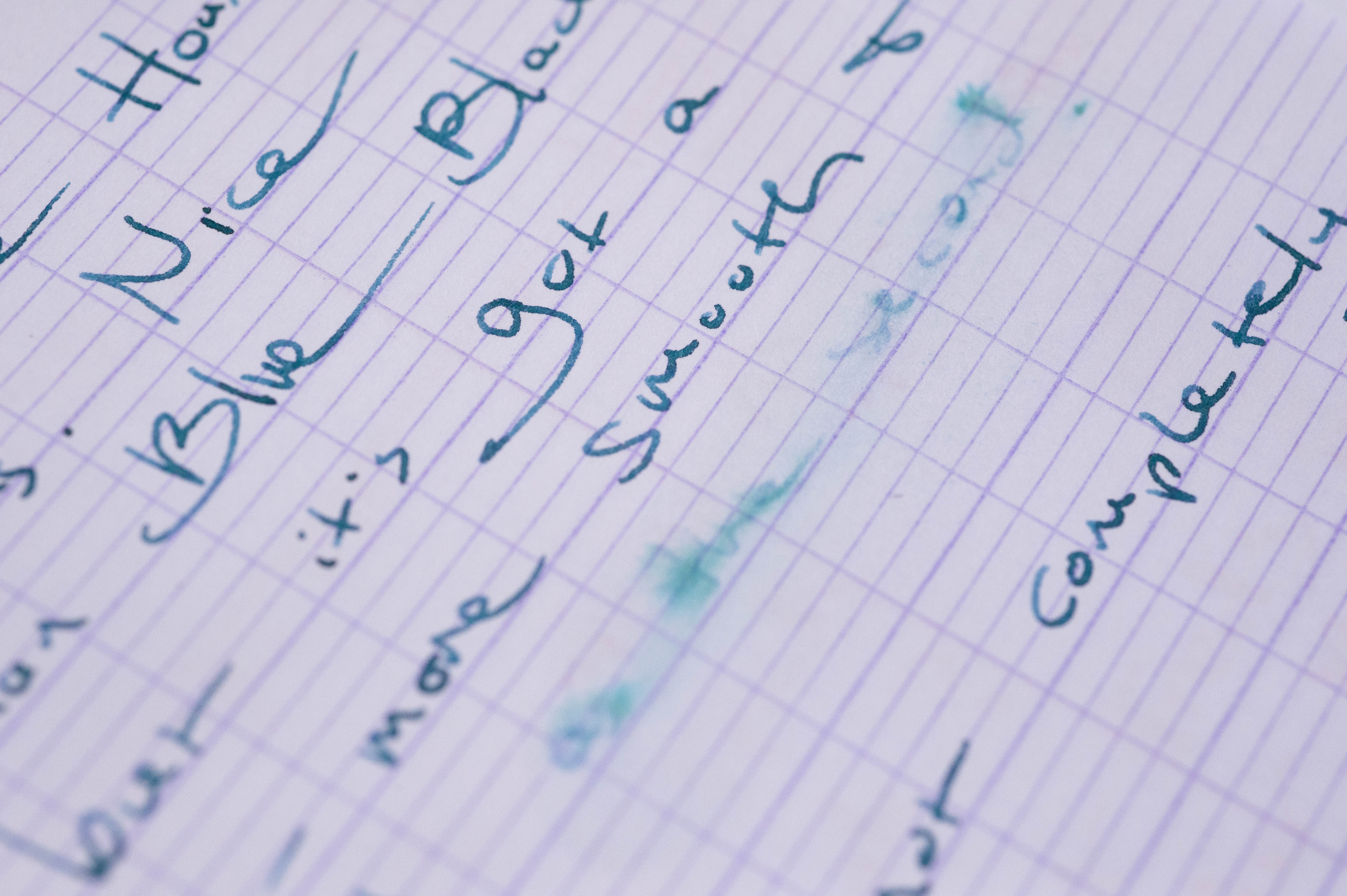
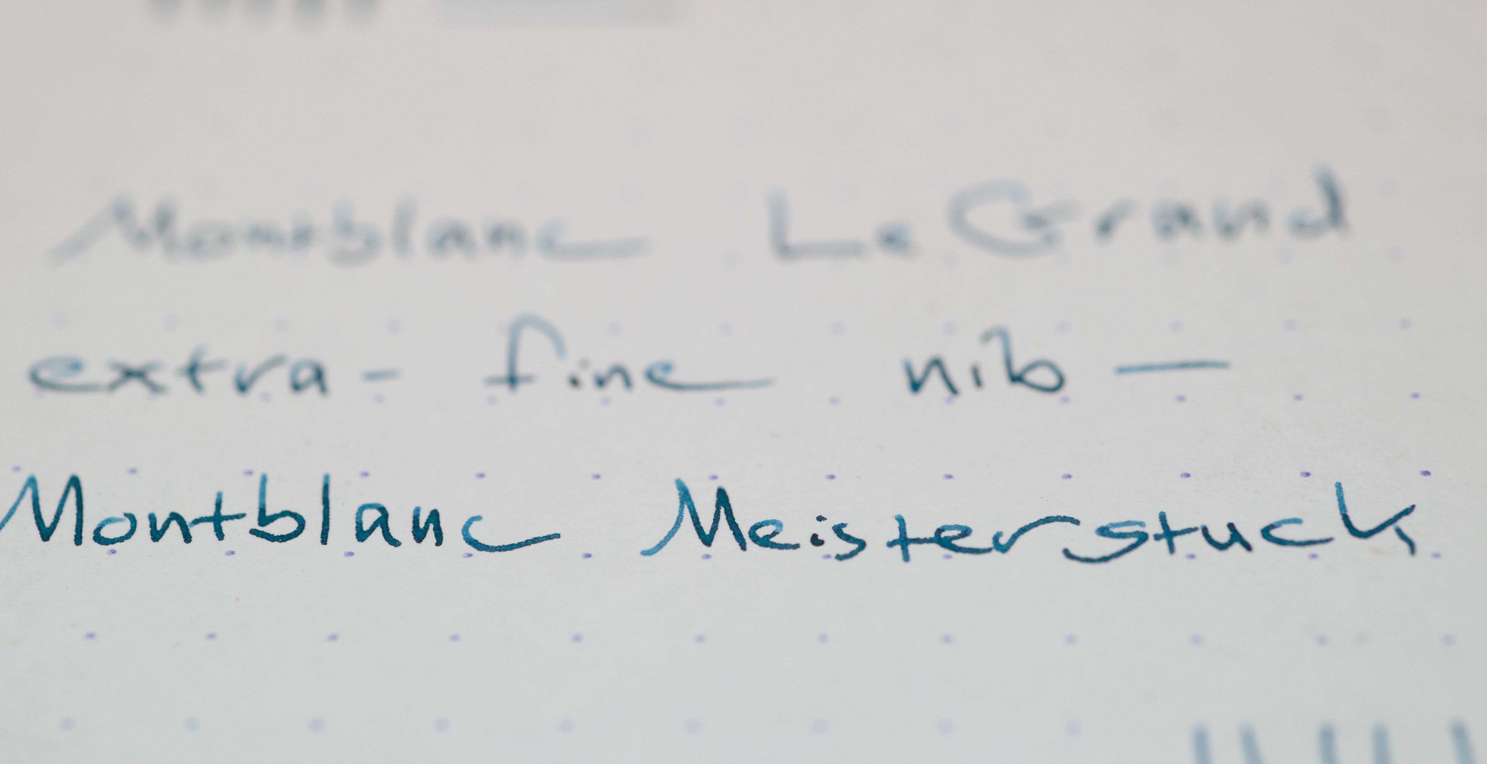
I have used Blue Hour Twilight Blue in a Lamy Safari with extra-fine nib, and while the performance was excellent, the color in that dry writing pen was weaker and lighter than I prefer. I don’t think that combination brings out the ink’s best. However, if you put it in a wet pen, I think it looks drop-dead gorgeous. Here it is in a Montblanc 146 with a broad nib.

And here it is with a Montblanc extra-fine nib.
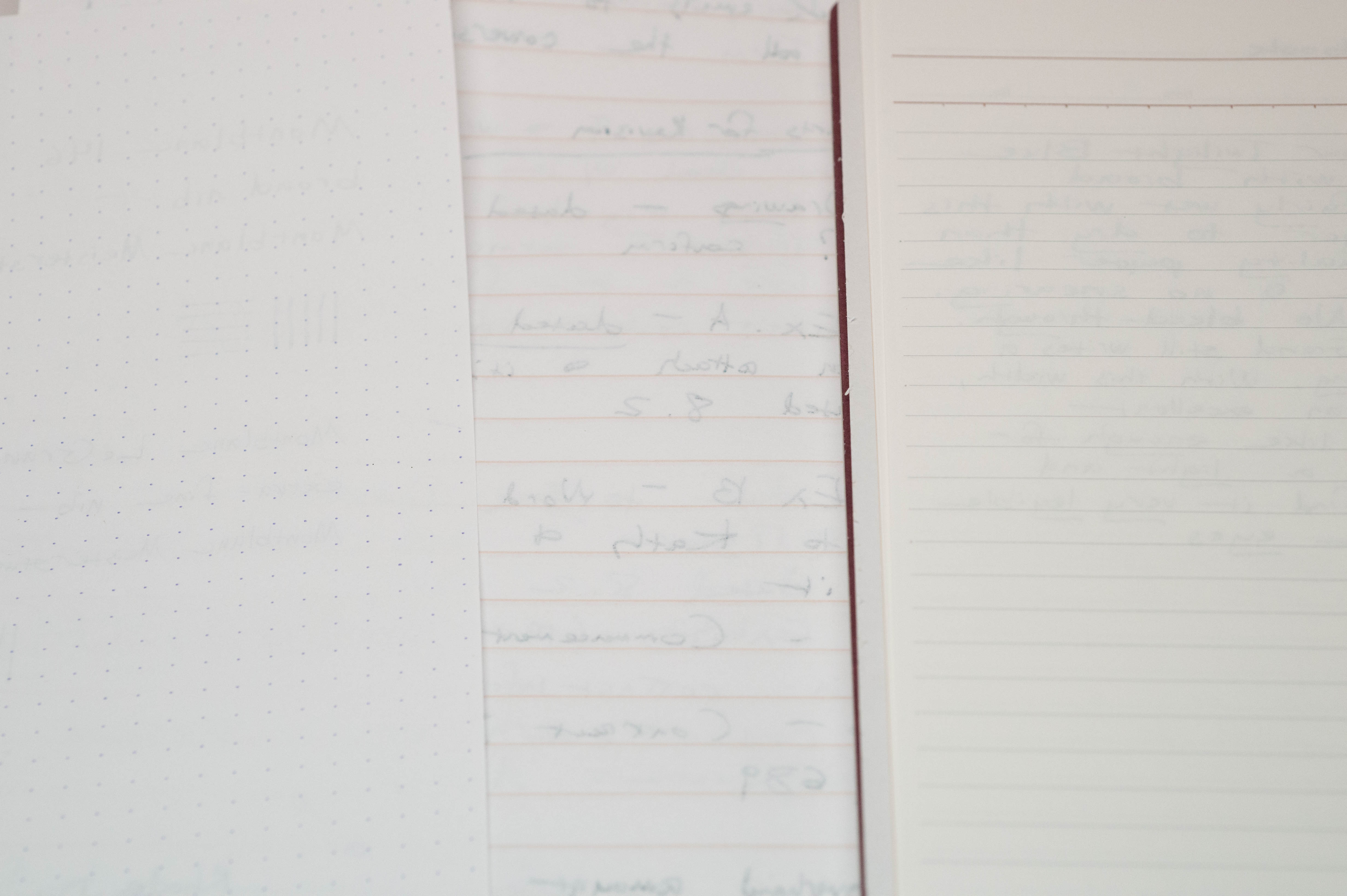
I’ve used the ink with a variety of paper — the lowest quality generic copy paper, decent laser-printer paper, Staple Sustainable Earth legal pads, Clairefontaine, Rhodia and a Kokuyo Campus notebook.
Twilight Blue shades nicely on almost any paper except the worst. I haven’t seen feathering, except for a small amount on the generic copy paper — and nearly every ink feathers on that stuff. Twilight Blue’s drying time varies with the paper: on the harder, smoother, better papers, it tends to dry more slowly than some inks, but it dries immediately on more absorbent or lower quality papers. I get drying times on better paper of up to five seconds with the extra-fine Montblanc and up to 10 seconds with the broad Montblanc. Once dry, it does not smear.
Whether there is any show-through also depends on the paper. With good paper, like Rhodia, I see hardly any show-through. With cheaper or thinner paper, I can; this is most obvious with the terrible copy paper, but it also happens on a Staples Sustainable Earth legal pad, which is my paper for work, but is very thin. Even so, the show-through on the Sustainable Earth paper is mild enough that I can write on the reverse side. This photo shows the reverse side of pages written with the Twilight Blue — from left to right is a Rhodia dot pad, Staples Sustainable Earth and Kokuyo paper.
Twilight Blue’s color is appropriate for everyday business use, and for an everyday ink in general. The green tint adds a little lift but the color is formal enough not to cause even the slightest comment. A full page is easy on the eye, and attractive, without calling attention to anything other than the words on the page. I do think it might seem a little too serious for some uses — for example, this would not be the ink I’d select for a girl’s five-year-old birthday party invitation. However, I think it does suit most writing situations, and in turn I haven’t found a fountain-pen friendly paper that doesn’t suit it.

Here are swabs of Blue Hour Twilight Blue with some other greenish blue black inks, for comparison.

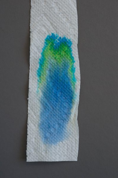
I got a kick out of the results of paper towel chromatography on Twilight Blue. I like how bright and cheery the dyes turn out to be.
I am a fan of greenish blue black inks, and this one has quickly become a favorite. It is a very nice color in any fountain pen but the most dry and stingy writer. And it behaves beautifully, whether in the pen, on paper or when it’s time to clean out the pen.

This pretty ink does shade very well. The ink’s color is a lot like the trivial Parker blue black, but definitely more saturated (although the hue is very similar) and capable of shading. And although it lightens as it dries, it does so much less dramatically than Parker blue black. If you like teal, this is one of the best got-to inks available.
LikeLiked by 1 person
I want to like the ink, but it is so similar to Tsuki-Yo that it hardly seems worth it. I much prefer the JFK ink.
LikeLiked by 1 person
The shading is really dramatic, especially with a wet pen. This is one of those inks that the more I use it, the more I like it.
LikeLiked by 1 person
Agree with Chrissy, even though I prefer blue-heavy blue-blacks (god I’m a geek) this makes me see big puffy hearts 🙂 And holy wow, look at all that shading!
LikeLiked by 1 person
I really like the look of this ink despite the fact that green leaning blue-black inks don’t usually attract me. It’s the luxurious feel that attracts me to this one
LikeLiked by 1 person